Startup tailored to guide founders' needs
The Design System overhaul transformed the platform into a streamlined, user-friendly resource for startup founders, achieving a 15% reduction in design inconsistencies and significantly enhancing development efficiency.
Techniques
UI Design • Interaction Design • UX Research • Interface Inventory • Visual Design • Accessibility
Team
Product Designer • Frontend Developer • AI Engineer
Role
I developed the design system, documentation, and UI Kits to help designers and product managers work efficiently and maintain a consistent style. Led cross-functional collaboration to bring ideas to life, making sure everyone could move quickly without sacrificing quality.
Background
During my 4-month product design internship, I focused on improving the existing design system
Crafted clear and comprehensive documentation for developers to enhance understanding and usage.
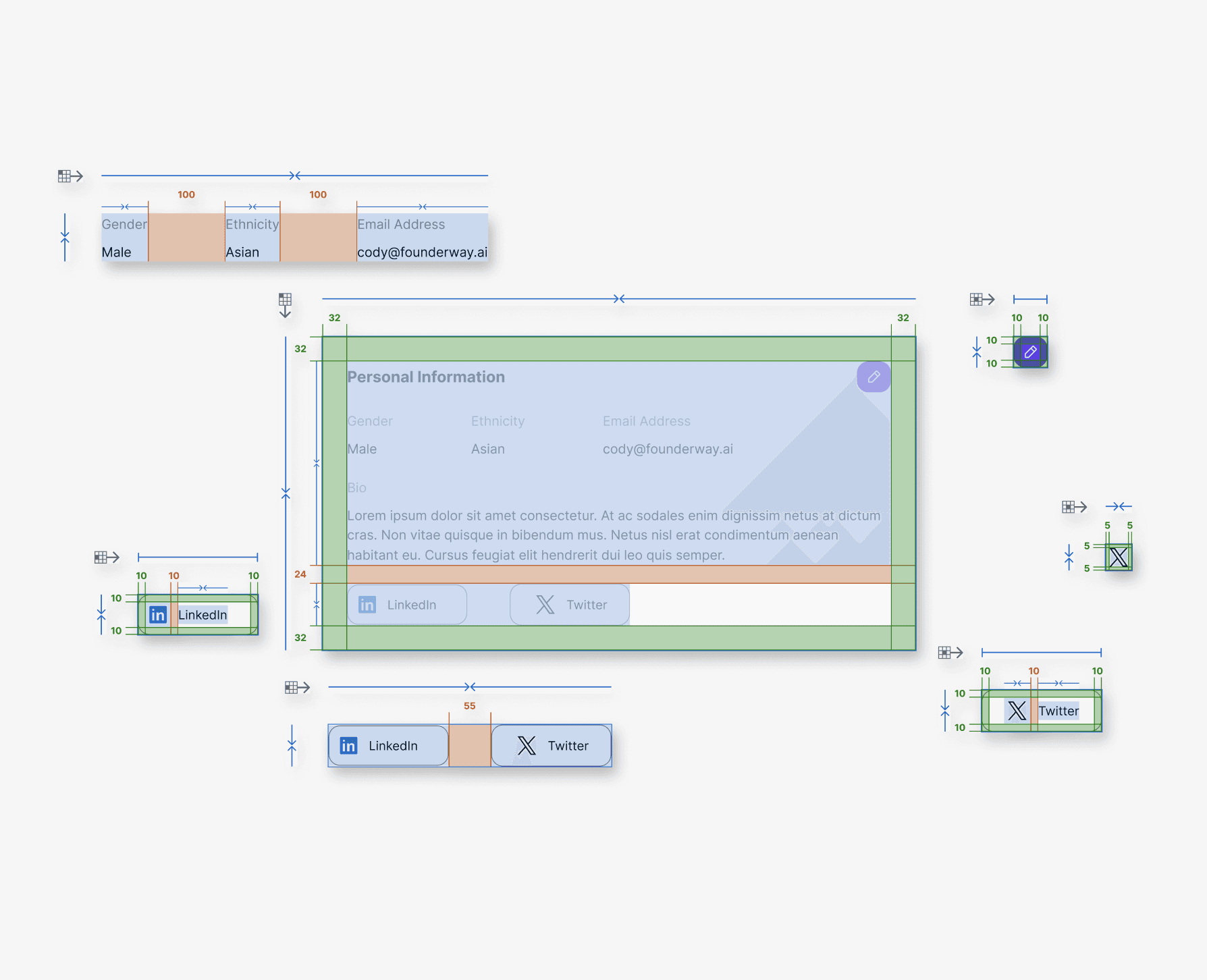
Designed new components to ensure the system seamlessly adapts to evolving product features.
After implementing the design system improvements, we noticed a 15% decrease in design inconsistencies. This directly translated to a more efficient product development process.
Problem Statement
Current problems with Founderway existing Design System
Lack of documentation.
Design files were scattered and disorganized.
Creating new components without updating the component library.
Goals
How might we create a more accessible, learnable, and inclusive design system that empowers everyone, regardless of their background (designers and developers)?
Our developers are encountering difficulties navigating the design system. They are feeling lost to locate the information or components they need.
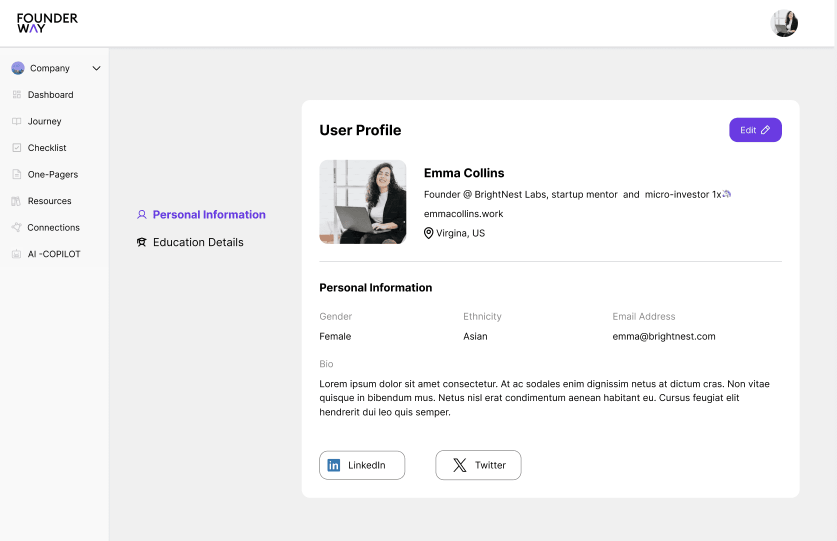
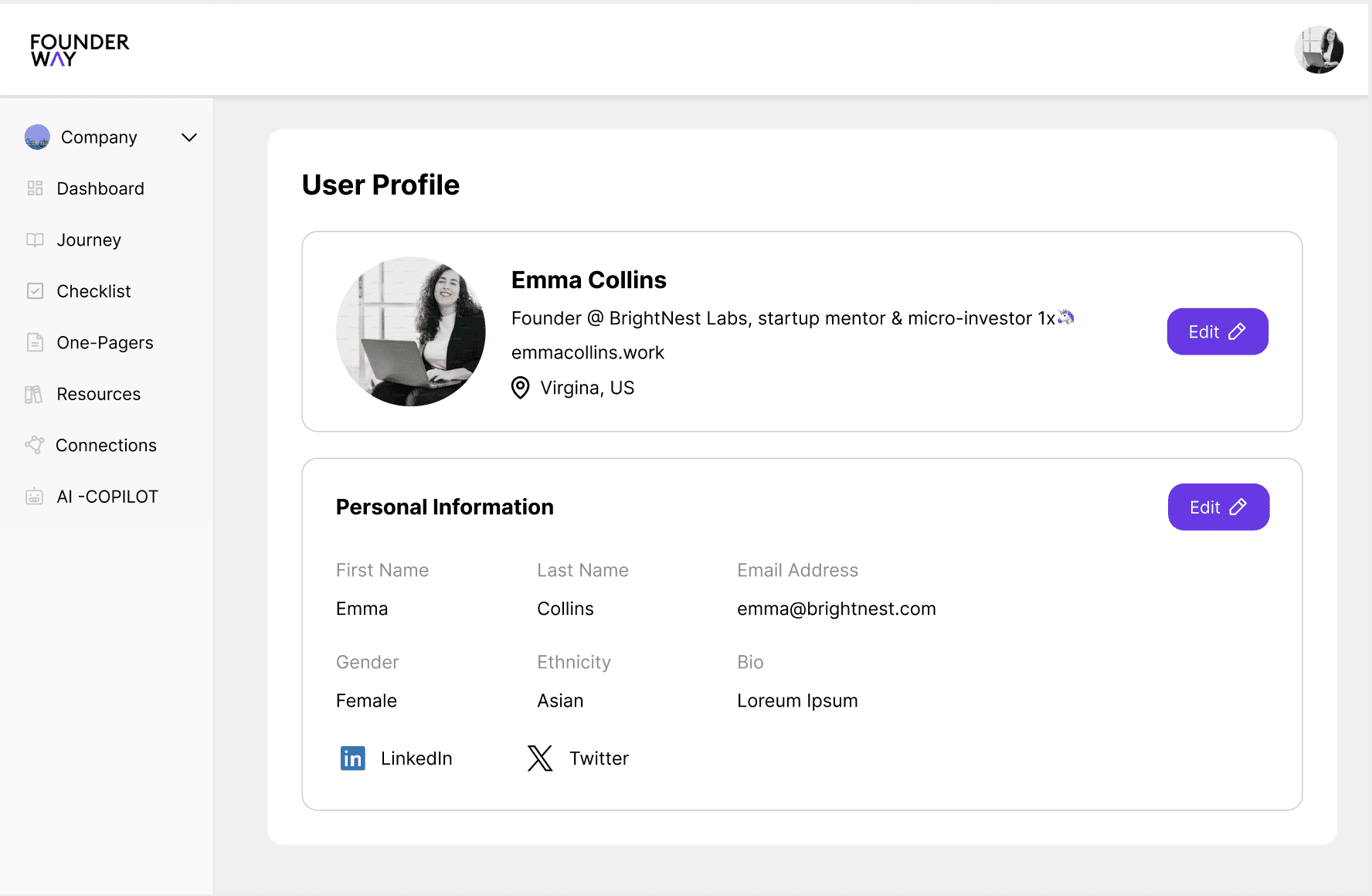
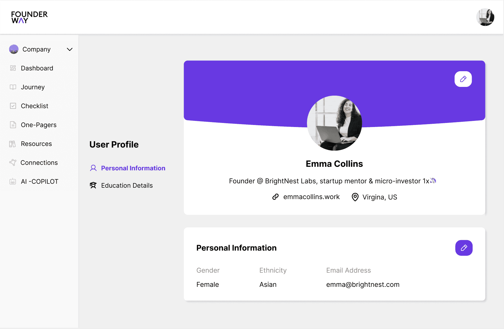
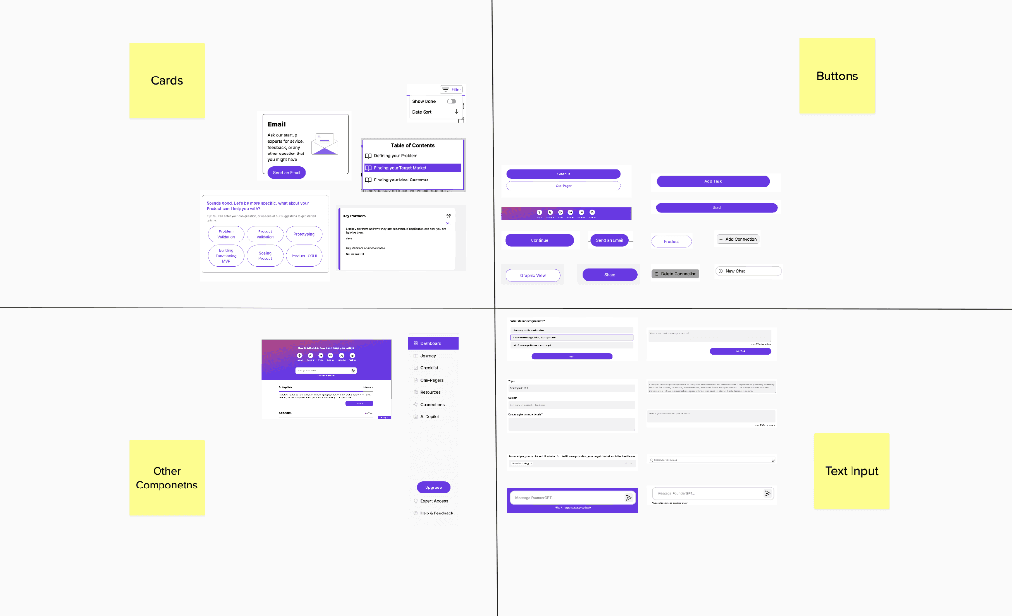
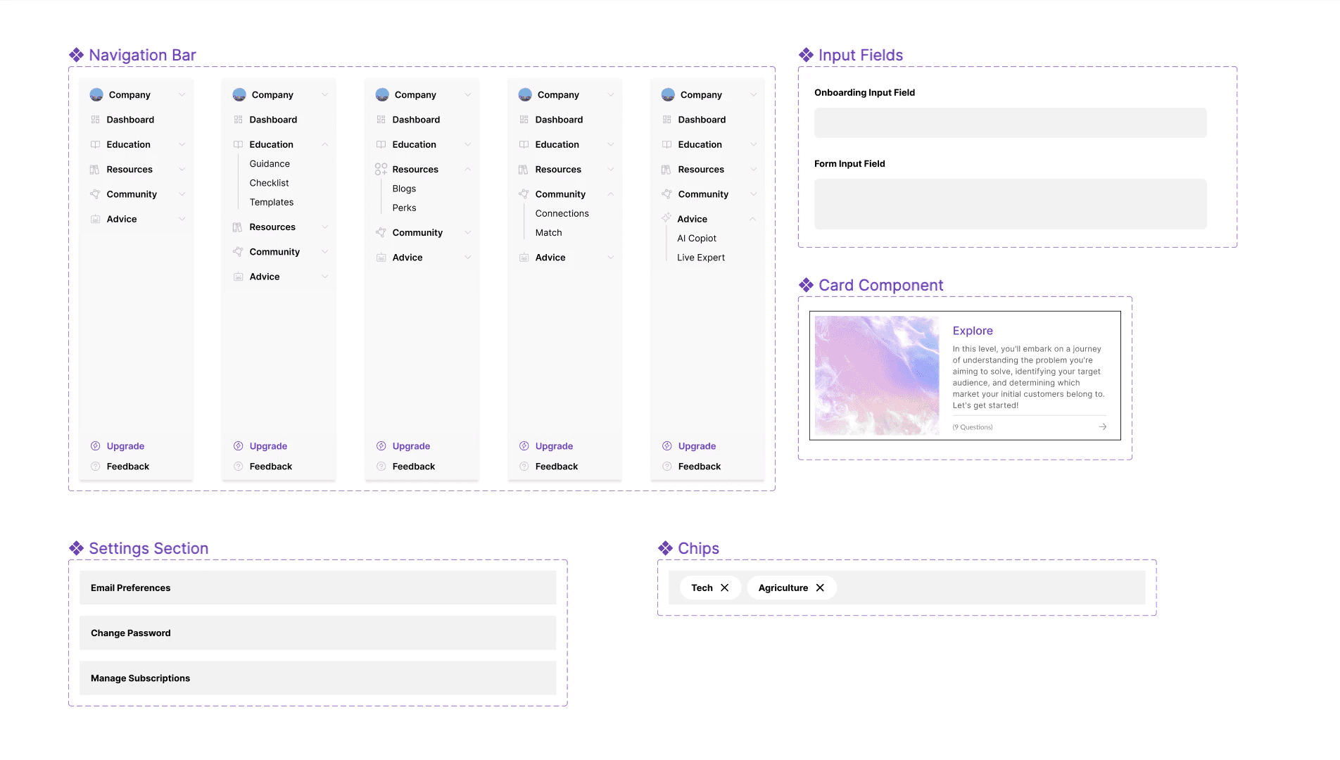
Component Library
Establish a well-organized and up-to-date library of reusable components.
Enhance Design System Documentation
Identify and address missing information in the existing design system.
Research
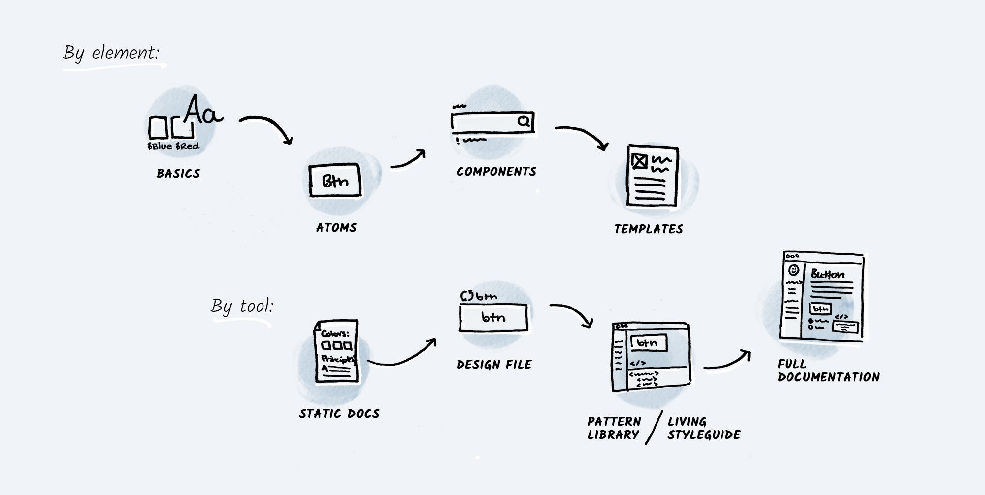
This was our first time developing a design system, and we began by researching popular design systems used by other companies. Our main focus was
The Figma components
The documentation
The style guide
The Code
"The old design system presented usability challenges due to inconsistency and a lack of comprehensive Ul component coverage" ~ Cody Jung, Frontend Developer
Interface Inventory
We ended up with all our content laid out on the table, which gave us a new perspective on what our content is and how to tackle it.
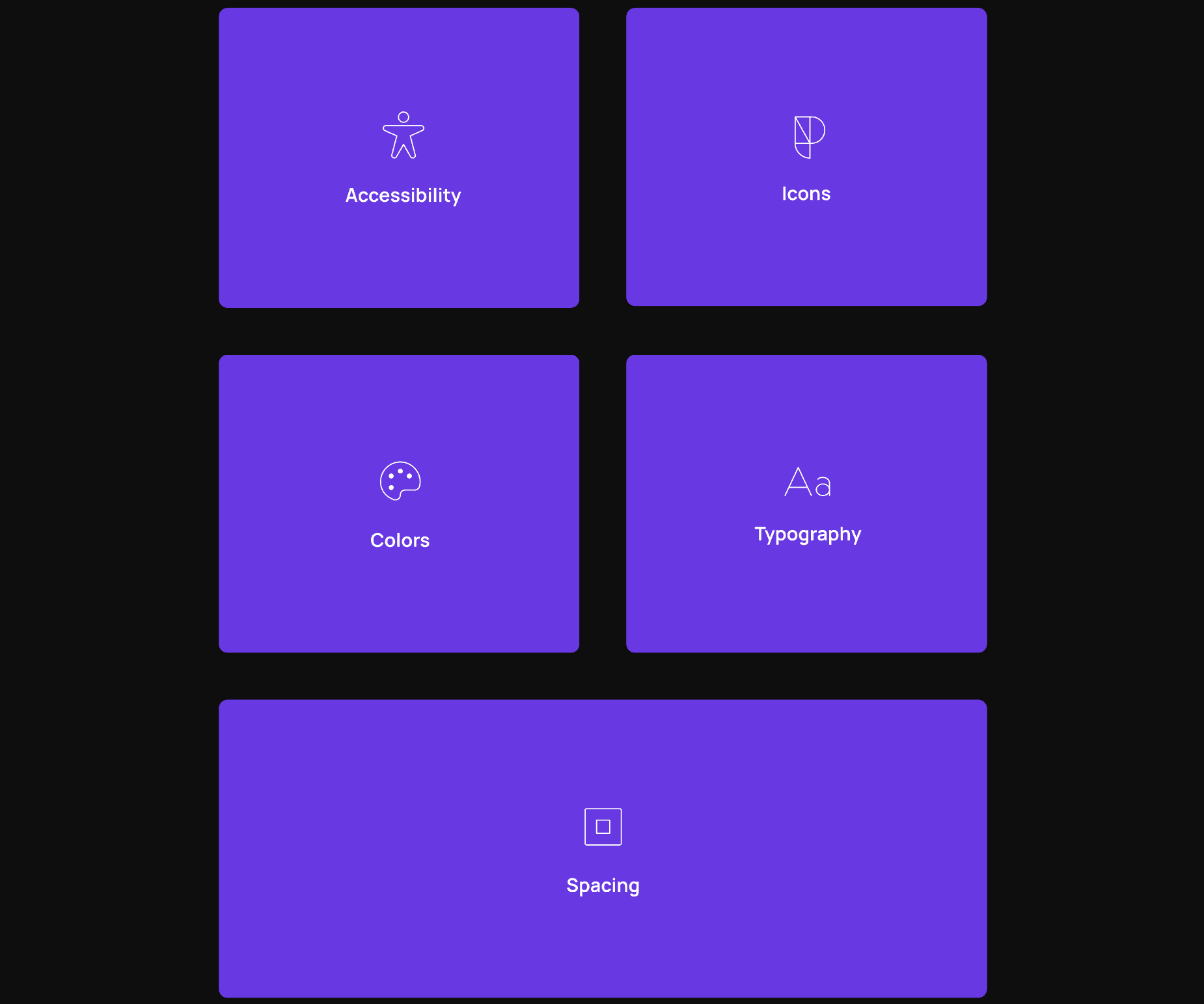
Foundation
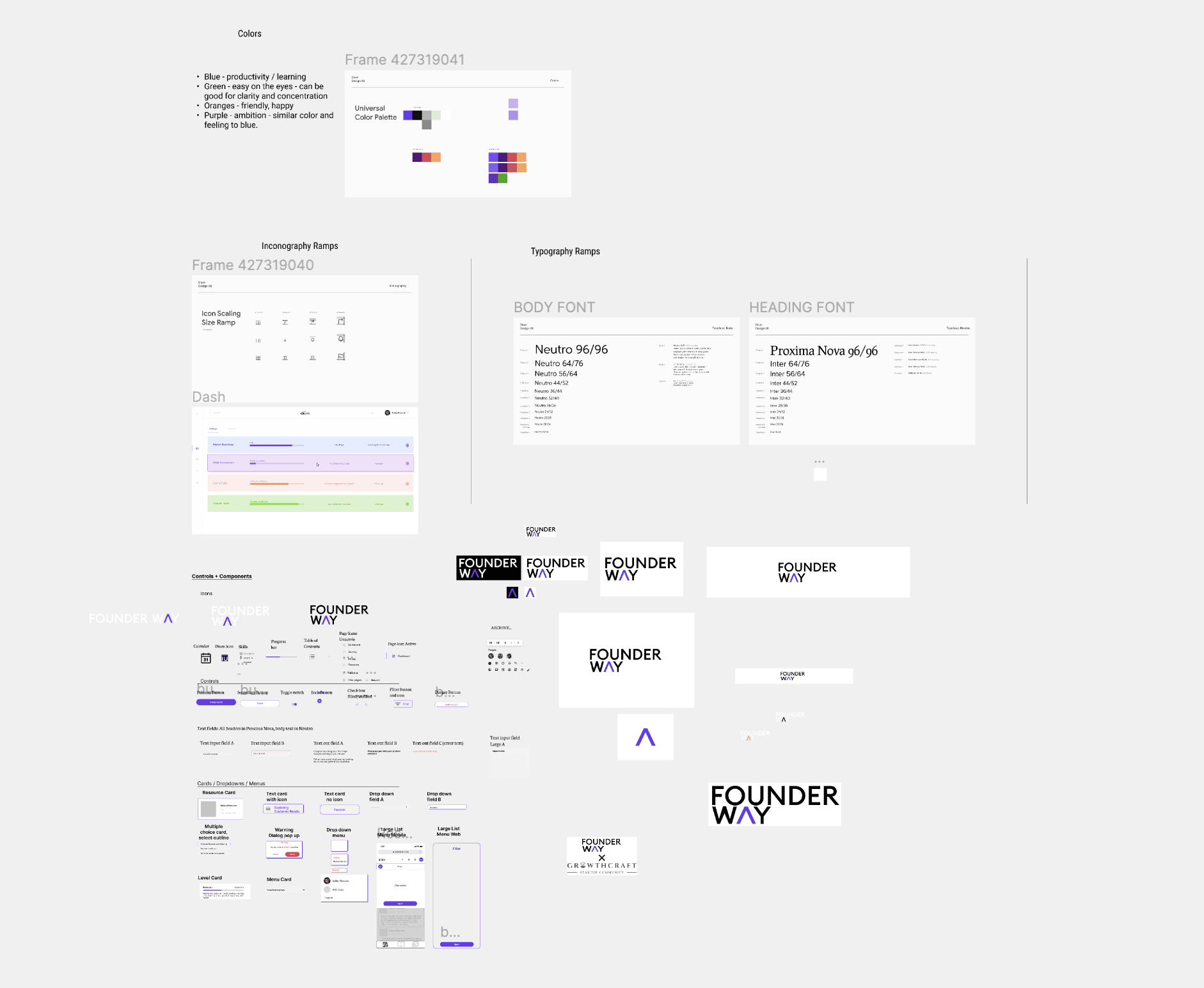
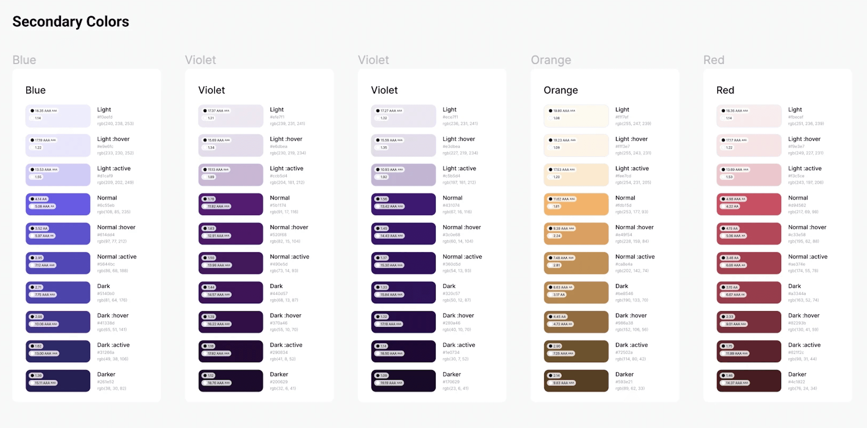
Color
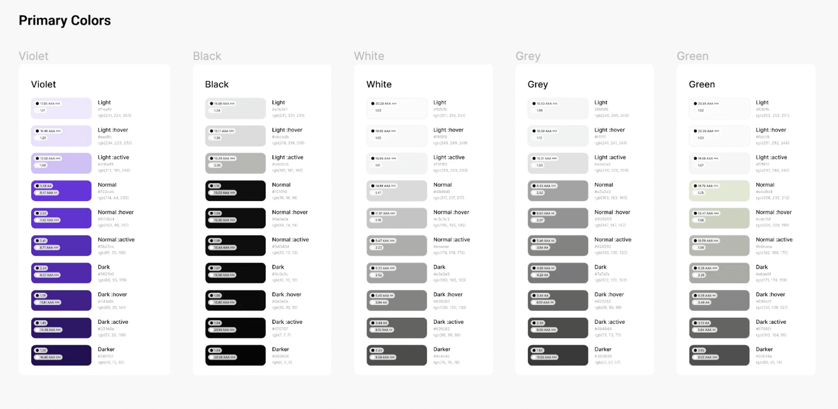
We use purple, specifically #722ceb, as our primary color because it symbolizes education and wisdom. This aligns with our brand identity and resonates with our target audience, creating a conducive learning environment.
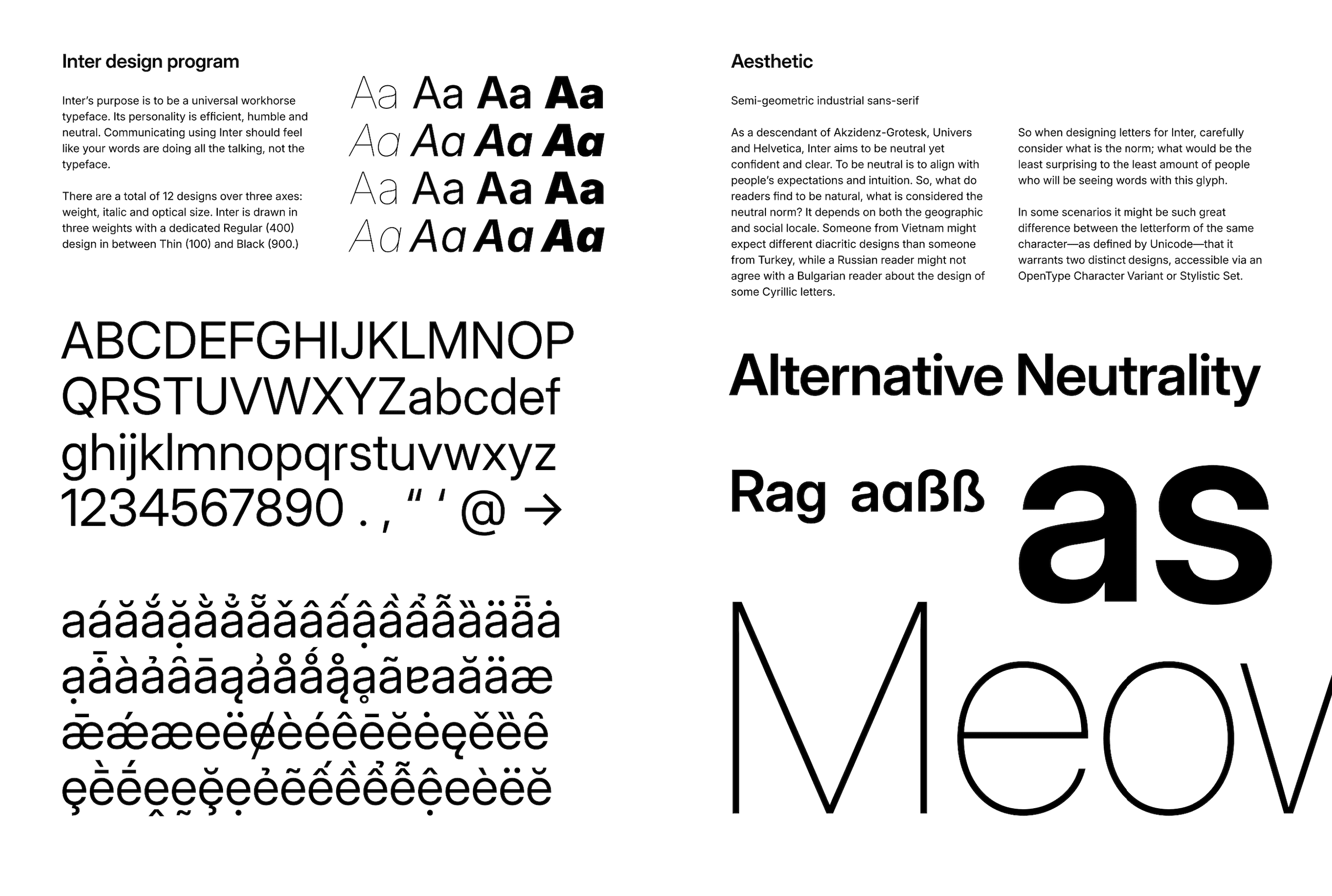
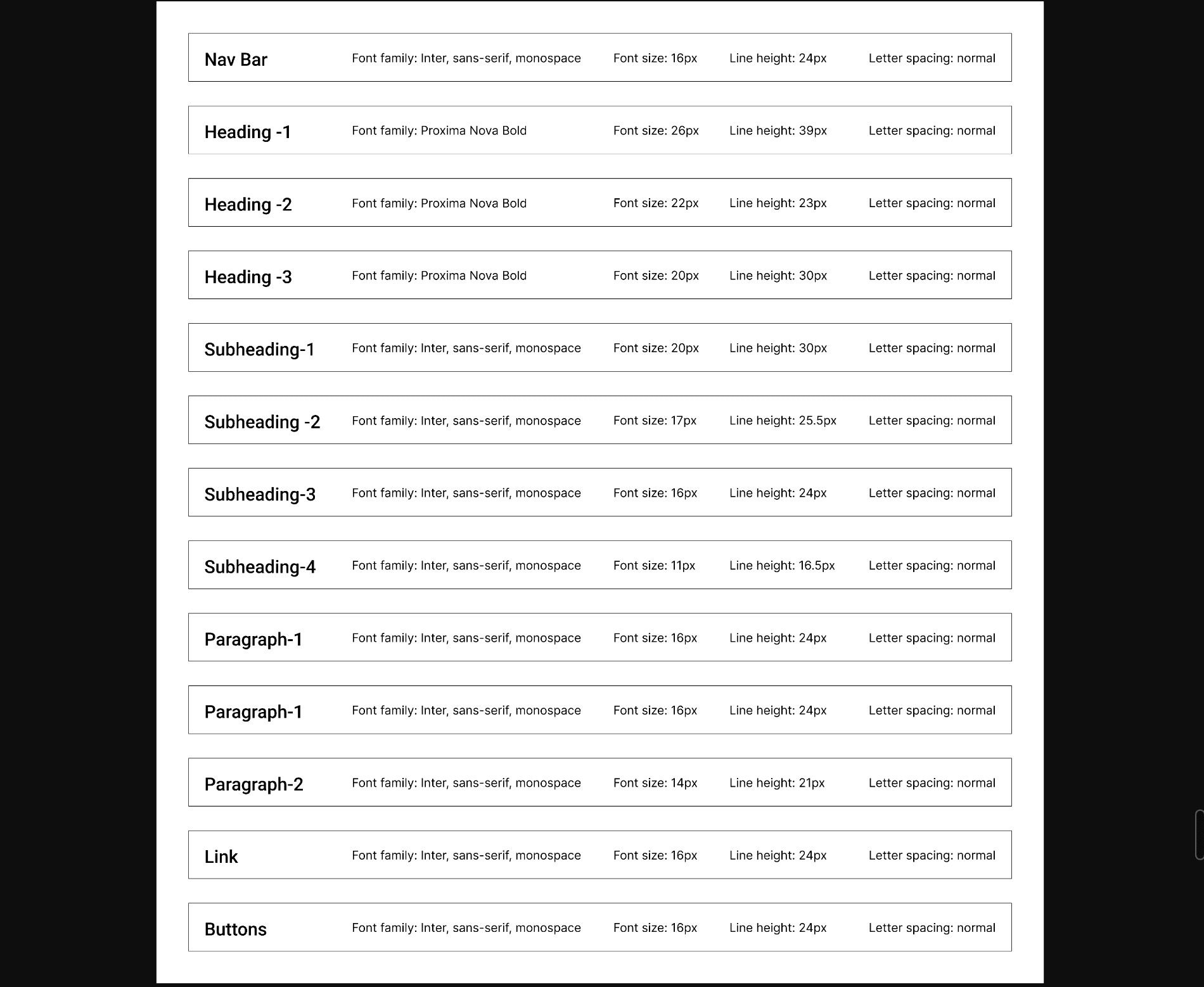
Inter feels to be a universal workhorse typeface.
Its personality is efficient, humble, and neutral.
Communicating using Inter feels like your words are doing all the taking, not the typeface.
It's a free and open-source font family.
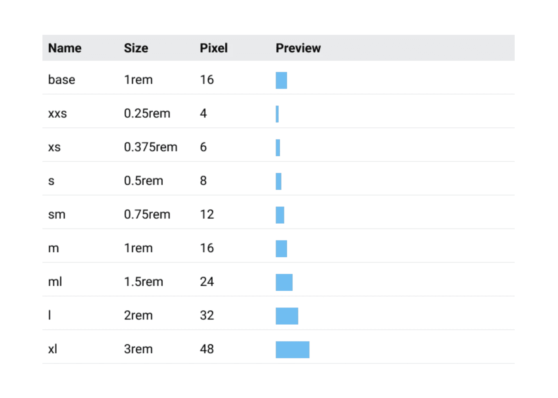
Spacing
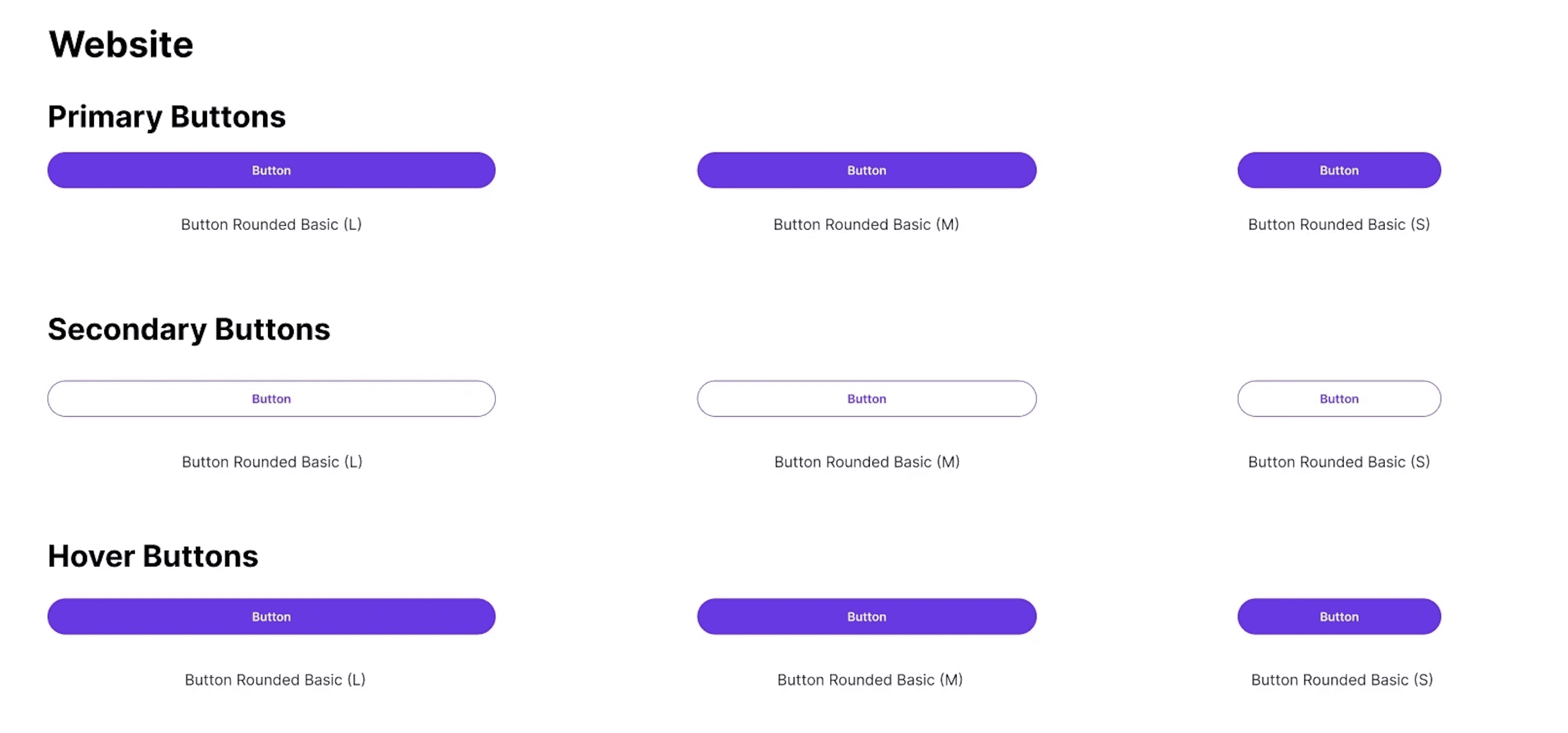
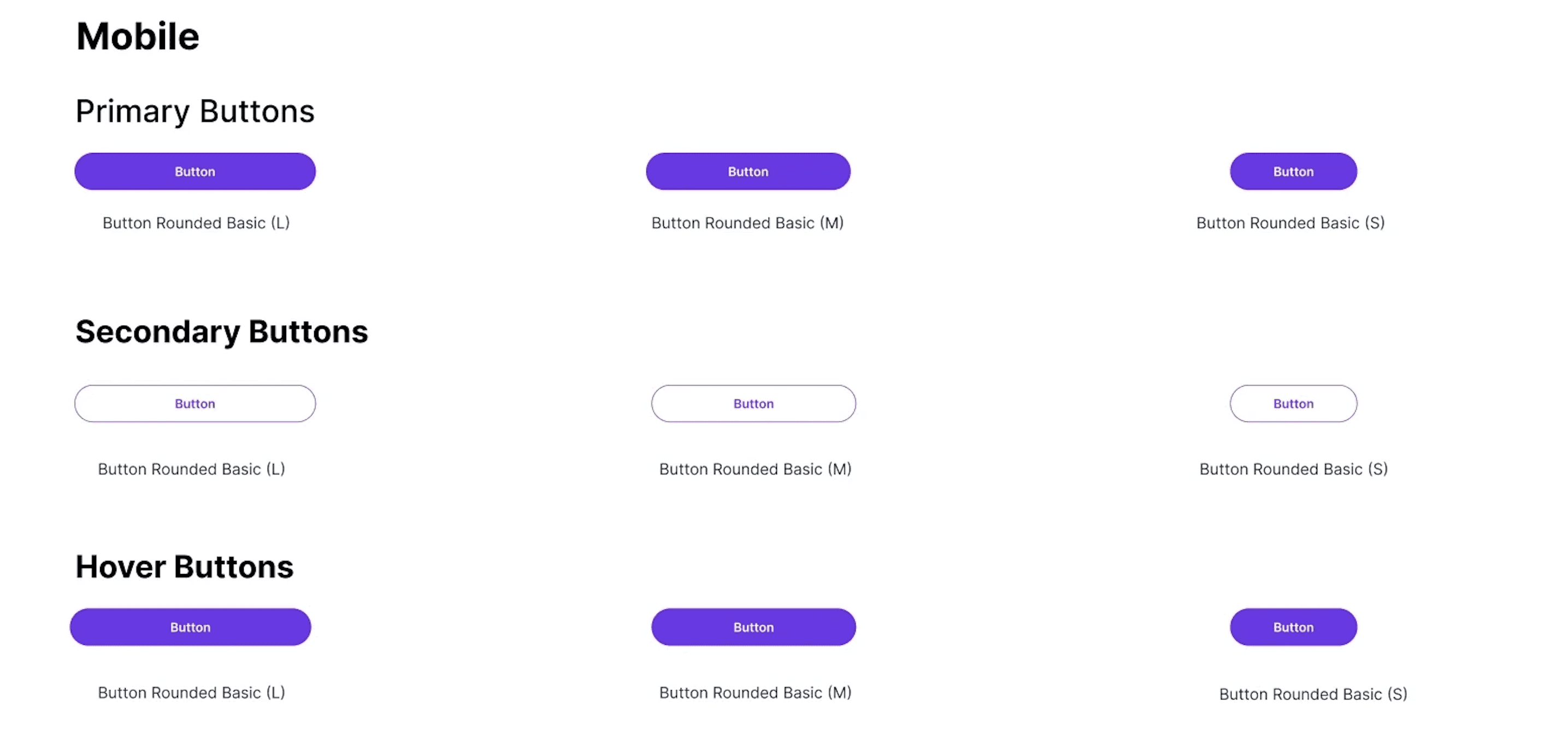
Button
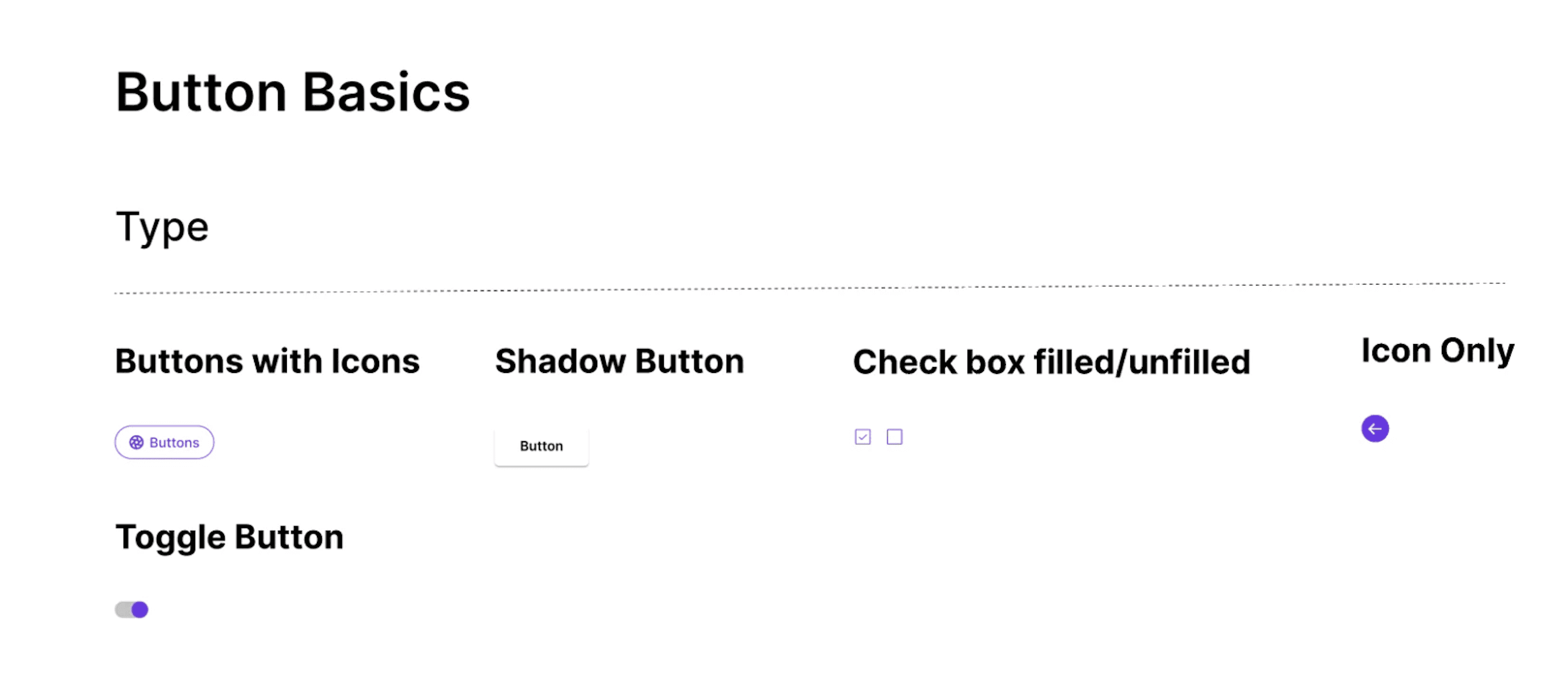
Patterns
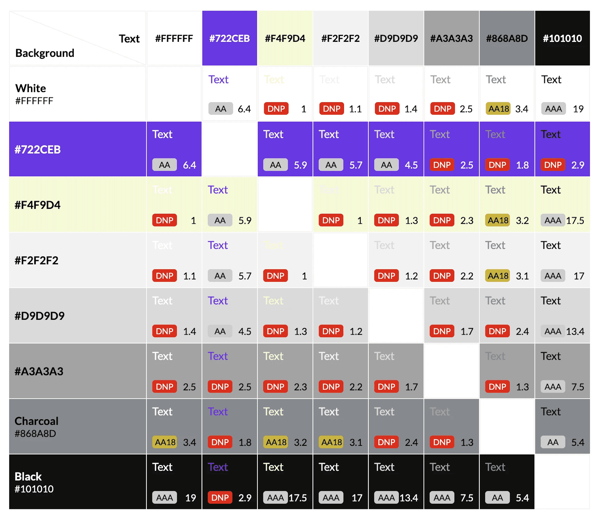
Accessibility
We made sure this design system rocked accessibility from the get-go. We used this super cool Stark plugin to sniff out any problem.
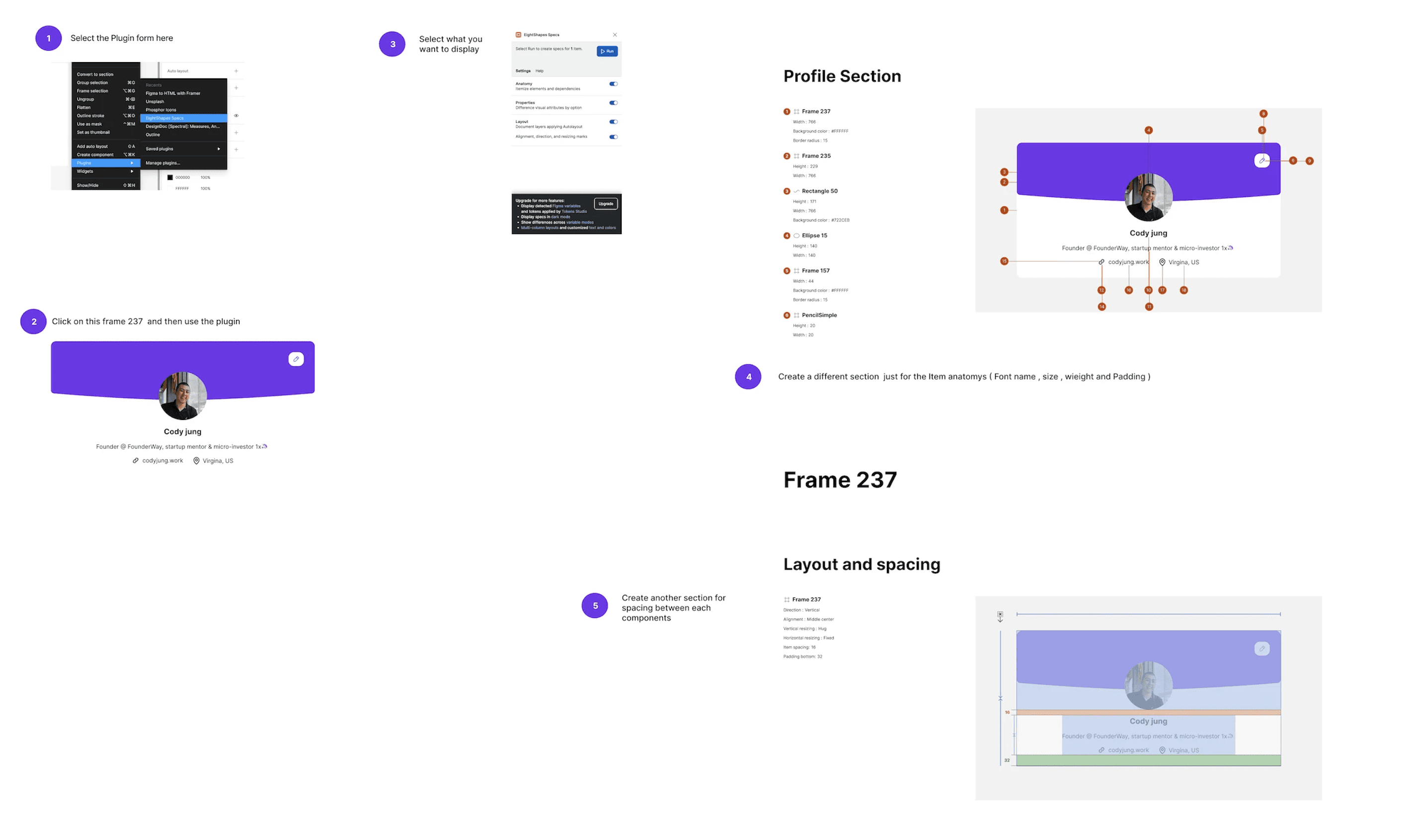
Design Handoff Document
To bridge the gap between design and development, we established a clear design handoff process.
We created a well-documented design handoff process, to ensure consistent implementation by future team members.
Learnings
Observe, Communicate, and Team Collaboration
Developing design system taught me the vital role of communication with engineering and developer team. Understanding their needs and constraints was key for seamless integration!