MyFitnessPal

MyFitnessPal

Revamping: Health and Fitness with Personalized Solutions

The redesign platform aims to achieve a 50% increase in user satisfaction and a 30% improvement in goal attainment rates among users with specific health issues, ultimately fostering a more supportive and engaging community for over 200 million users worldwide.

Techniques

UX Research • Interaction Design • Wireframing • Prototyping

Team

Individual Contributor

Role

As a UX Designer, my role is to understand user needs through research. This involves considering inclusivity and ensuring that the redesigned platform caters to their specific needs and provided a welcoming environment for all users.

Product Background

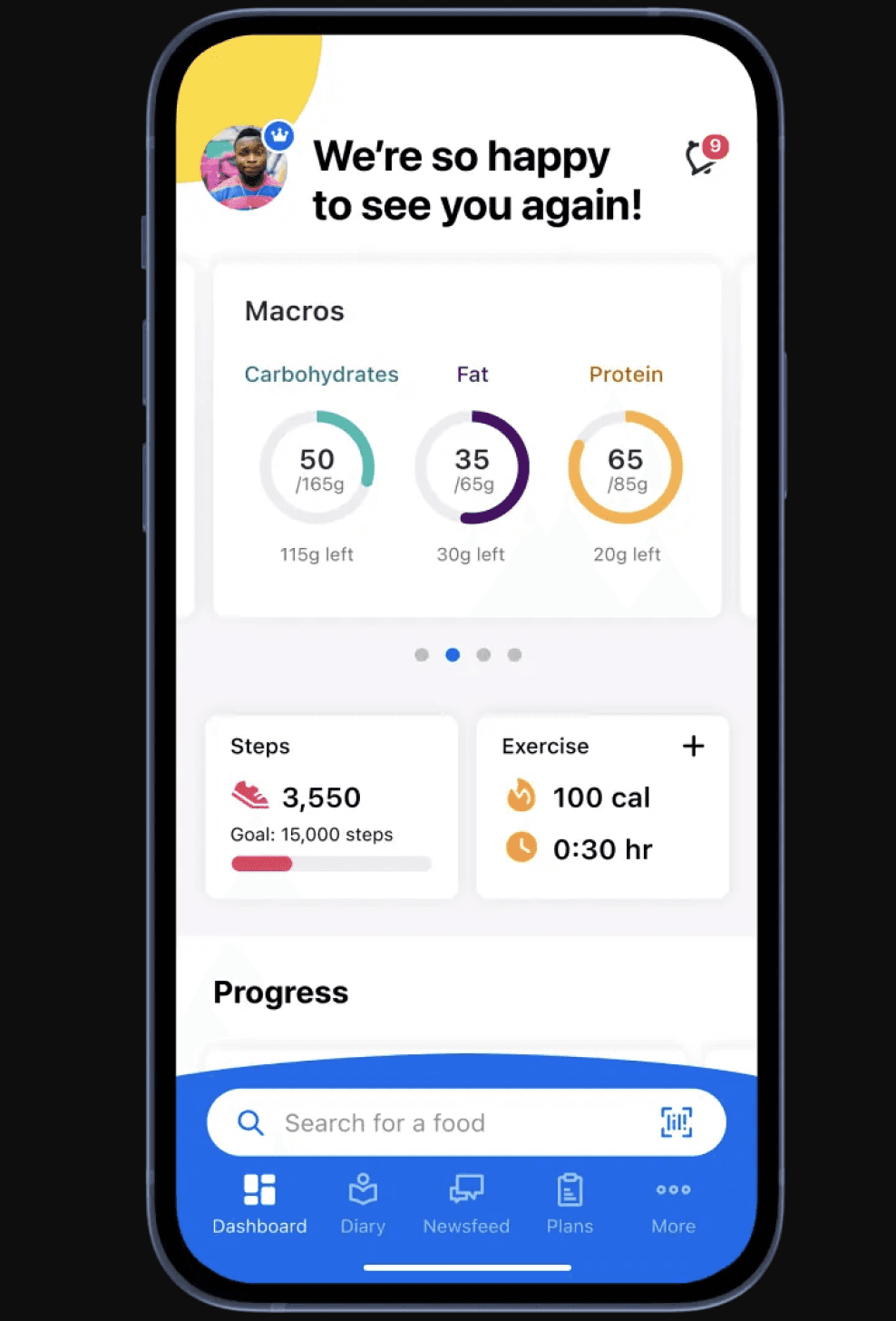
MyFitnessPal, developed by Under Armour, is a popular app for tracking nutrition and exercise, used by 200 million users worldwide.


It offers features like calorie tracking, meal logging, and access to an extensive food database.


Users can set goals, monitor progress, and connect with a supportive community.
Problem Statement

The current MyFitnessPal app, while comprehensive, does not adequately support users with specific health issues.

It lacks personalized onboarding, tailored meal and workout plans, and essential accessibility features, making it difficult for users with health conditions to achieve their fitness goals.

User Study

User Study

User Interview


I engaged in in-person interviews with 6 individuals passionate about health and fitness who also grapple with various health conditions and accessibility challenges.


Outcome


Gathered crucial insights into the distinct needs and challenges of individuals with..

  • Varying fitness experience levels

  • Health conditions

  • Dietary restrictions

  • Seniors looking to stay active


What are users' issues with the fitness platform?
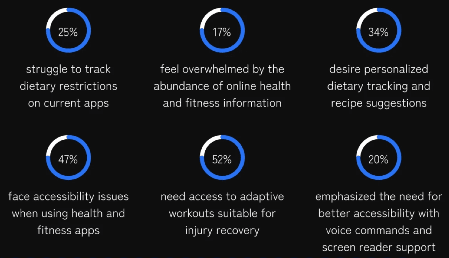


Identified Pain Points


  • Lack of features for specific health conditions

  • Inadequate accessibility features

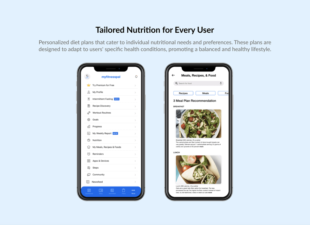
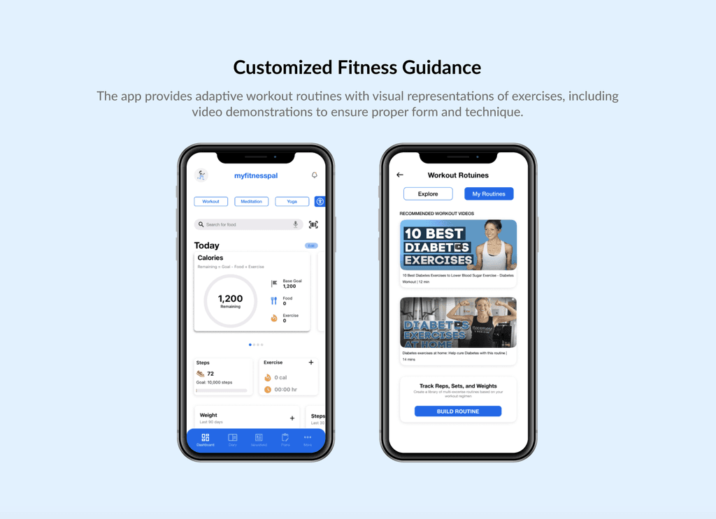
  • Need for personalized diet plans and adaptive workout routines

Design Ideation

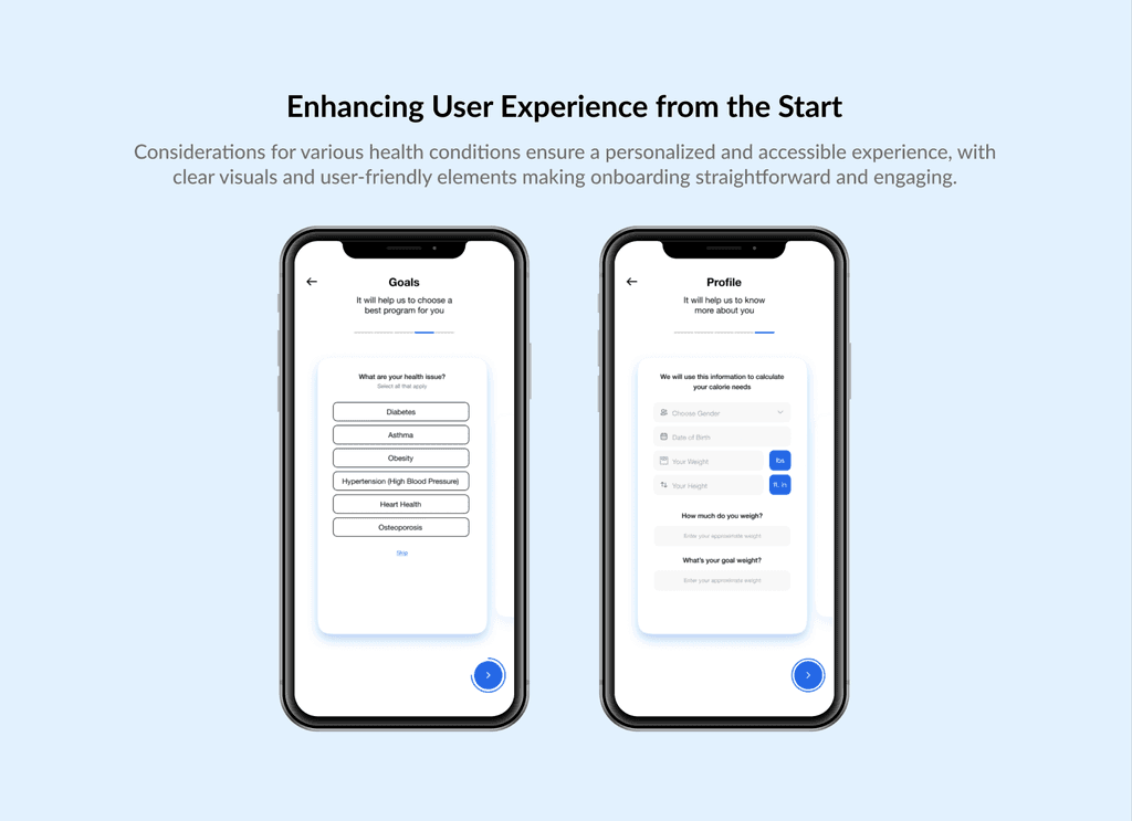
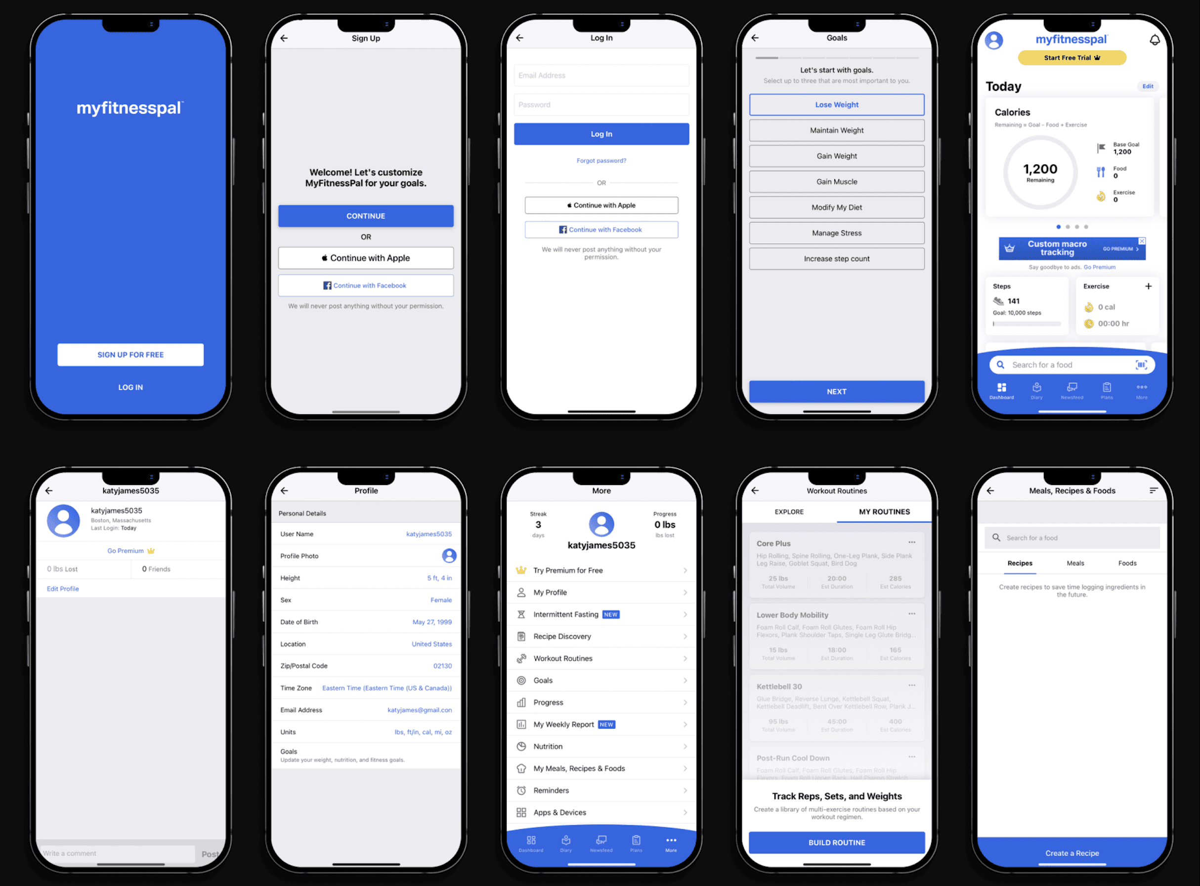
I brainstormed ideas and developed low-fidelity wireframes, which I then used to create high-fidelity prototypes. These prototypes illustrate the app's design before and after the transformation process began.


Pre-Tranformation App


MyFitnessPal Redesigned App
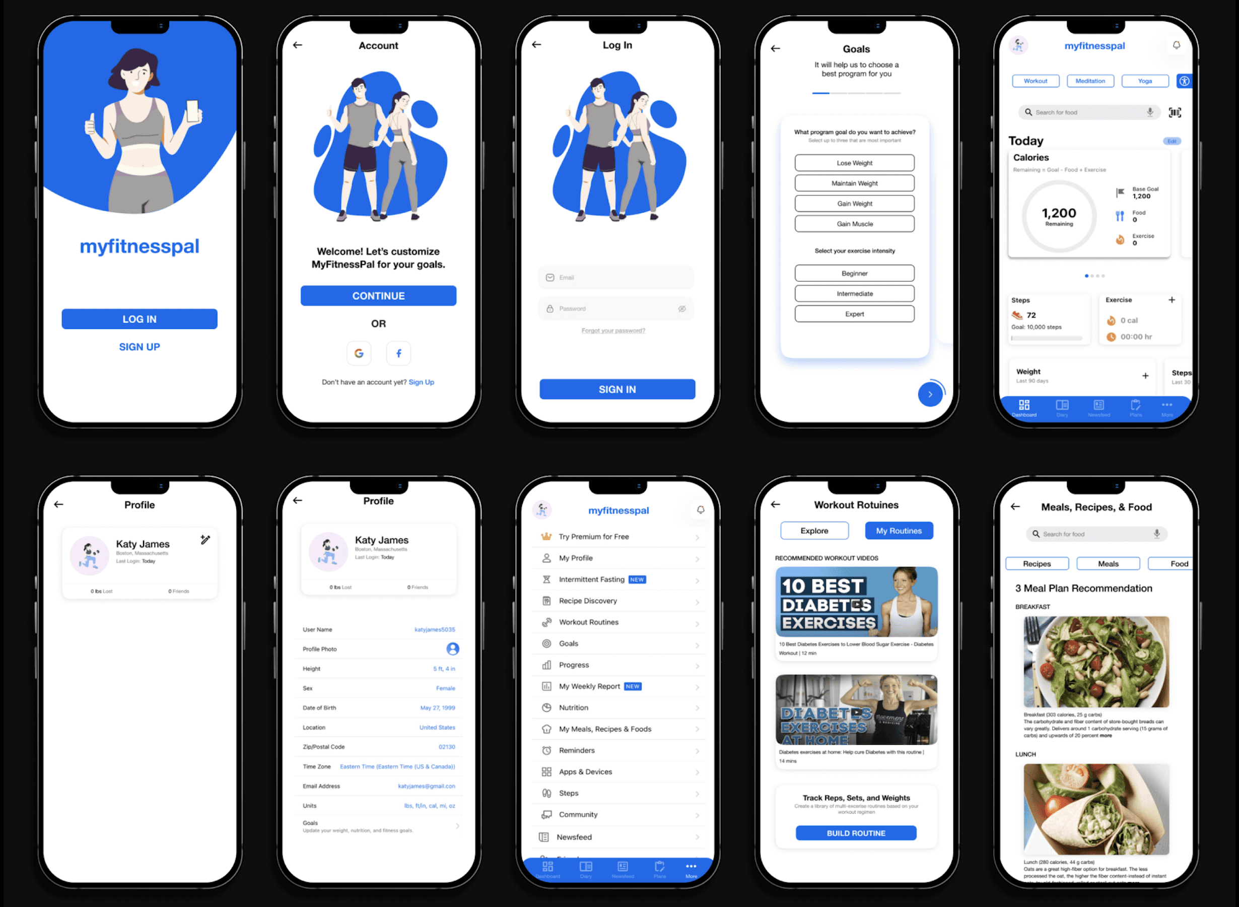


Proposed Solution

Outcome

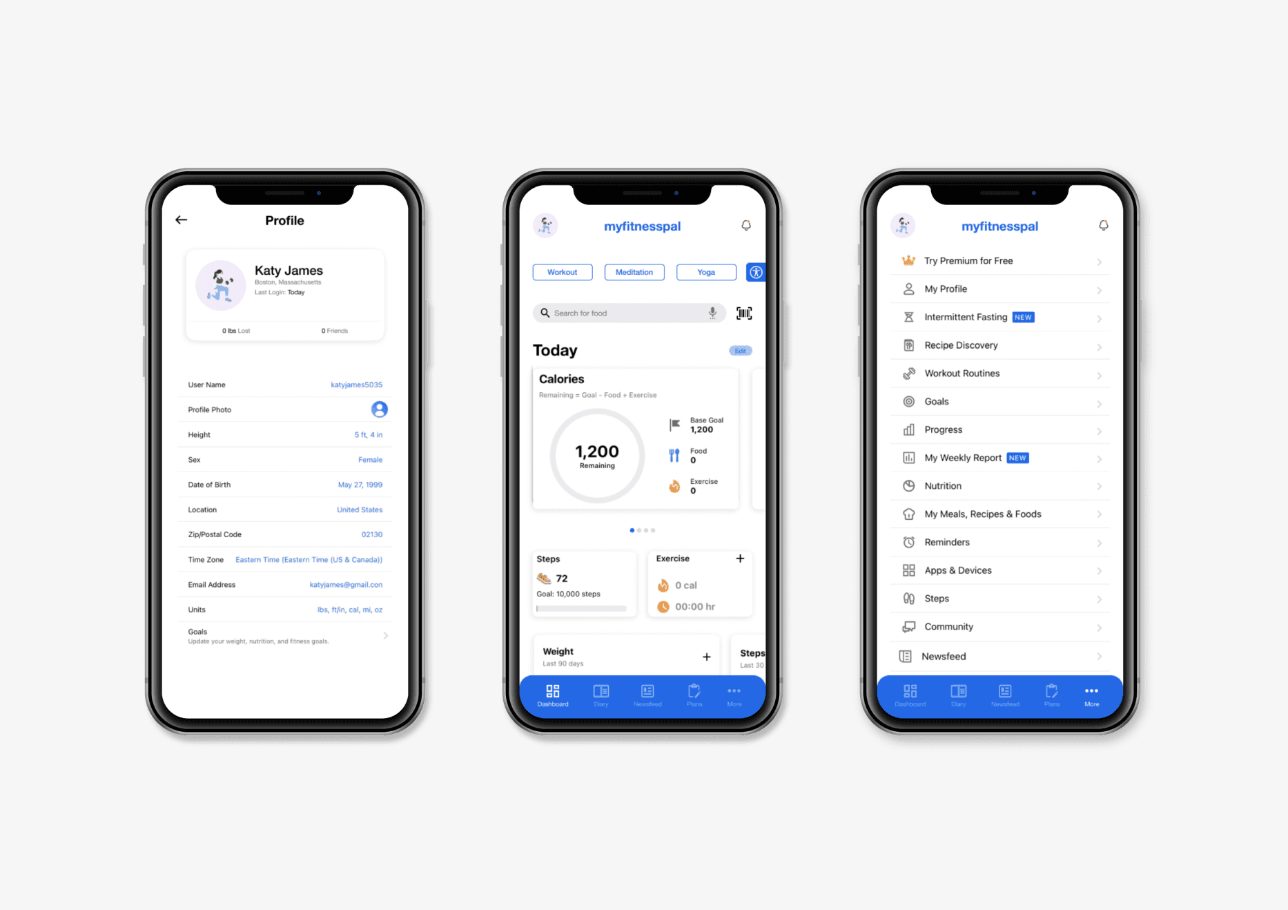
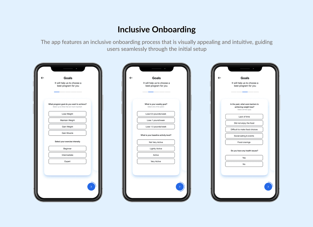
I feel a sense of satisfaction knowing that by addressing previous challenges and incorporating personalized features, improving accessibility, and enhancing usability, I've created a more inclusive platform.


Overall, I'm confident that the redesigned MyFitnessPal app will make a meaningful difference in users' lives.
Design A

Design A

Design A

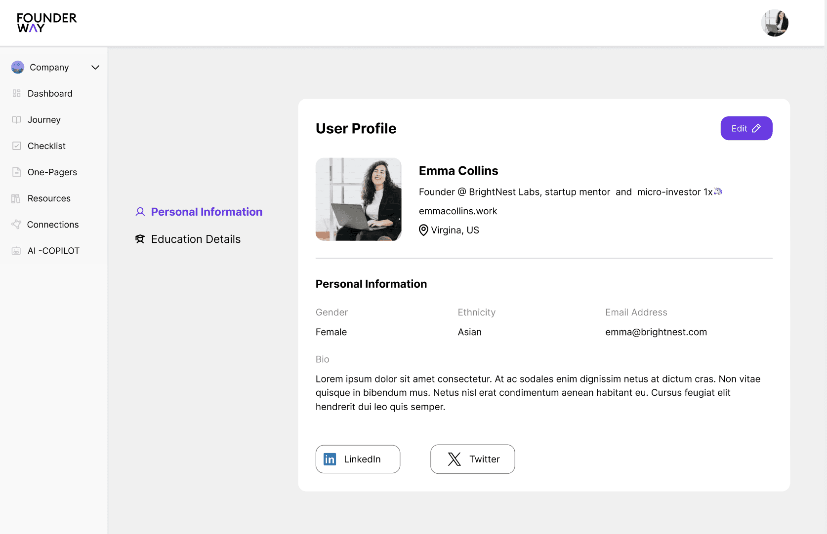
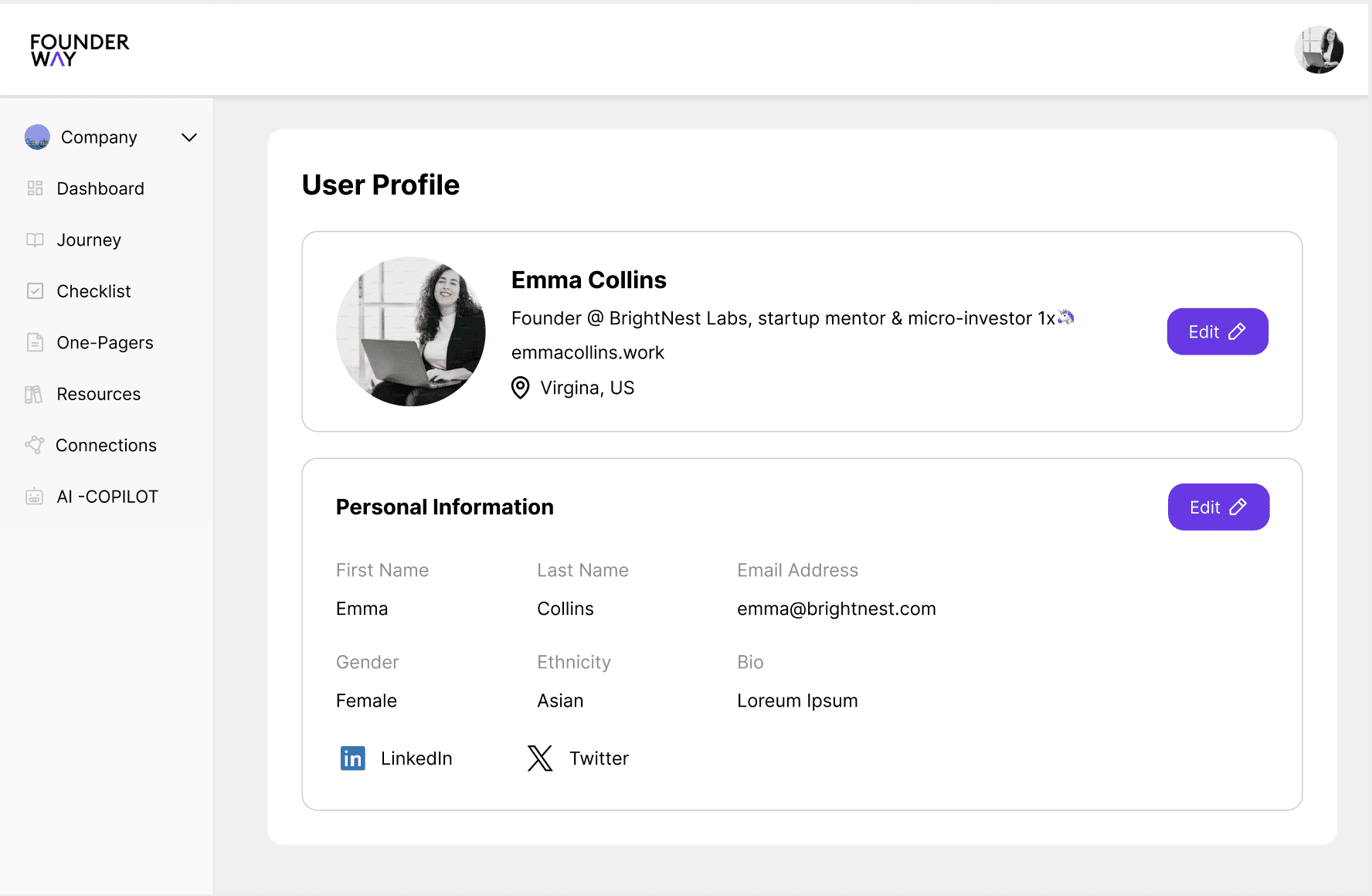
This version focused on a clean, minimal essential navigation elements like "Personal Information," and "Education" easily accessible on the left. The goal was to keep the user interface (UI) highly streamlined, focusing on the key actions a user would take.

This version focused on a clean, minimal essential navigation elements like "Personal Information," and "Education" easily accessible on the left. The goal was to keep the user interface (UI) highly streamlined, focusing on the key actions a user would take.

This version focused on a clean, minimal essential navigation elements like "Personal Information," and "Education" easily accessible on the left. The goal was to keep the user interface (UI) highly streamlined, focusing on the key actions a user would take.

Design B

Design B

Design B

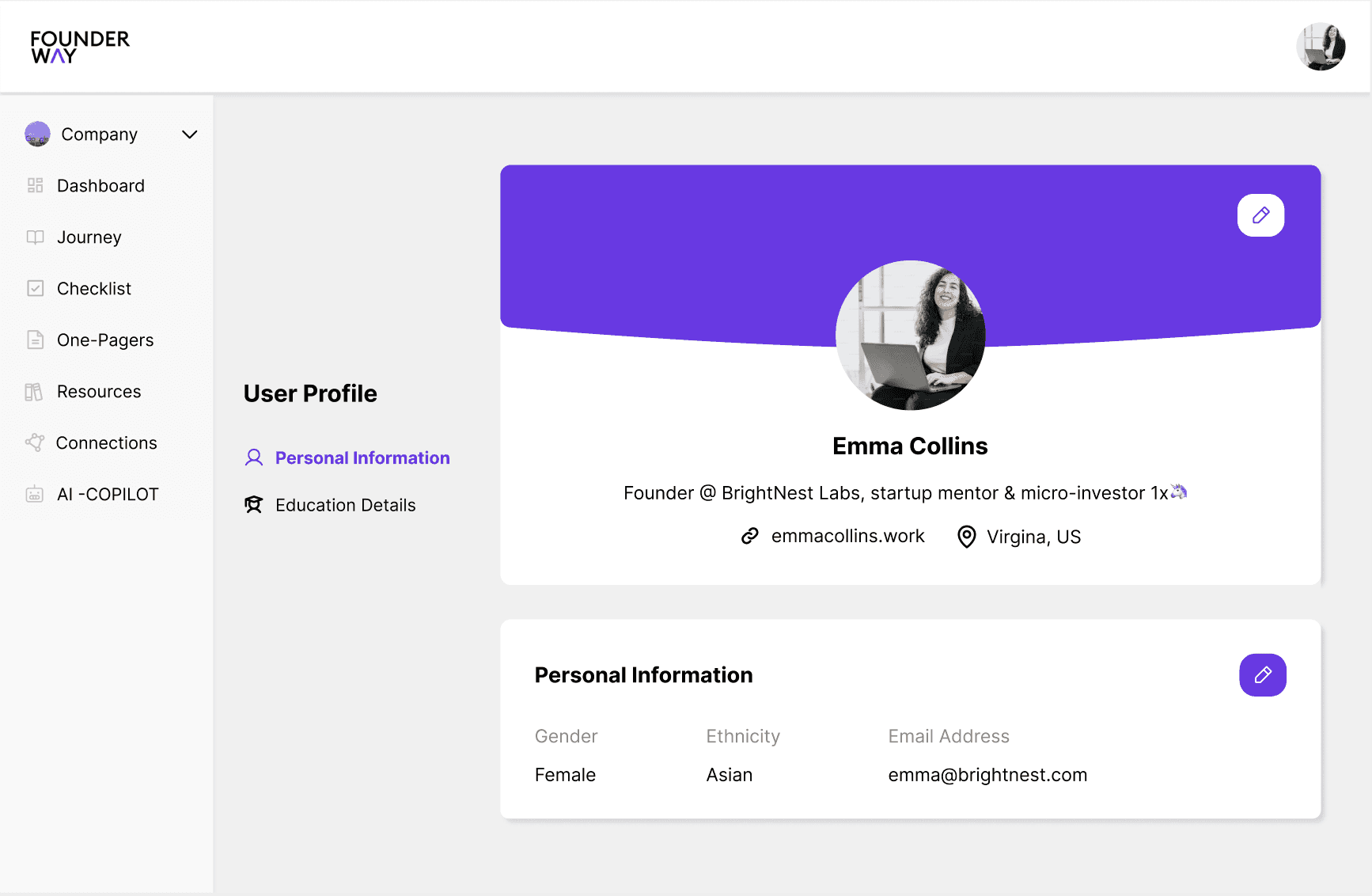
User-centric, with a big emphasis on personalization (profile bio, education details). Enhanced hierarchy with profile details front and center. More space for key actions like "Profile Basics" and "Personal Information."

User-centric, with a big emphasis on personalization (profile bio, education details). Enhanced hierarchy with profile details front and center. More space for key actions like "Profile Basics" and "Personal Information."

User-centric, with a big emphasis on personalization (profile bio, education details). Enhanced hierarchy with profile details front and center. More space for key actions like "Profile Basics" and "Personal Information."

Design C

Design C

Design C

This option incorporates a balance between the first two. The information is integrated in a clean, accessible layout, while the sidebar remains functional and compact. Additionally, this version has easy scroll and edit options reducing the time spent.

This option incorporates a balance between the first two. The information is integrated in a clean, accessible layout, while the sidebar remains functional and compact. Additionally, this version has easy scroll and edit options reducing the time spent.

This option incorporates a balance between the first two. The information is integrated in a clean, accessible layout, while the sidebar remains functional and compact. Additionally, this version has easy scroll and edit options reducing the time spent.

Design A

This version focused on a clean, minimal essential navigation elements like "Personal Information," and "Education" easily accessible on the left. The goal was to keep the user interface (UI) highly streamlined, focusing on the key actions a user would take.

Design B

User-centric, with a big emphasis on personalization (profile bio, education details). Enhanced hierarchy with profile details front and center. More space for key actions like "Profile Basics" and "Personal Information."

Design C

This option incorporates a balance between the first two. The information is integrated in a clean, accessible layout, while the sidebar remains functional and compact. Additionally, this version has easy scroll and edit options reducing the time spent.

Let's Work Together?

Now that you've come this far, let's work together on your next product?

Let's Work Together?

Now that you've come this far, let's work together on your next product?

Let's Work Together?

Now that you've come this far, let's work together on your next product?

Let's Work Together?

Now that you've come this far, let's work together on your next product?

Let's Work Together?

Now that you've come this far, let's work together on your next product?