PaperBound

PaperBound

Cultivating Reading and Empowering Local Bookstores

Cultivate a community of socially aware readers, resulting in a 40% increase in user engagement and a 35% rise in purchases from local bookstores, while fostering meaningful connections and a sense of belonging in an increasingly digital world.

Techniques

Interaction Design • UX/UI Design • UX Research • Journey Mapping • Competitor Analysis • Design Ideation

Team

Individual Contributor

Role

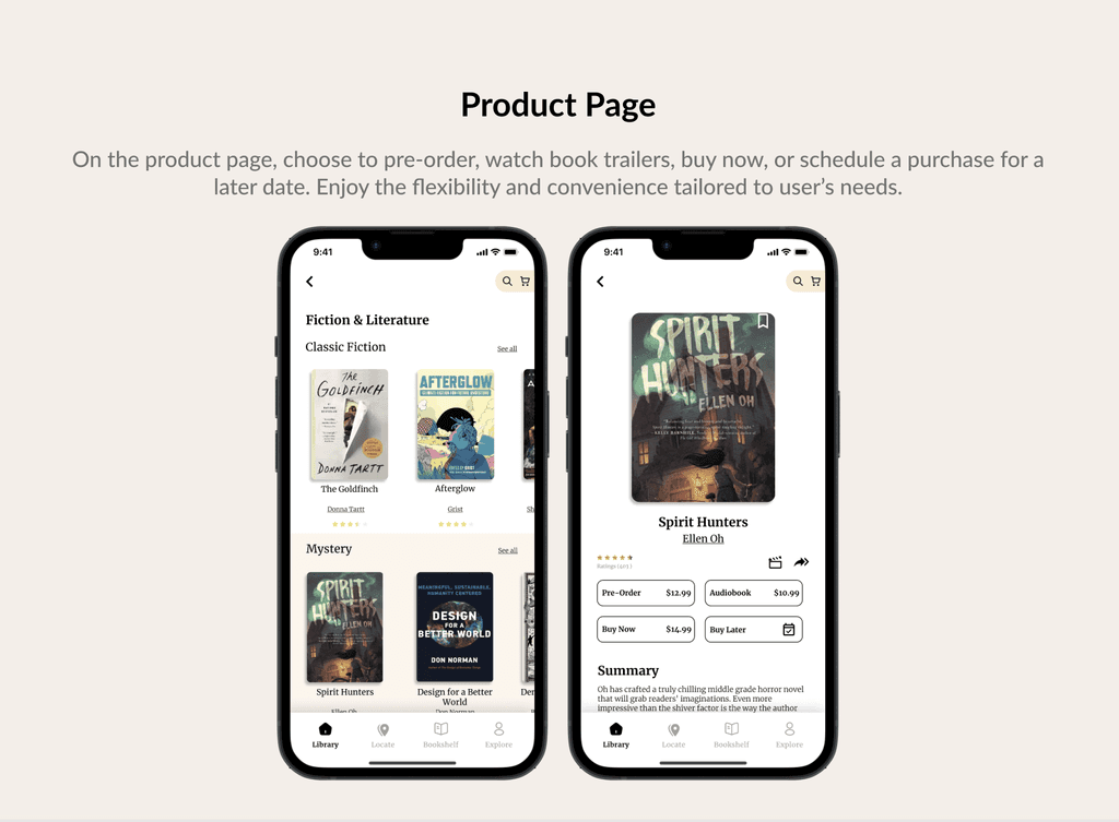
As a Product Designer, I introduced a hypothetical solution to streamline book purchasing and reading experience, akin to browsing and learning in a traditional bookstore, but from the convince of a digital platform.

Background

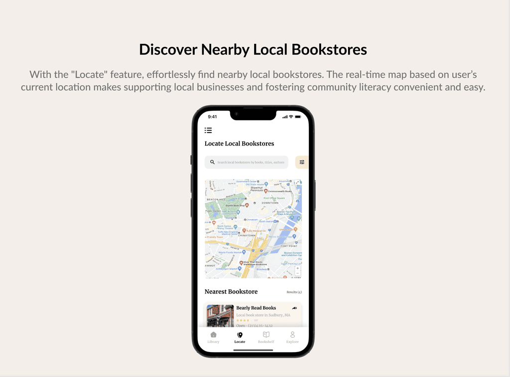
PaperBound addresses the gaps in online bookstores by blending convenience with supporting local bookstores and fostering a sense of community among readers.


This community-driven reading revolution nurtures socially aware readers.

Problem Statement

Many online bookstores overlook the importance of community and support for local shops, missing the chance to foster meaningful connections among readers. This creates a gap for readers who seek not just convenience, but a sense of belonging.


How can I develop a digital solution that connects people and supports local bookstores?

Goals

Develop a digital platform that enhances community engagement, supports local bookstores, and enriches user experience through social interaction and intuitive design.

Research

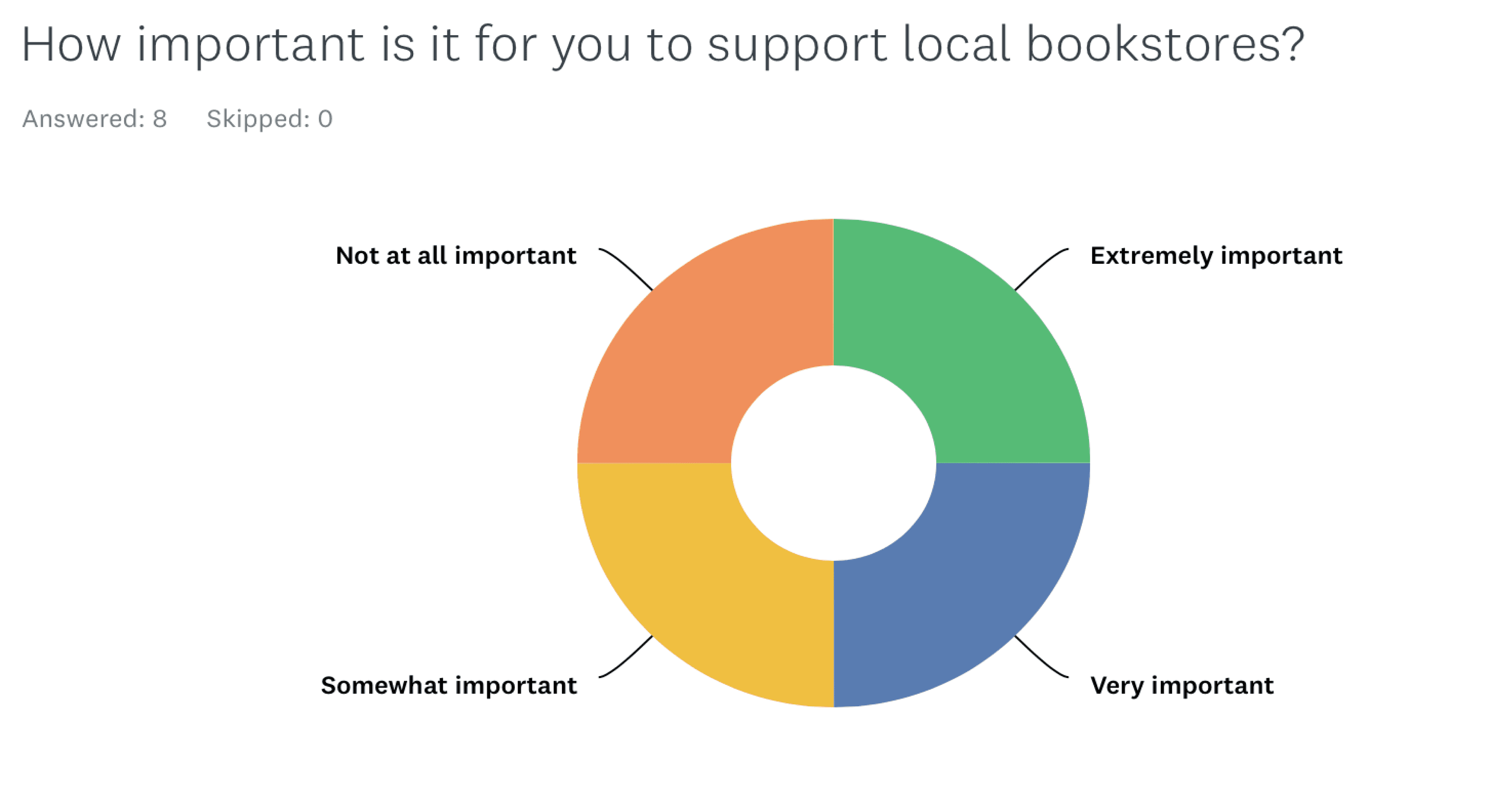
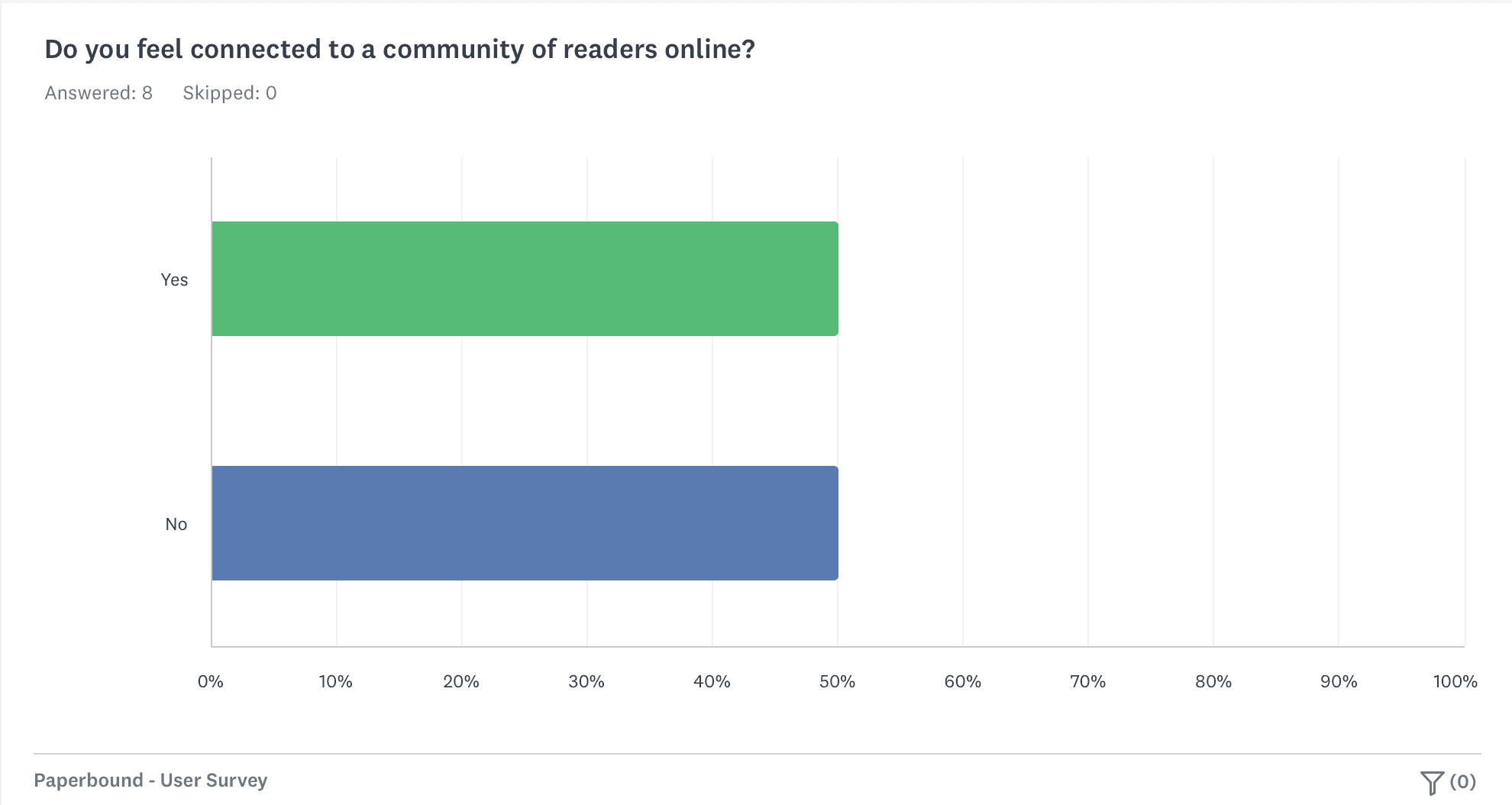
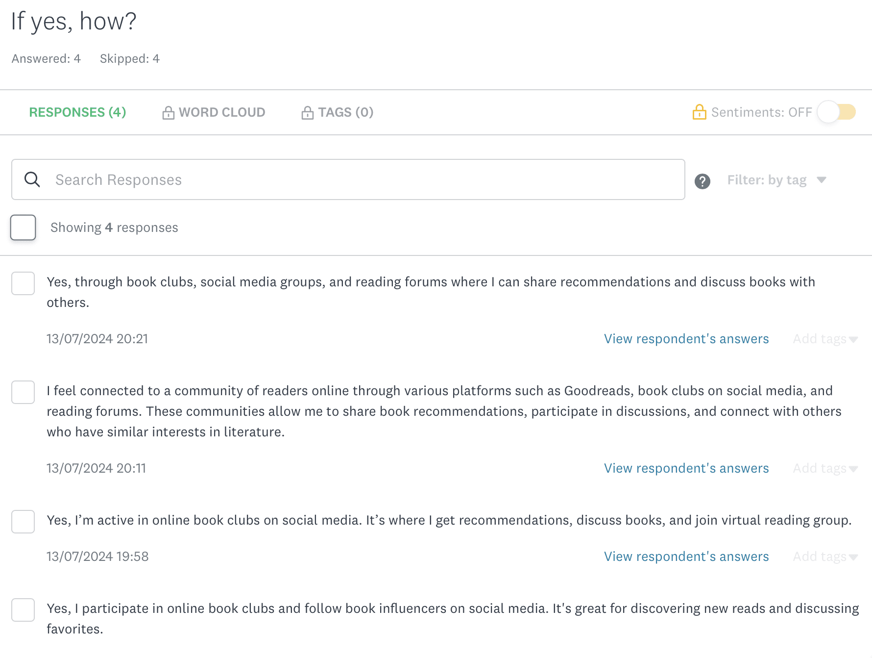
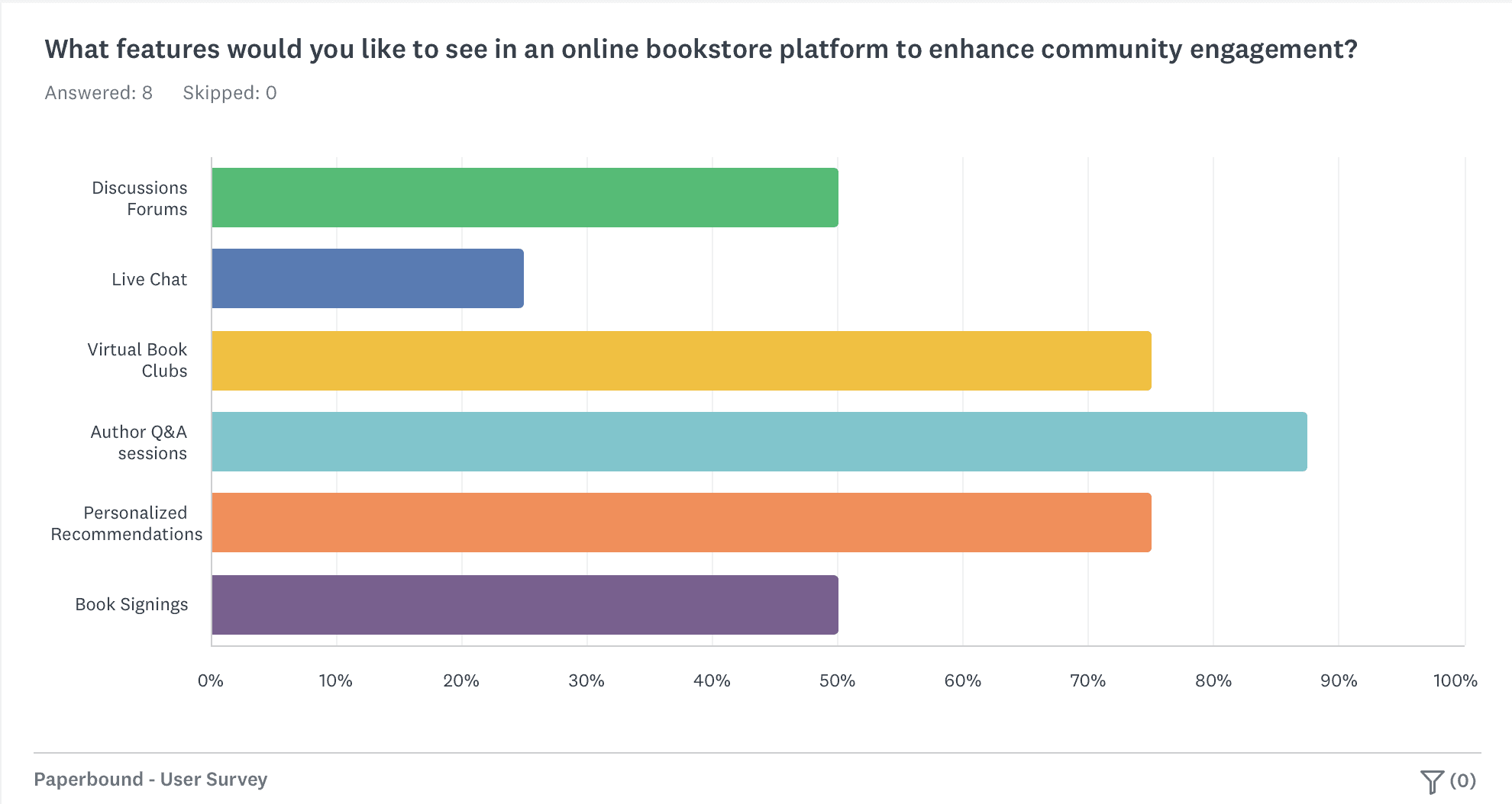
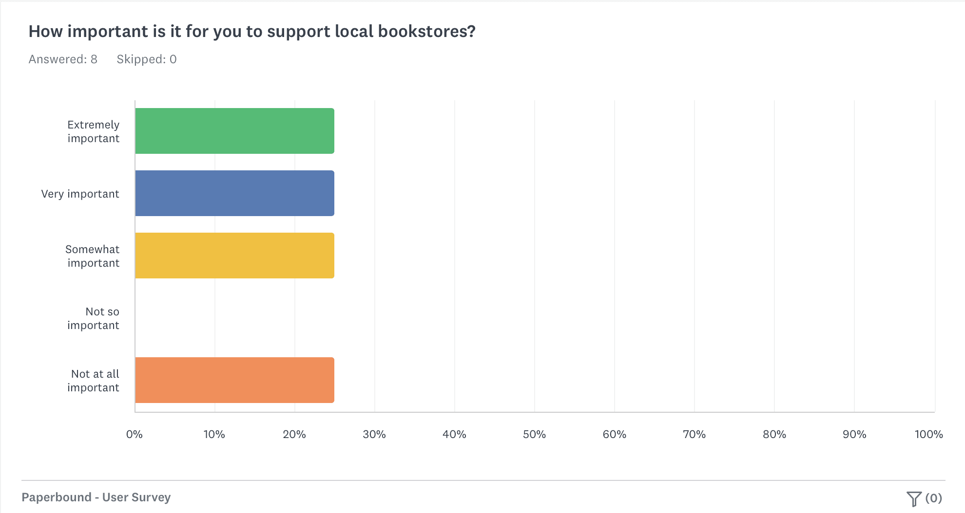
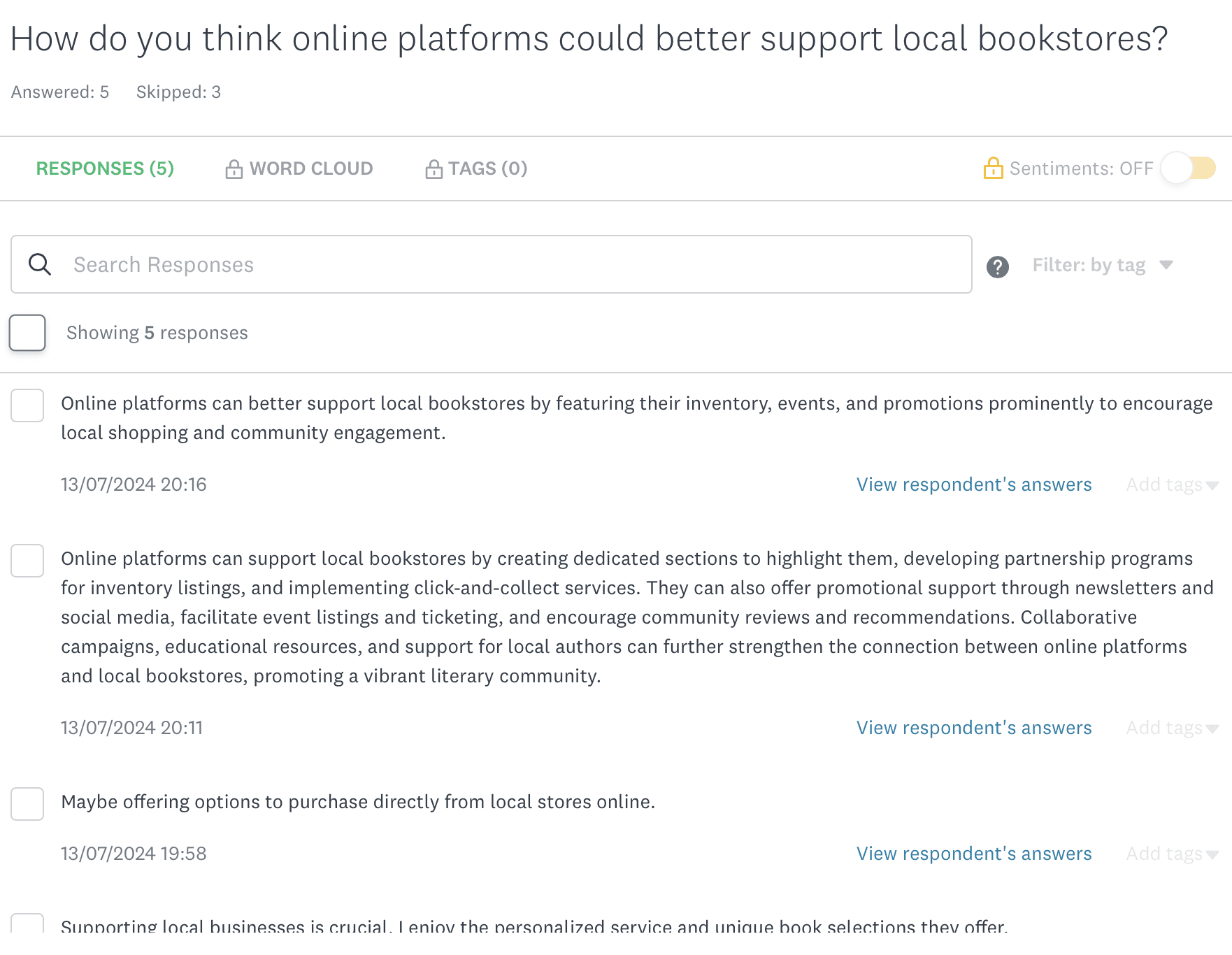
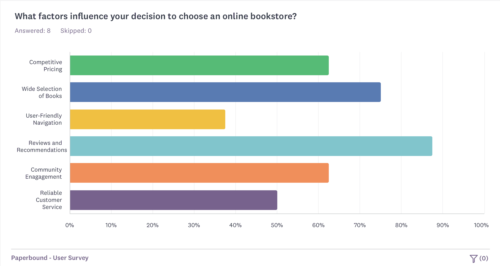
I conducted user survey to gather comprehensive data on user preferences and market trends. Gained valuable insights that shaped the app's design and development, ensuring it meets users' expectations.

Customer Journey Mapping

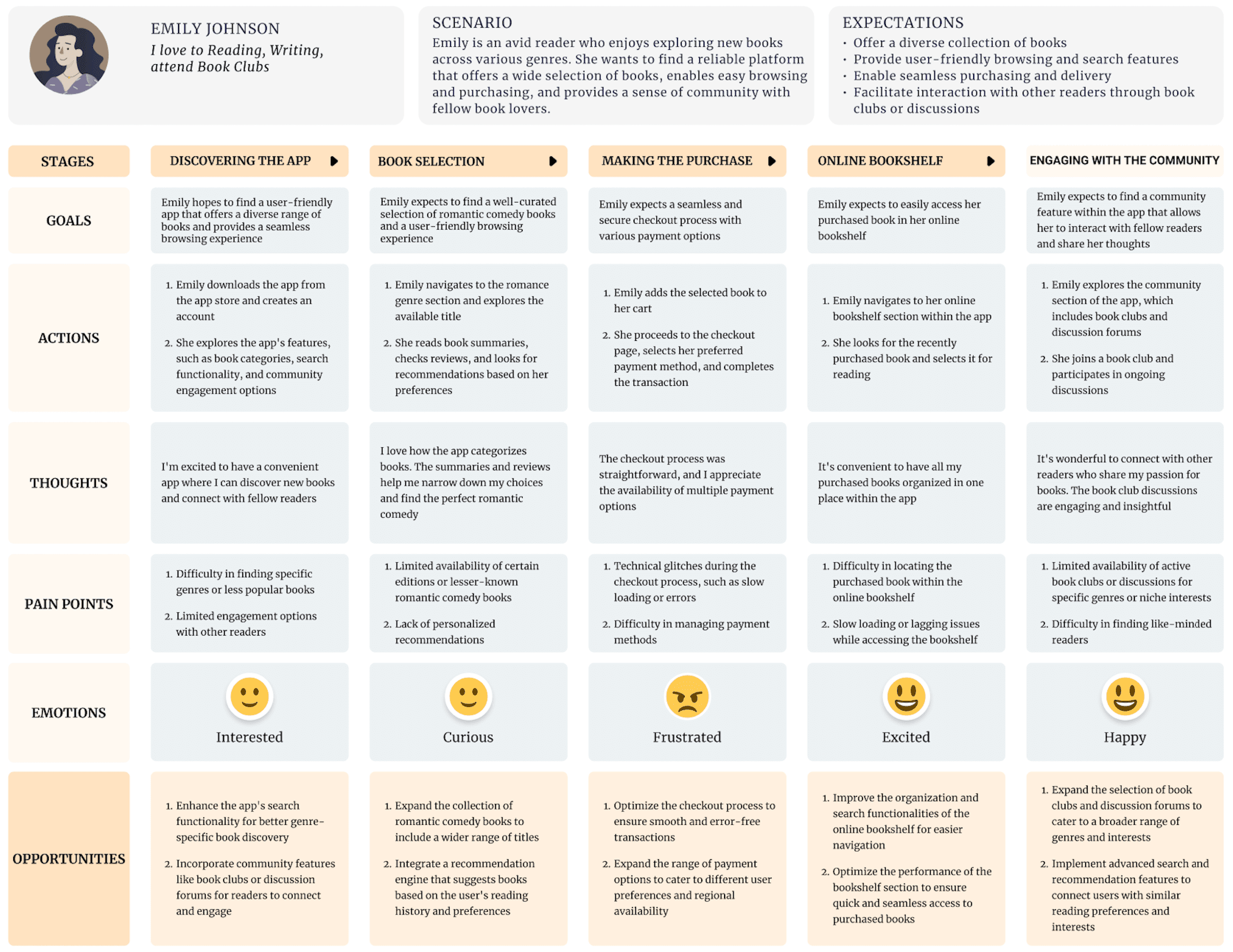
I created a customer journey map for the PaperBound Book Store App to understand and improve the user experience, identify needs, and address pain points.

Design Ideation

Sketches


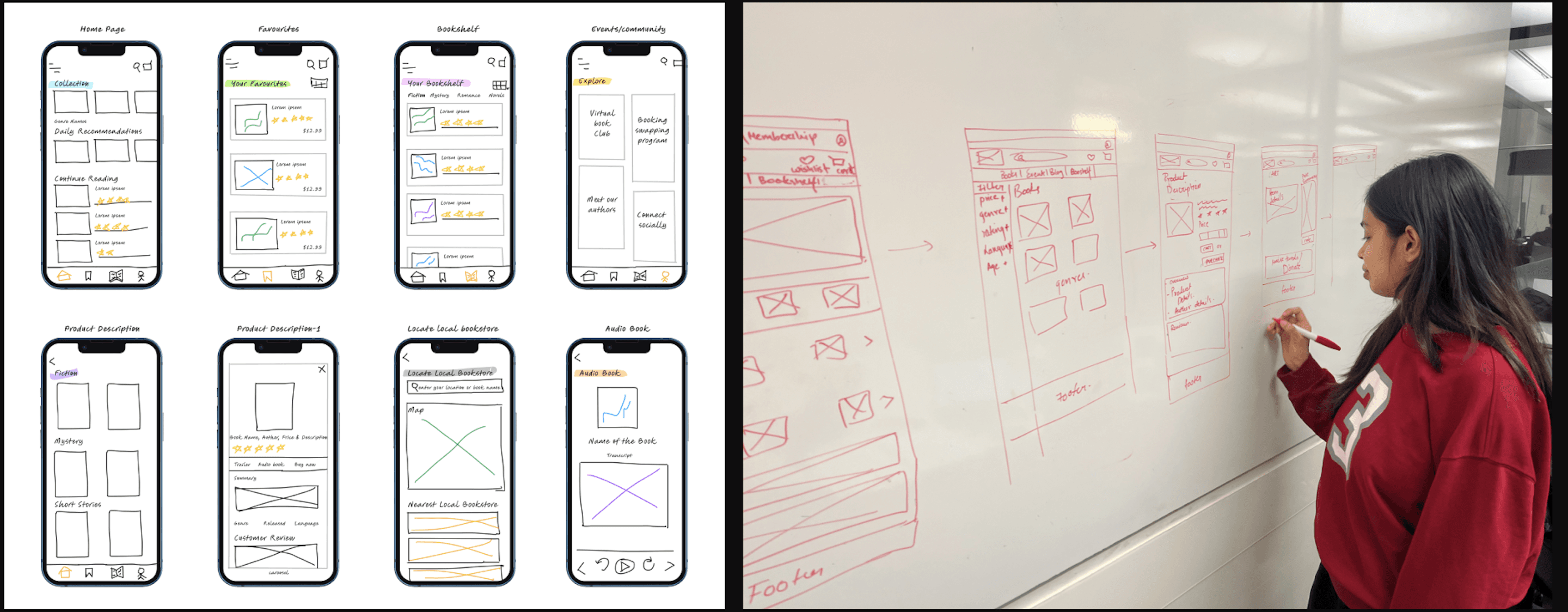
Visualized and explored different layout and feature possibilities for the PaperBound app through sketches.


Rapid iteration and experimentation generated diverse design concepts before moving on to more detailed wireframes and prototypes.


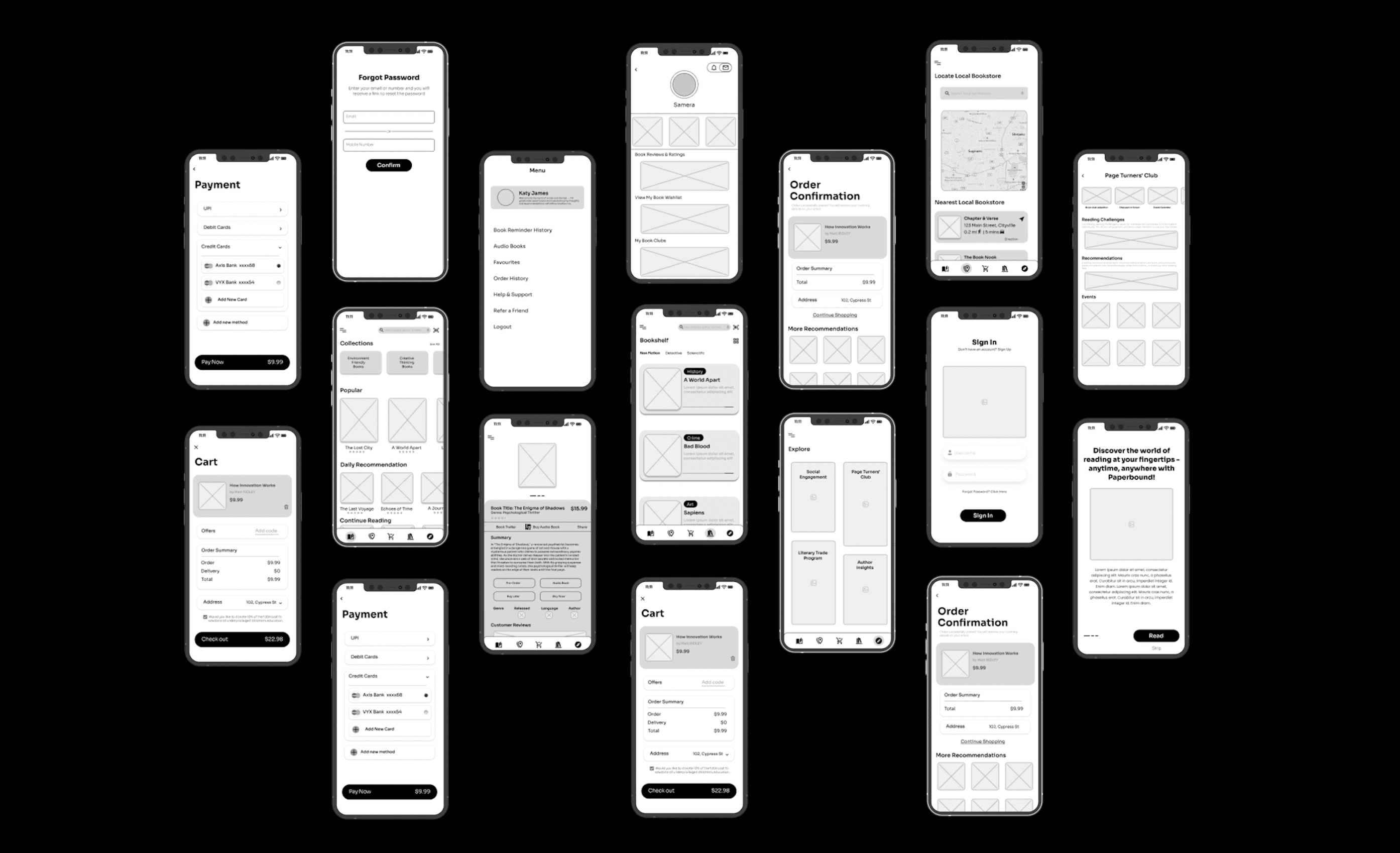
Low-Fidelity Wireframes

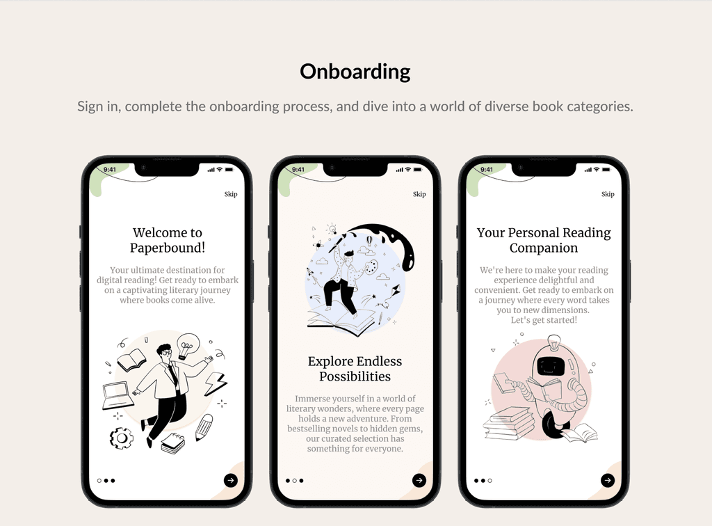
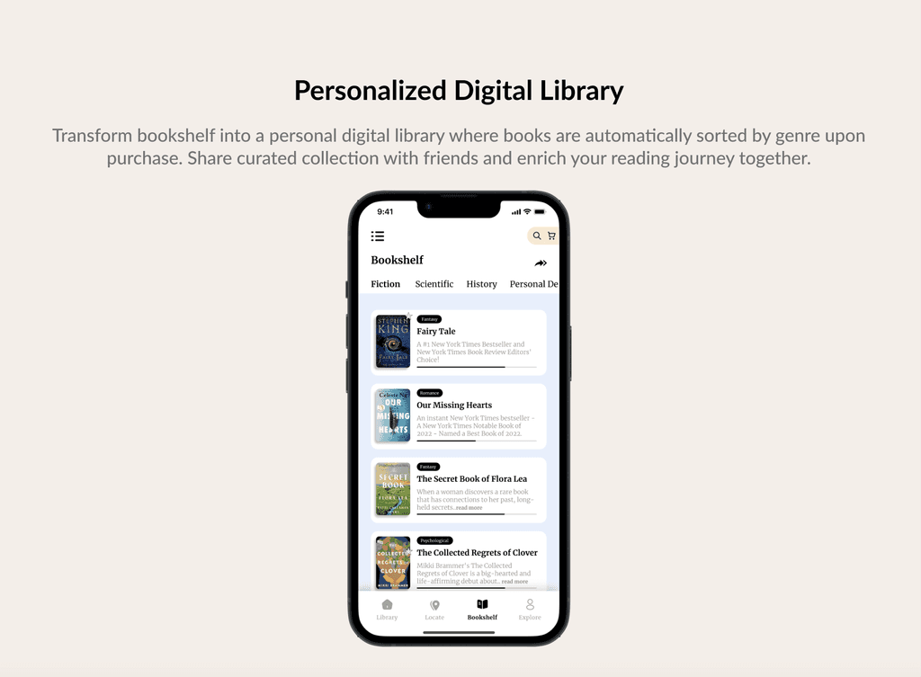
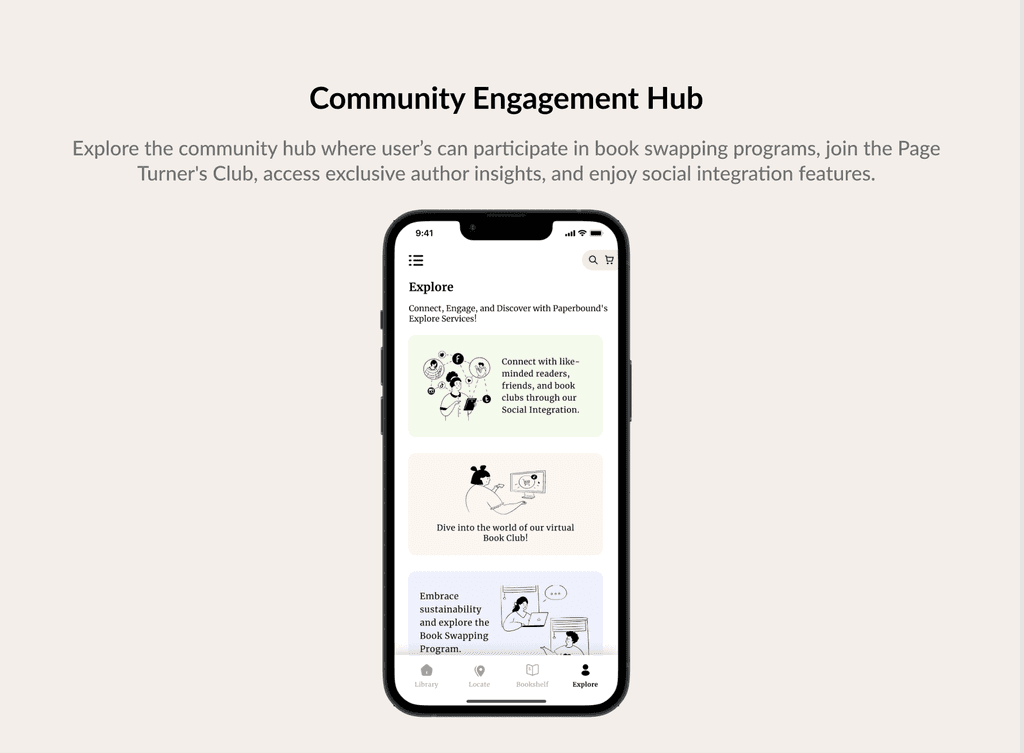
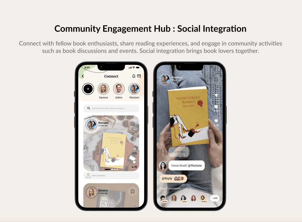
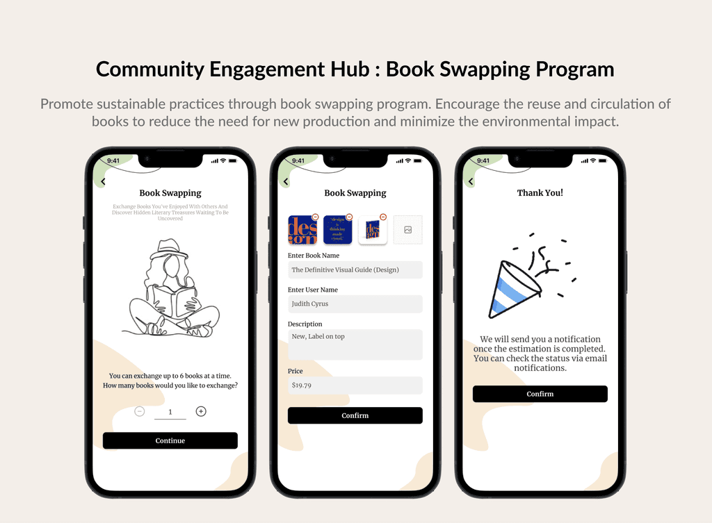
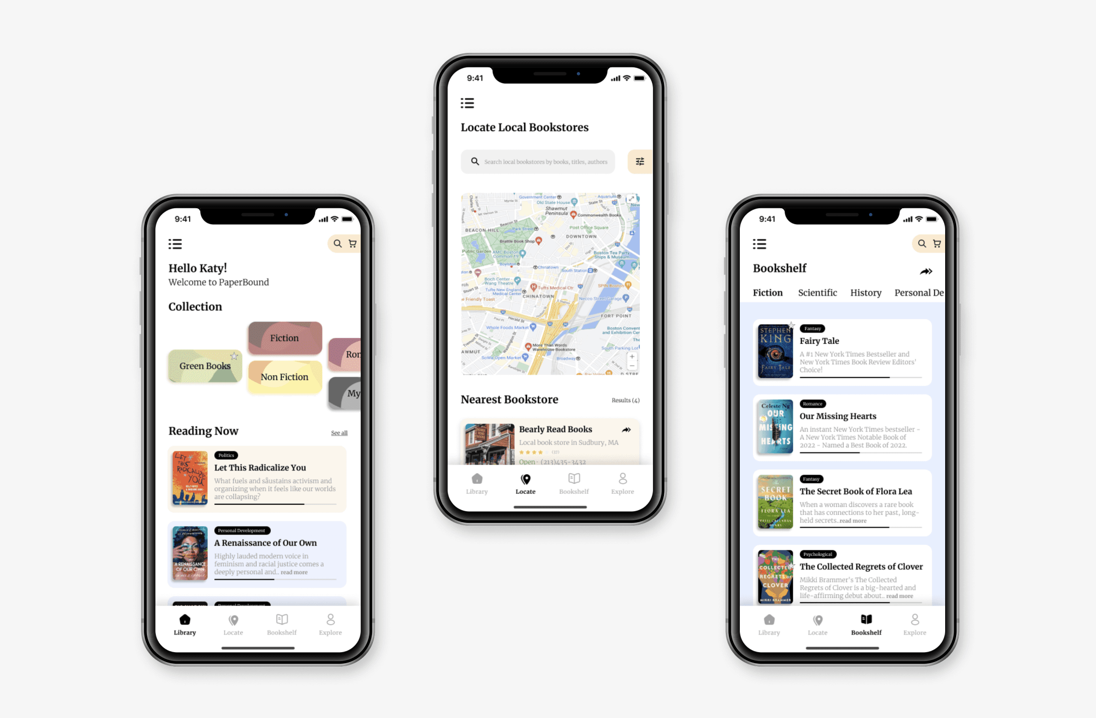
Core Design Features

Core Design Features

Usability Testing


Scenario


Evaluating the ease of navigating the app to find specific book categories or genres, and analyzing the clarity and informativeness of book descriptions to aid decision-making.

Learnings

Designing the PaperBound eBook Store app was a significant learning experience, emphasizing user-centered solutions. It reinforced my dedication to creating digital experiences that prioritize convenience, inclusivity, and community support.

Future Vision

Reading Gamification


How to implement gamification elements to make reading a more interative and enjoyable experience?

How to introduce reading challenges, and leaderboards to incentivize and motivate readers to achieve reading goals and explore new books?


Augmented Reality (AR) Integration


How to integrate of Augmented Reality technology into the app to enhance the reading experience and enable users to unlock additional AR content, such as character animations, immersive visualizations, or interactive storytelling experiences?


Integration of Interactive eBooks


How to offer interactive eBooks that go beyond traditional text-based content, incorporating multimedia elements such as 3D animations, audio narration, and video clips?
Design A

Design A

Design A

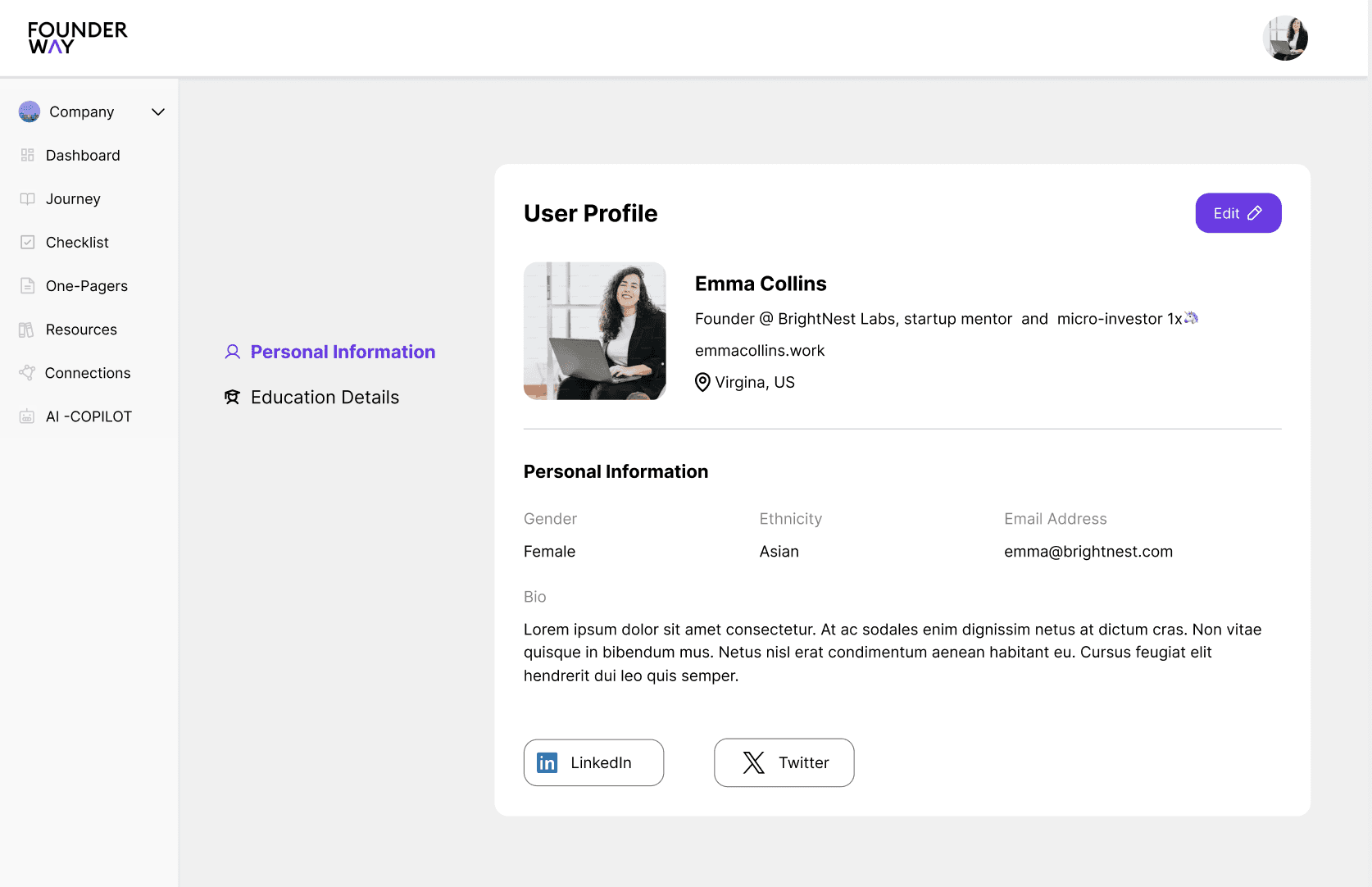
This version focused on a clean, minimal essential navigation elements like "Personal Information," and "Education" easily accessible on the left. The goal was to keep the user interface (UI) highly streamlined, focusing on the key actions a user would take.

This version focused on a clean, minimal essential navigation elements like "Personal Information," and "Education" easily accessible on the left. The goal was to keep the user interface (UI) highly streamlined, focusing on the key actions a user would take.

This version focused on a clean, minimal essential navigation elements like "Personal Information," and "Education" easily accessible on the left. The goal was to keep the user interface (UI) highly streamlined, focusing on the key actions a user would take.

Design B

Design B

Design B

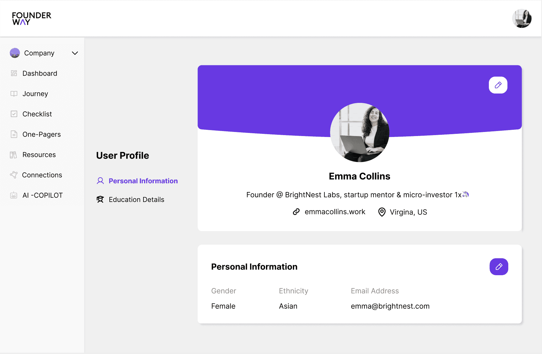
User-centric, with a big emphasis on personalization (profile bio, education details). Enhanced hierarchy with profile details front and center. More space for key actions like "Profile Basics" and "Personal Information."

User-centric, with a big emphasis on personalization (profile bio, education details). Enhanced hierarchy with profile details front and center. More space for key actions like "Profile Basics" and "Personal Information."

User-centric, with a big emphasis on personalization (profile bio, education details). Enhanced hierarchy with profile details front and center. More space for key actions like "Profile Basics" and "Personal Information."

Design C

Design C

Design C

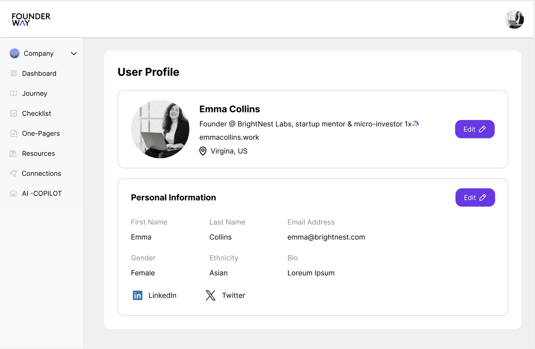
This option incorporates a balance between the first two. The information is integrated in a clean, accessible layout, while the sidebar remains functional and compact. Additionally, this version has easy scroll and edit options reducing the time spent.

This option incorporates a balance between the first two. The information is integrated in a clean, accessible layout, while the sidebar remains functional and compact. Additionally, this version has easy scroll and edit options reducing the time spent.

This option incorporates a balance between the first two. The information is integrated in a clean, accessible layout, while the sidebar remains functional and compact. Additionally, this version has easy scroll and edit options reducing the time spent.

Design A

This version focused on a clean, minimal essential navigation elements like "Personal Information," and "Education" easily accessible on the left. The goal was to keep the user interface (UI) highly streamlined, focusing on the key actions a user would take.

Design B

User-centric, with a big emphasis on personalization (profile bio, education details). Enhanced hierarchy with profile details front and center. More space for key actions like "Profile Basics" and "Personal Information."

Design C

This option incorporates a balance between the first two. The information is integrated in a clean, accessible layout, while the sidebar remains functional and compact. Additionally, this version has easy scroll and edit options reducing the time spent.

Let's Work Together?

Now that you've come this far, let's work together on your next product?

Let's Work Together?

Now that you've come this far, let's work together on your next product?

Let's Work Together?

Now that you've come this far, let's work together on your next product?

Let's Work Together?

Now that you've come this far, let's work together on your next product?

Let's Work Together?

Now that you've come this far, let's work together on your next product?