Profile Hub Revamped

Profile Hub Revamped

Redesign Profile Management System

The goal of the redesigned profile hub is to create smoother navigation, integrate tools like a metrics management system and "Teams" section, leading to a 40% surge in active users, user engagement, and improved workflow efficiency for seamless collaboration.

What I did

Design Stratergy • Competitor Analysis • Information Architecture • User Flows • Wireframing • Prototyping • Interface Design

Team

Product Manager • Engineers • UX Researchers • Product Designers

Role

As Product Designer, I drove a data-driven redesign of the profile hub, adding key management tools. My focus on user-centric design and streamlined navigation significantly improved overall platform performance and engagement metrics.

Design Breakdown

Design Breakdown

Buzz Alert ~ Profile Page Redesign Turning Heads!

Here are a few design ideas implemented on the website and mobile to help improved navigation and usability for customers effectively.

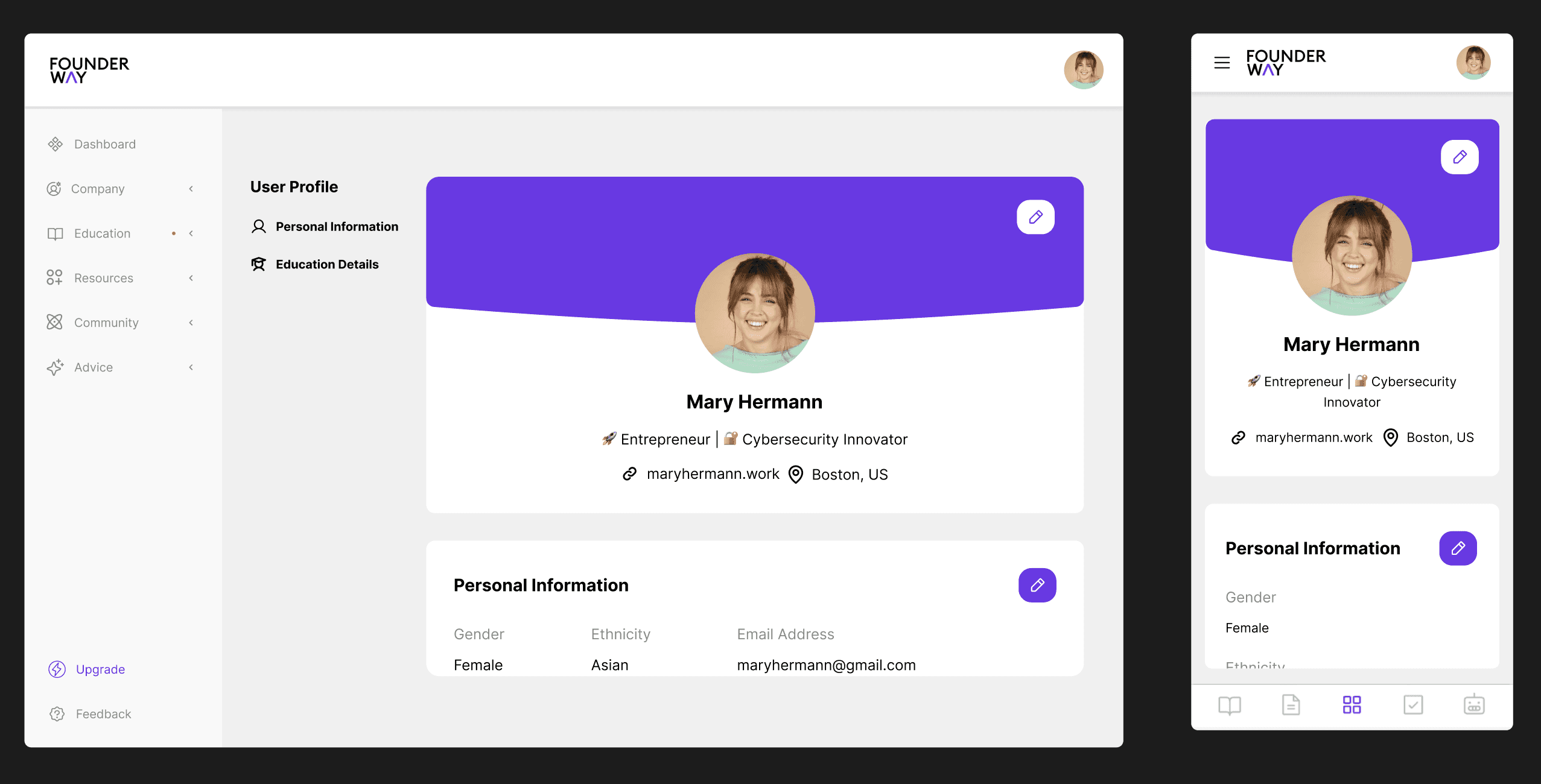
A Simplified New Look

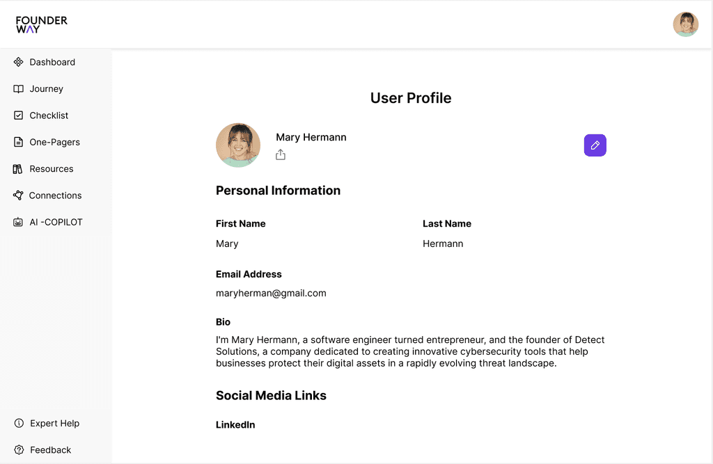
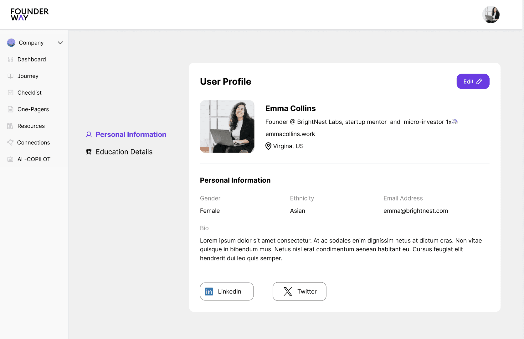
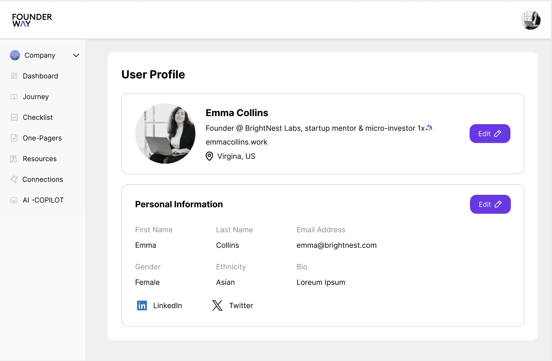
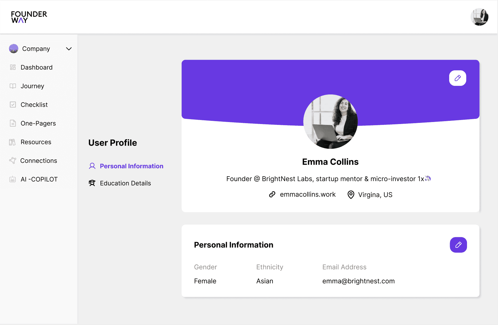
The redesigned Profile Display enhances clarity, making key information easily accessible and improving user experience.

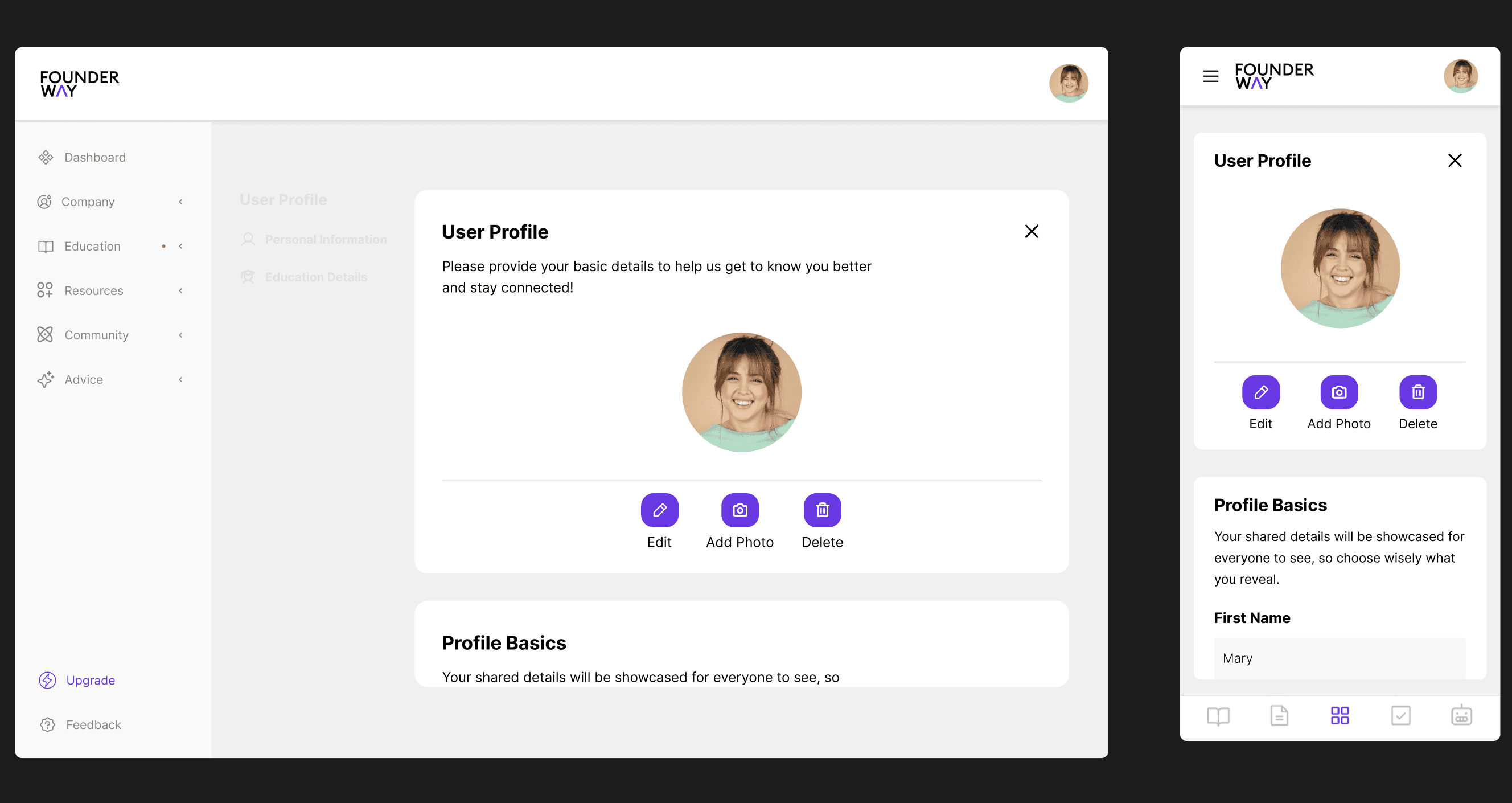
Empowering Easy Updates

The Edit User Profile section was revamped with intuitive forms, enabling users to quickly update their details for a more personalized experience.

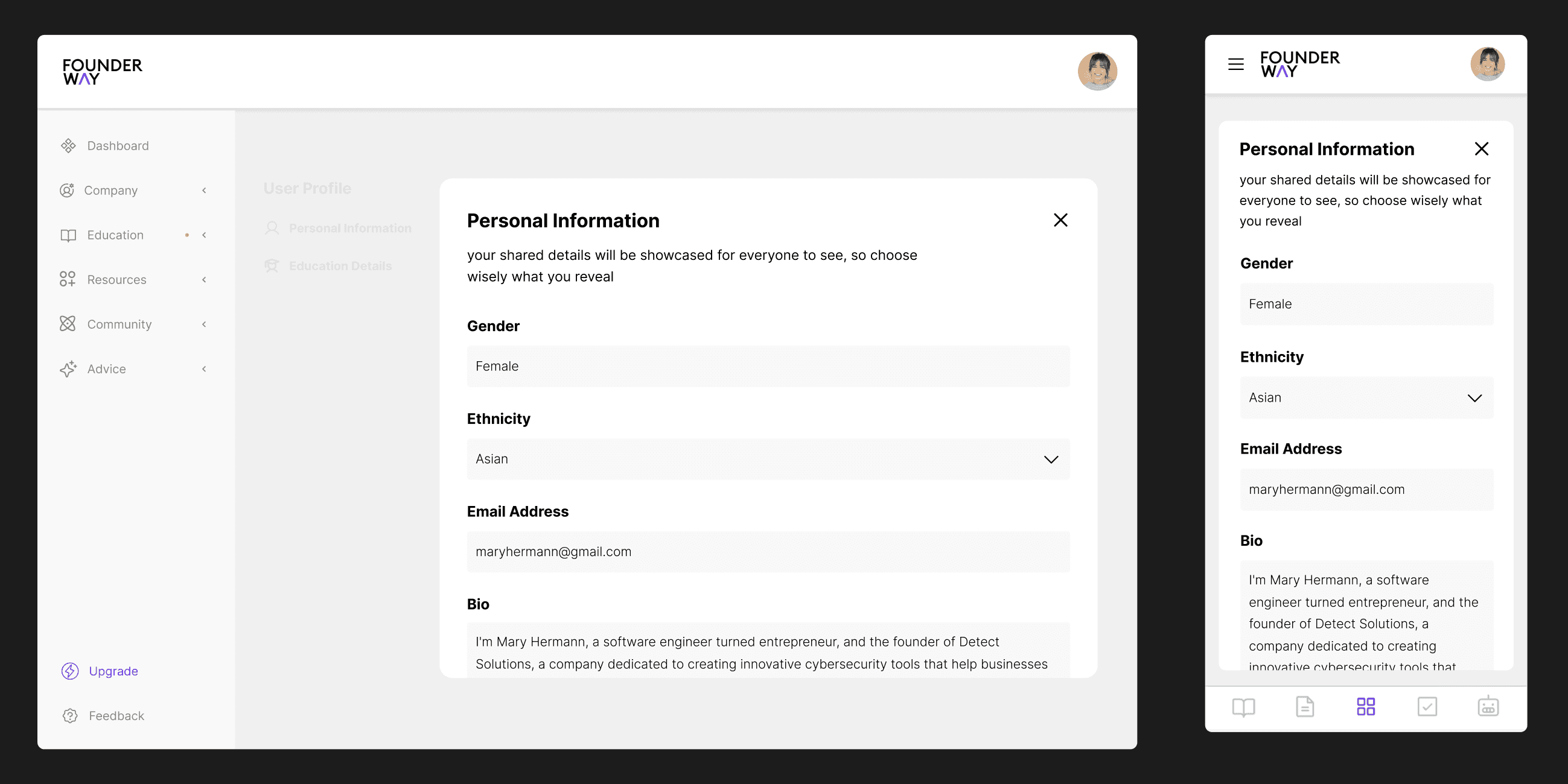
Centralized for Quick Access

The Personal Information section consolidates key details for easy access and streamlined updates, improving user efficiency.

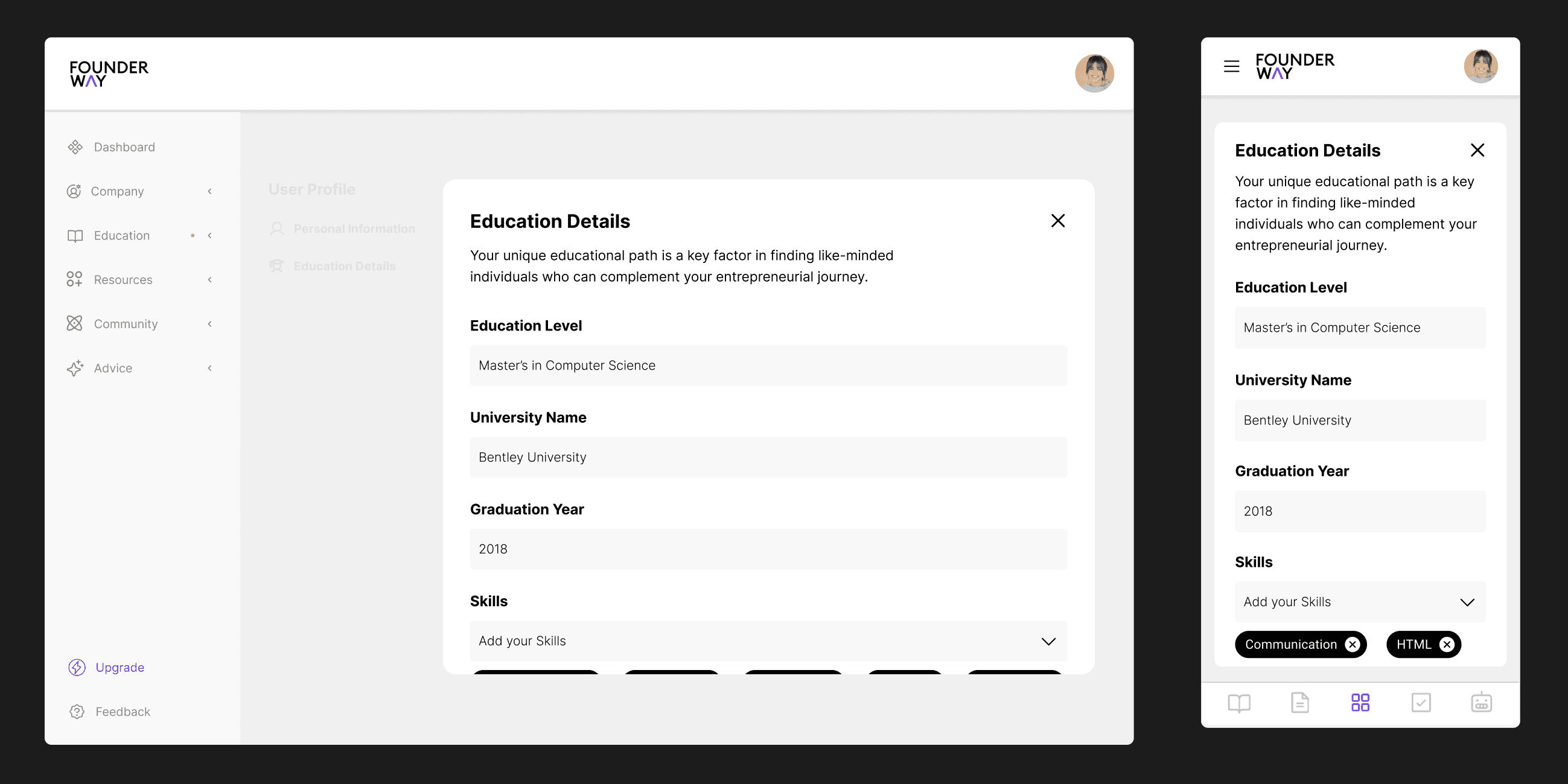
Organizing What Matters Most

The Education Details section was restructured to simplify the management and display of educational credentials, improving usability.

Rumor Has It, Company Profiles Now Packed with Powerful New Tools!

Here are a few design ideas implemented aimed at enhancing business performance, and streamlining collaboration for customers.

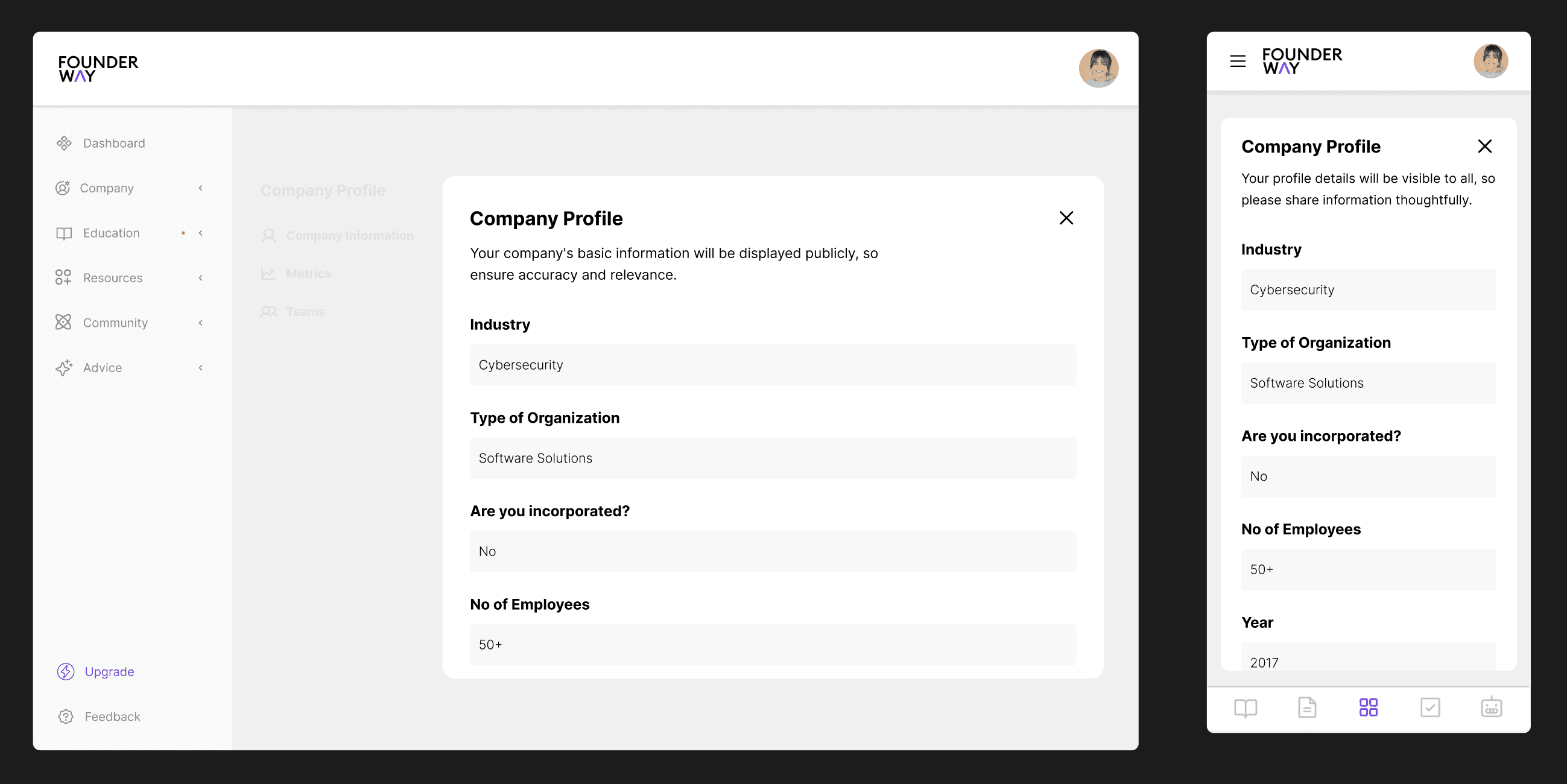
Comprehensive Details at a Glance

This section consolidates all essential company details into one view, offering users easy access to critical information.

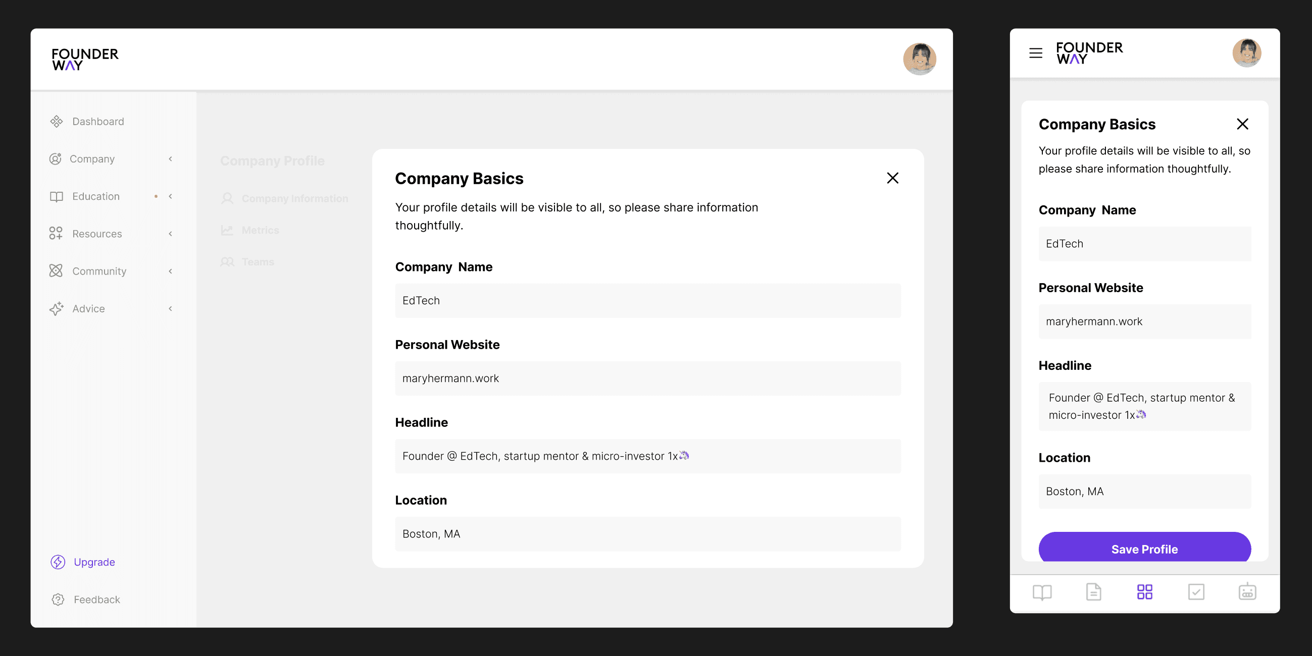
Core Data Streamlined for Efficiency

A simplified layout that highlights the foundational elements of the company, making key data quickly accessible and editable.

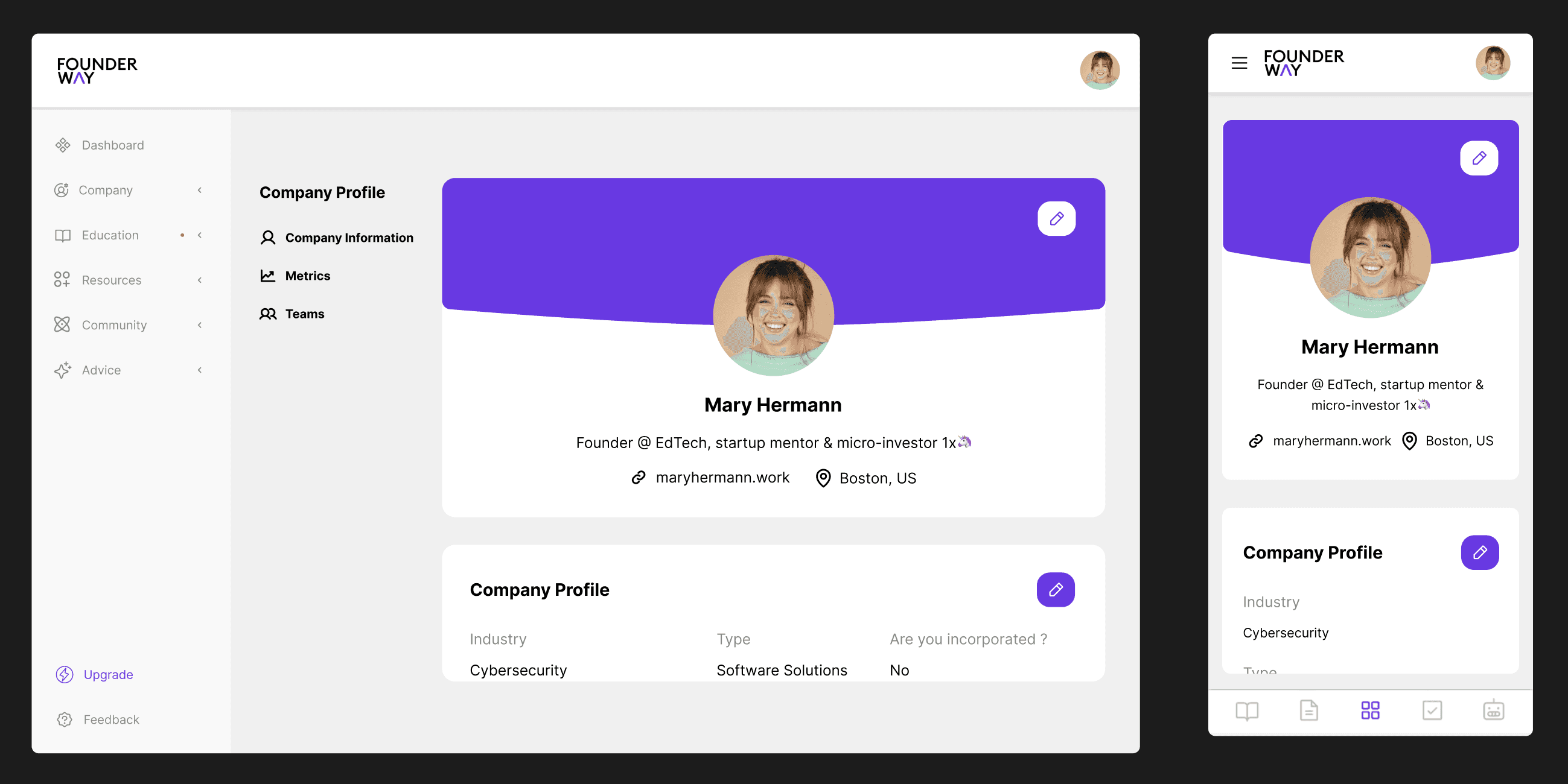
A Snapshot of Your Business Identity

The Company Profile page presents a clean, user-friendly overview of the company, ensuring a strong first impression.

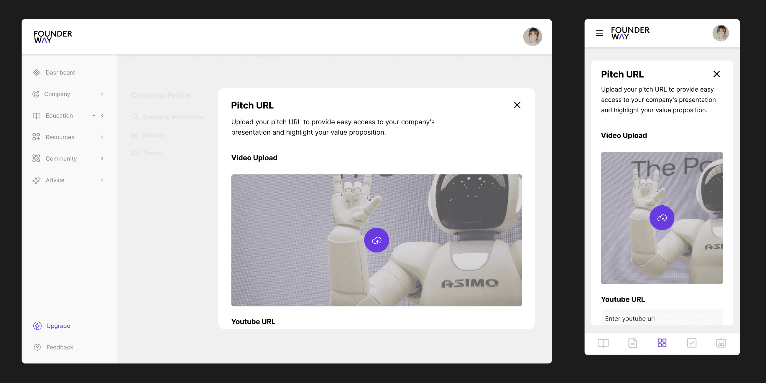
Showcase Your Brand in One Click

This design focuses on providing an easily pitch URL, allowing businesses to quickly present their value proposition to potential investors.

Data-Driven Insights at Your Fingertips

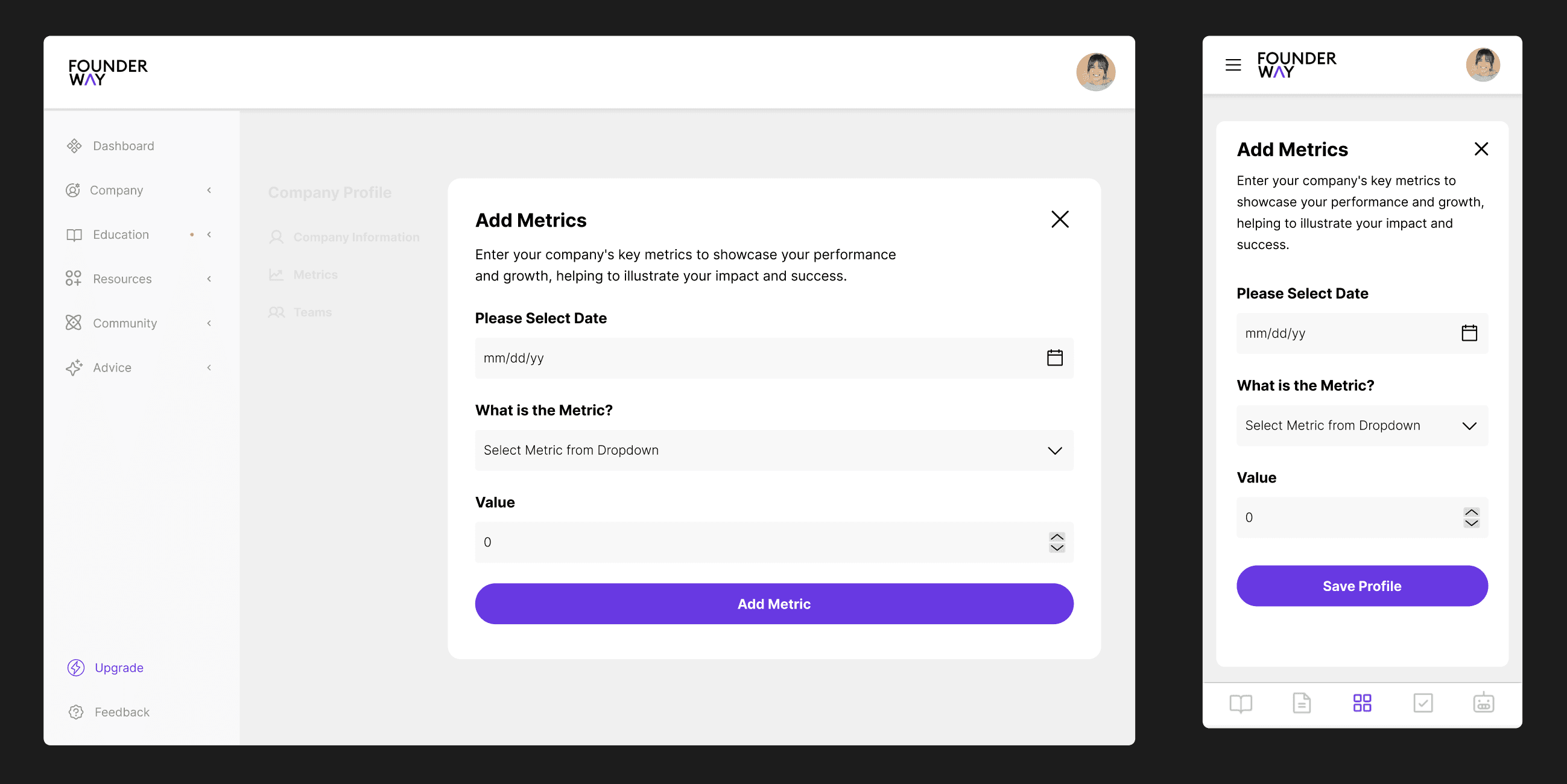
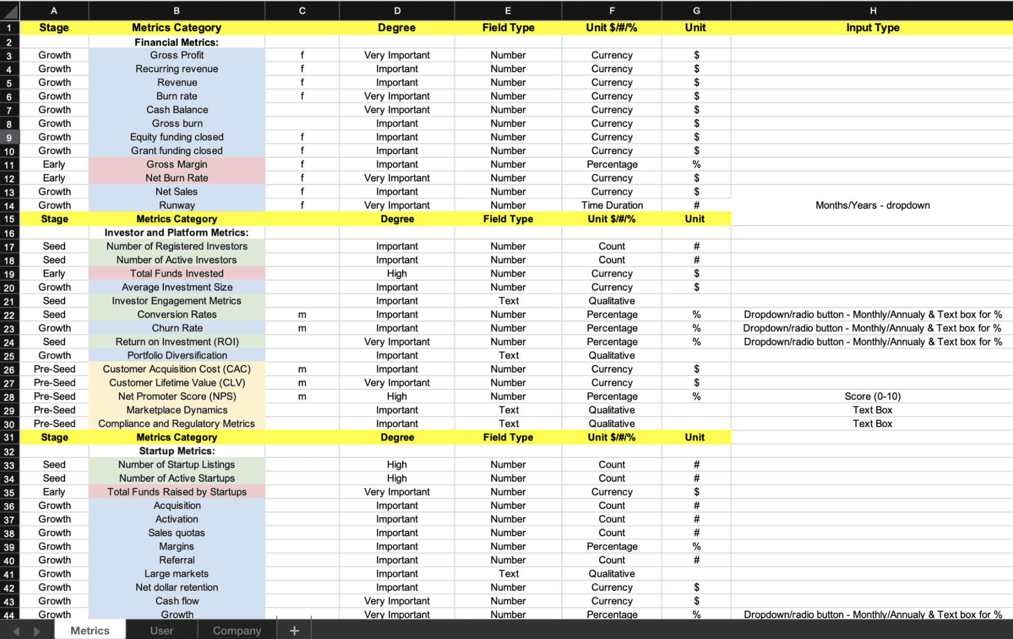
A dedicated section for tracking and visualizing key business metrics, empowering users with real-time performance insights.

Collaboration Centralized for Success

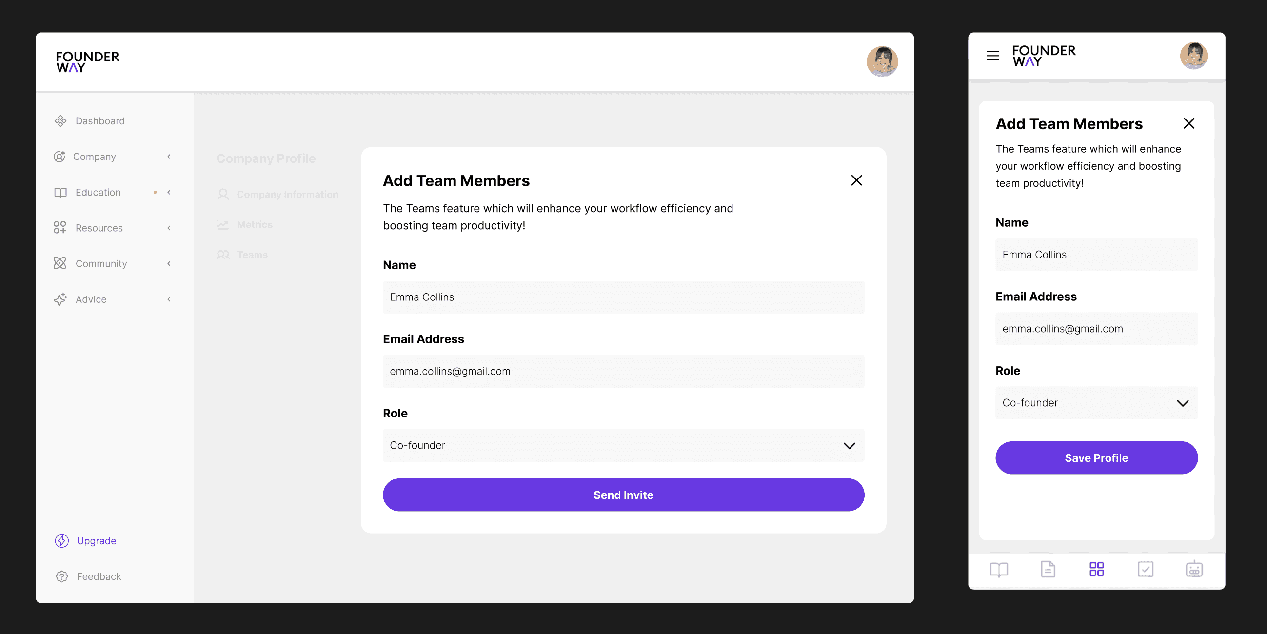
This tool promotes teamwork by offering a space for users to collaborate seamlessly, manage projects, and enhance productivity.

Business Impacts & Results

Business Impacts & Results

After implementing the redesigned profile structure, I closely tracked its impact over a 3-month period using a variety of data analytics and feedback tools like Typeform, Hotjar, and Google Analytics to measure success.

35%

35%

Increase in user satisfaction, measured through post-launch surveys.

40%

40%

Reduction in time spent on profile-related tasks (from 5 to 3 minutes).

25%

25%

Increase in user engagement with the new Metrics and Teams tool.

Problem Statement (Before Redesign)

Profile Page Issues


The existing profile page had a cluttered layout with minimal visual hierarchy, resulting in a 42% drop-off rate at this stage of the user journey.


Lack of Metrics Management and Collaboration Tools


  • Users frequently requested a performance dashboard for tracking their activity metrics. The absence of this tool contributed to a 30% churn rate among data-driven users.

  • The platform lacked a dedicated space for teams to collaborate on projects, causing frustration among users and limiting overall engagement.


Redesign Goals

Redesign Goals

The redesign aims to create separate user and company profiles to streamline navigation and information management while integrating metrics tracking and team collaboration tools directly into the platform.

Research & Analysis

Competitive Analysis


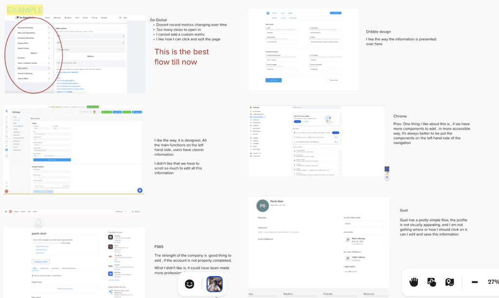
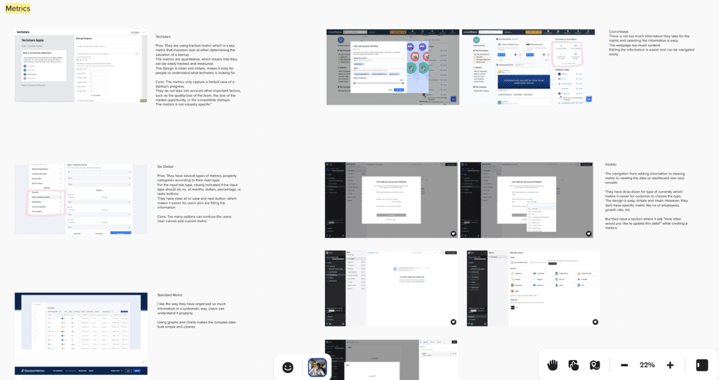
Conducted a competitive analysis of over 25+ similar platforms, identifying key missing features such as personalized dashboards, goal tracking, visual analytics, and real-time data updates that could enhance our offering.

User Research


I conducted interviews with 12 users, including startup founders and team members, to understand their pain points. Key findings showed that:

Users spent an average of 5 minutes searching for specific company data on the original profile page.

Users spent an average of 5 minutes searching for specific company data on the original profile page.

Users spent an average of 5 minutes searching for specific company data on the original profile page.

83% of users wanted separate profiles for personal and company data.

83% of users wanted separate profiles for personal and company data.

83% of users wanted separate profiles for personal and company data.

Information Architecture


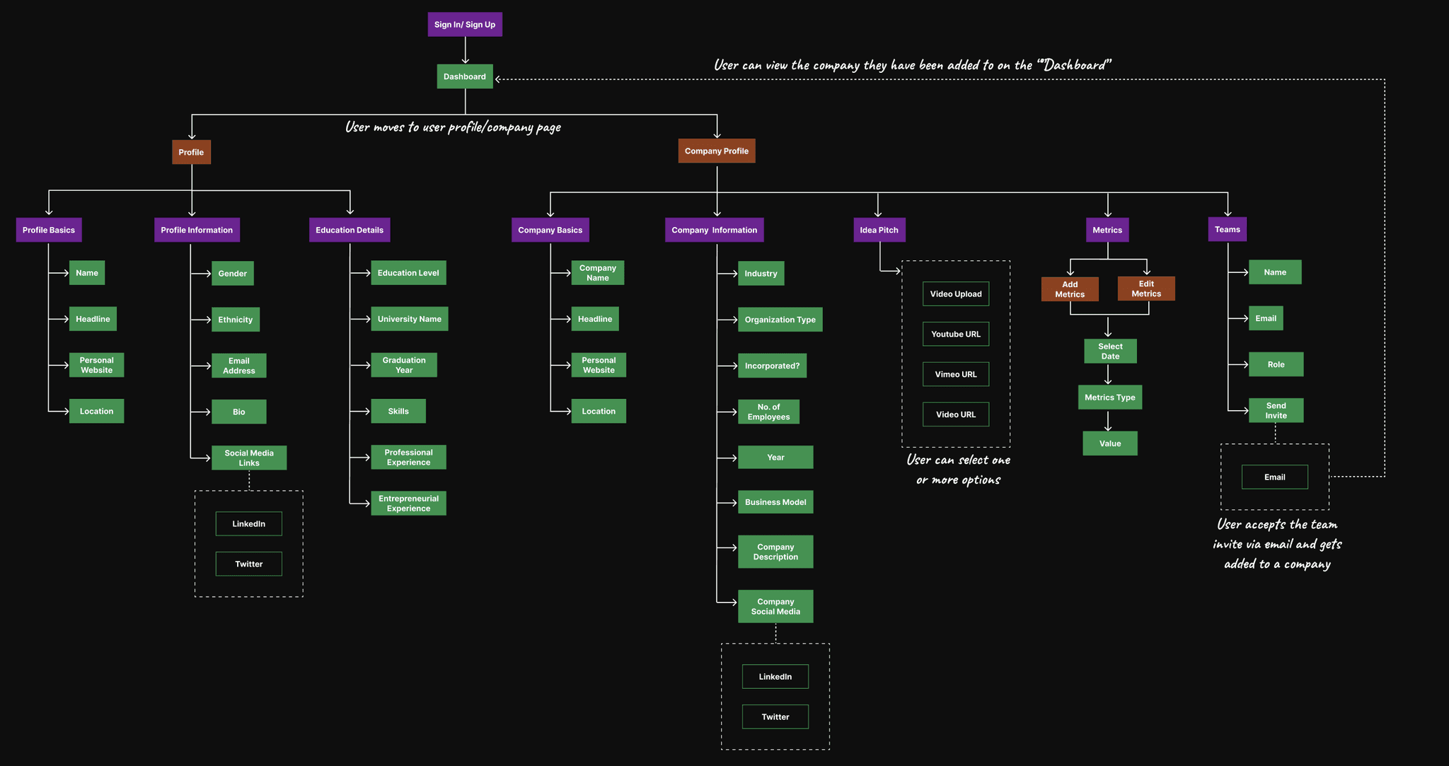
Restructured the information architecture to prioritize separate access to the personal profile and company profile, reducing the time spent searching for company-related data by 25%.

User Flow


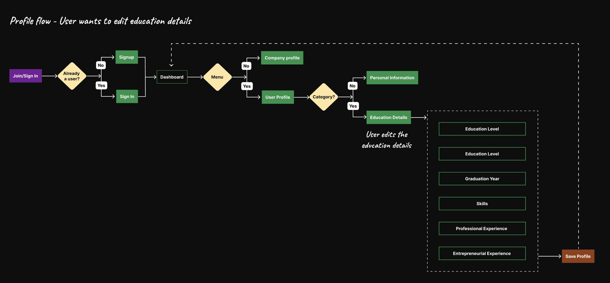
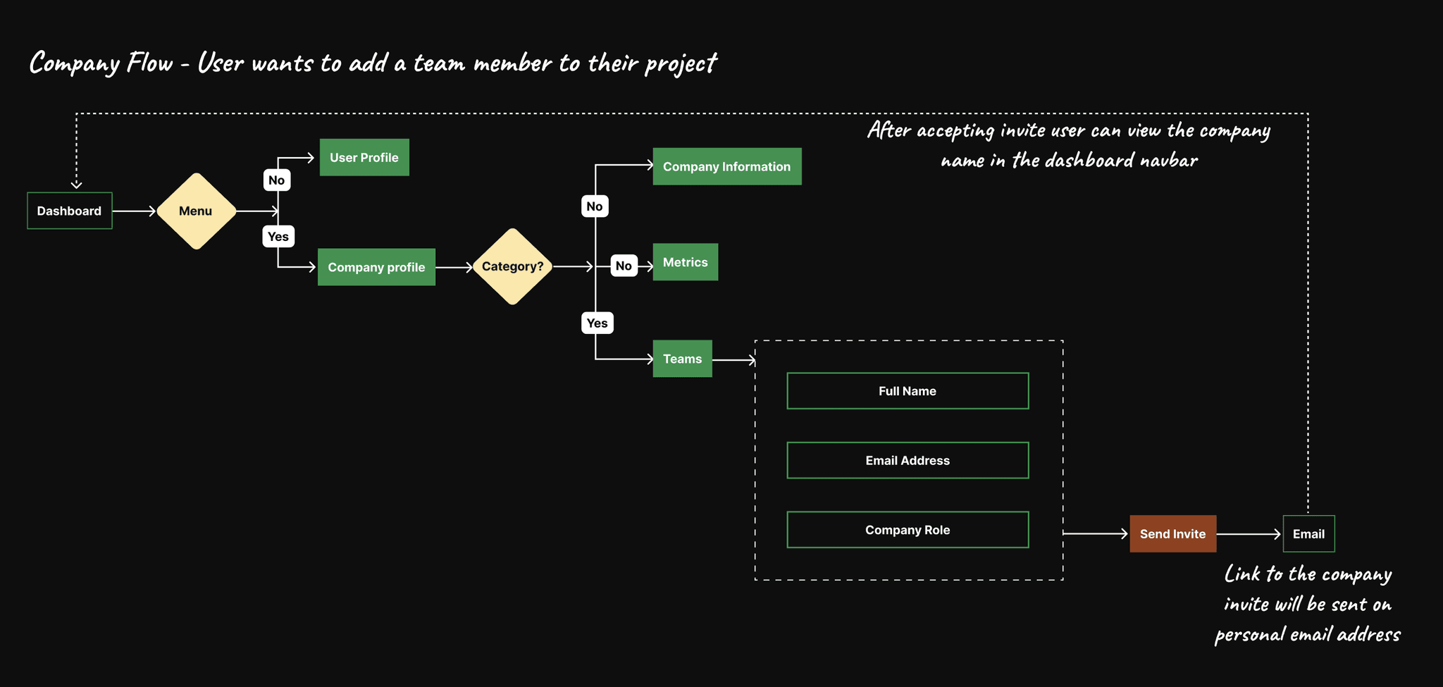
Identified that users were abandoning the company profile section due to confusion about where to find important information.

Insights: A redesign was essential to separate user and company information, improve efficiency, and integrate key tools like team collaboration and metrics tracking.

Design Process

Wireframes and Low-Fidelity Prototypes


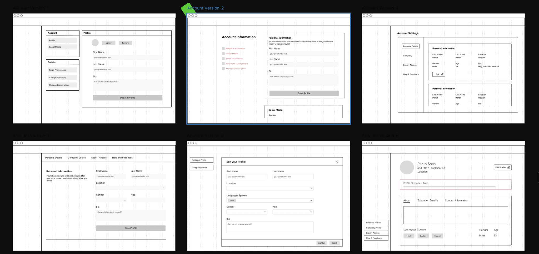
30% of users found the initial wireframe layout easy to navigate during early testing, but 60% wanted clearer separation between personal and company data based on user feedback. The wireframes were created to visualize the separation between personal and company profiles.

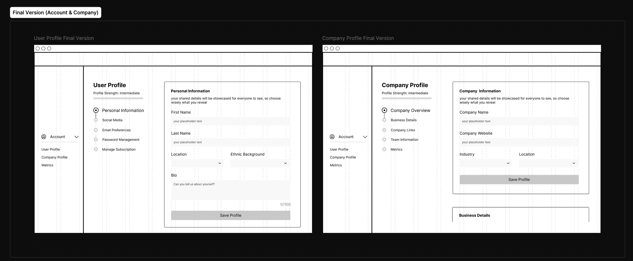
I developed the final version of the account and company profile wireframes, building upon the insights from version 2.

High-Fidelity Prototypes & Design Choices ~ Design Exploration


I developed three high-fidelity design concepts, each with a different focus:

Design A

Design A

Design A

This version focused on a clean, minimal essential navigation elements like "Personal Information," and "Education" easily accessible on the left. The goal was to keep the user interface (UI) highly streamlined, focusing on the key actions a user would take.

This version focused on a clean, minimal essential navigation elements like "Personal Information," and "Education" easily accessible on the left. The goal was to keep the user interface (UI) highly streamlined, focusing on the key actions a user would take.

This version focused on a clean, minimal essential navigation elements like "Personal Information," and "Education" easily accessible on the left. The goal was to keep the user interface (UI) highly streamlined, focusing on the key actions a user would take.

Design B

Design B

Design B

User-centric, with a big emphasis on personalization (profile bio, education details). Enhanced hierarchy with profile details front and center. More space for key actions like "Profile Basics" and "Personal Information."

User-centric, with a big emphasis on personalization (profile bio, education details). Enhanced hierarchy with profile details front and center. More space for key actions like "Profile Basics" and "Personal Information."

User-centric, with a big emphasis on personalization (profile bio, education details). Enhanced hierarchy with profile details front and center. More space for key actions like "Profile Basics" and "Personal Information."

Design C

Design C

Design C

This option incorporates a balance between the first two. The information is integrated in a clean, accessible layout, while the sidebar remains functional and compact. Additionally, this version has easy scroll and edit options reducing the time spent.

This option incorporates a balance between the first two. The information is integrated in a clean, accessible layout, while the sidebar remains functional and compact. Additionally, this version has easy scroll and edit options reducing the time spent.

This option incorporates a balance between the first two. The information is integrated in a clean, accessible layout, while the sidebar remains functional and compact. Additionally, this version has easy scroll and edit options reducing the time spent.

Design A

This version focused on a clean, minimal essential navigation elements like "Personal Information," and "Education" easily accessible on the left. The goal was to keep the user interface (UI) highly streamlined, focusing on the key actions a user would take.

Design B

User-centric, with a big emphasis on personalization (profile bio, education details). Enhanced hierarchy with profile details front and center. More space for key actions like "Profile Basics" and "Personal Information."

Design C

This option incorporates a balance between the first two. The information is integrated in a clean, accessible layout, while the sidebar remains functional and compact. Additionally, this version has easy scroll and edit options reducing the time spent.

Why Did I Choose "Design C"?

Why Did I Choose "Design C"?

45%

35%

35%

35%

35%

Improvement in usability scores during testing.

20%

40%

40%

40%

40%

Less time navigating between personal and company profiles.

80%

25%

25%

25%

25%

Found the new metrics and teams tool useful and easy.

Final Designs

Final Designs

Before Redesign Profile Page

After

The new company profile page enabled users to manage their startup's info in one place, resulting in a 40% increase in user satisfaction according to post-launch surveys.

Key Features

Metrics Management Tool

Since the introduction of the metrics tool, we saw a 50% increase in engagement with startup data, with users spending an average of 15% more time reviewing their metrics.


Teams Tool

The collaboration tool allowed teams to manage projects directly from the company profile page, with 70% of users reporting improved collaboration efficiency and identifying it as essential for managing remote teams.

Conclusion

Conclusion

The redesign of the profile management page experience allowed users to more effectively manage their personal information and company data. By providing dedicated tools for collaboration and metrics tracking, I improved user satisfaction and overall platform engagement.

Next Steps

  • Continue refining the metrics management tool based on user feedback.

  • Explore the possibility of adding more customizable data views for advanced users.

Design A

This version focused on a clean, minimal essential navigation elements like "Personal Information," and "Education" easily accessible on the left. The goal was to keep the user interface (UI) highly streamlined, focusing on the key actions a user would take.

Design B

User-centric, with a big emphasis on personalization (profile bio, education details). Enhanced hierarchy with profile details front and center. More space for key actions like "Profile Basics" and "Personal Information."

Design C

This option incorporates a balance between the first two. The information is integrated in a clean, accessible layout, while the sidebar remains functional and compact. Additionally, this version has easy scroll and edit options reducing the time spent.

Let's Work Together?

Now that you've come this far, let's work together on your next product?

Let's Work Together?

Now that you've come this far, let's work together on your next product?

Let's Work Together?

Now that you've come this far, let's work together on your next product?

Let's Work Together?

Now that you've come this far, let's work together on your next product?

Let's Work Together?

Now that you've come this far, let's work together on your next product?