StepUp

StepUp

Crafting a Community-Centric Experience Beyond Transactions

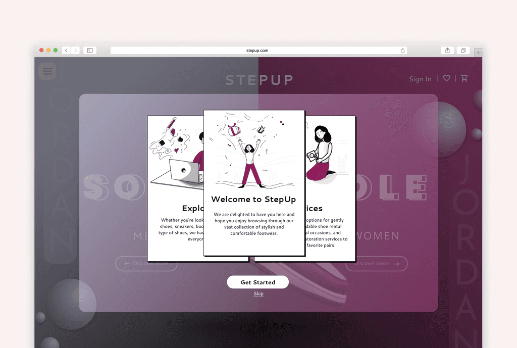
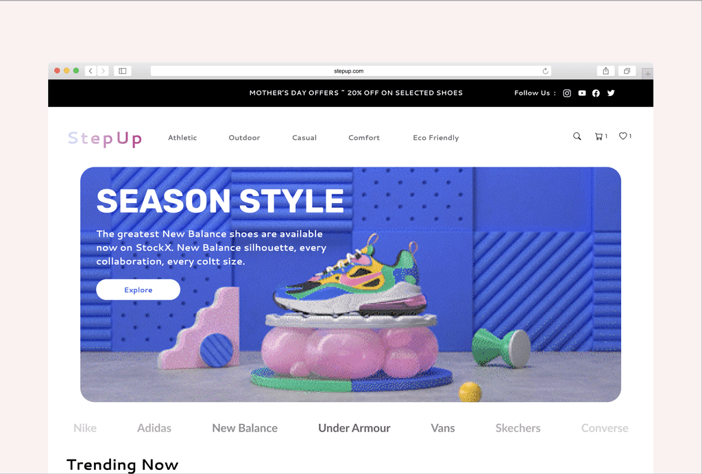
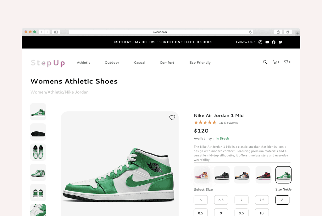
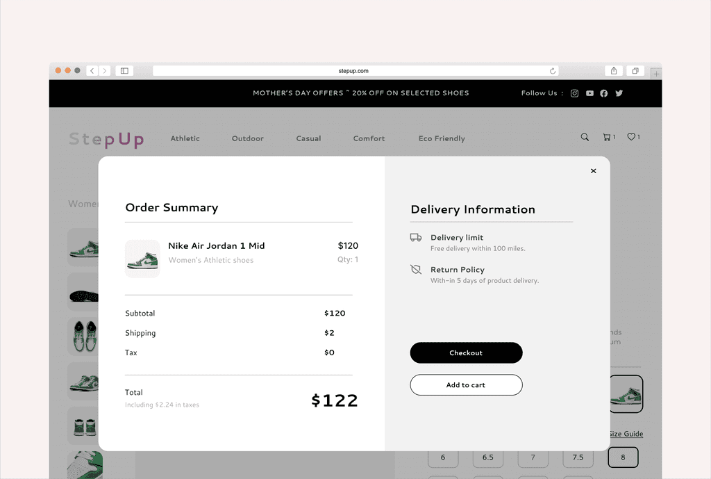
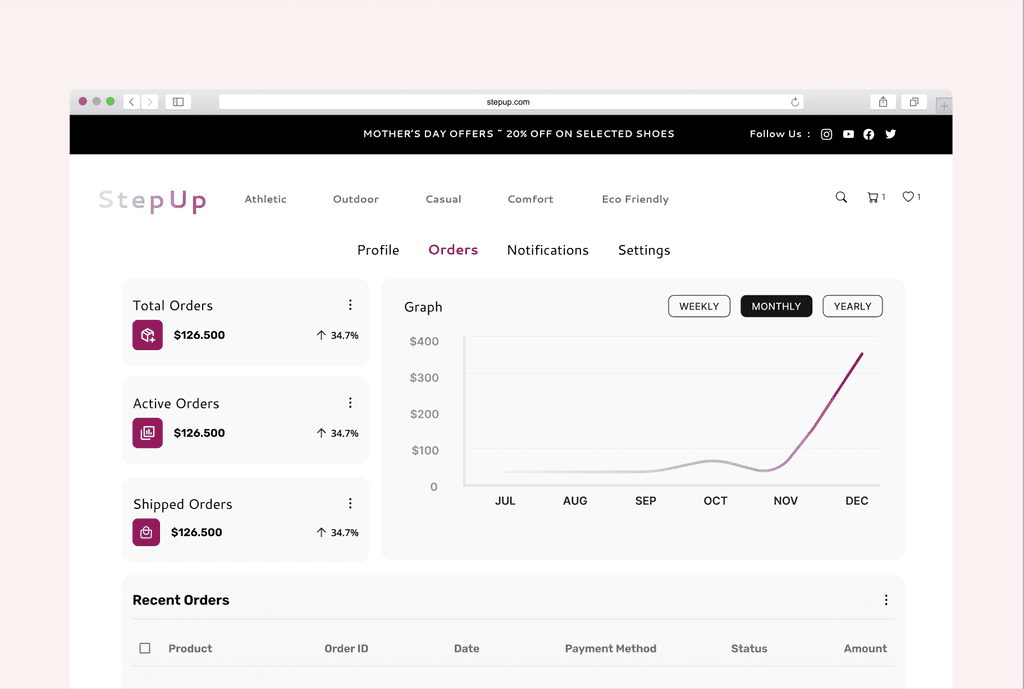
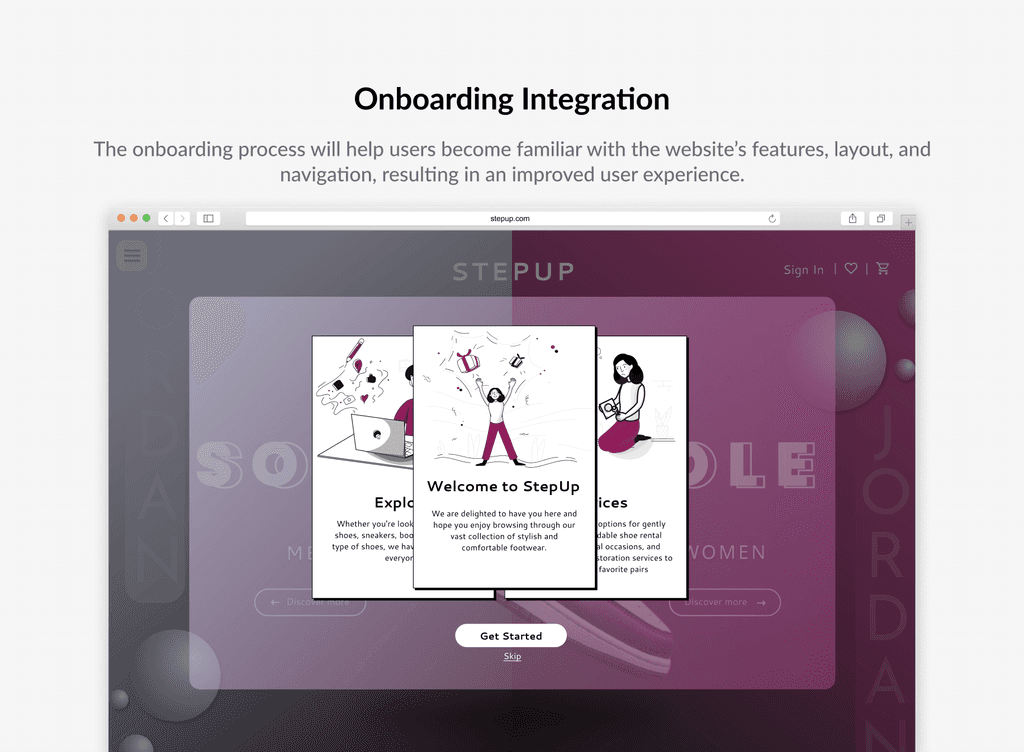
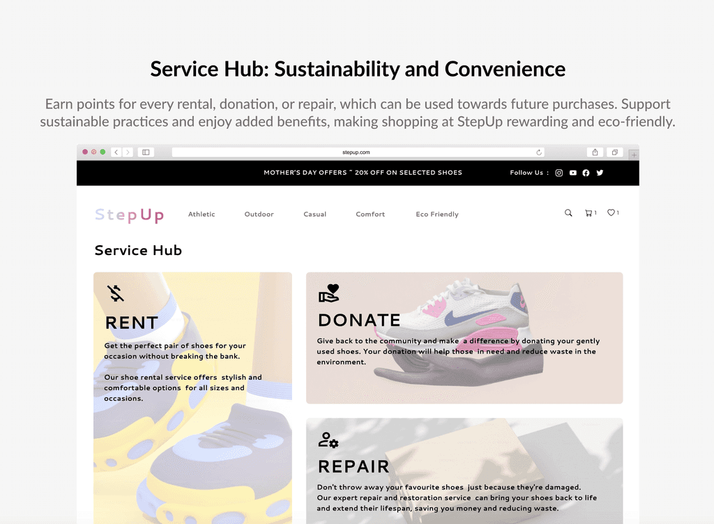
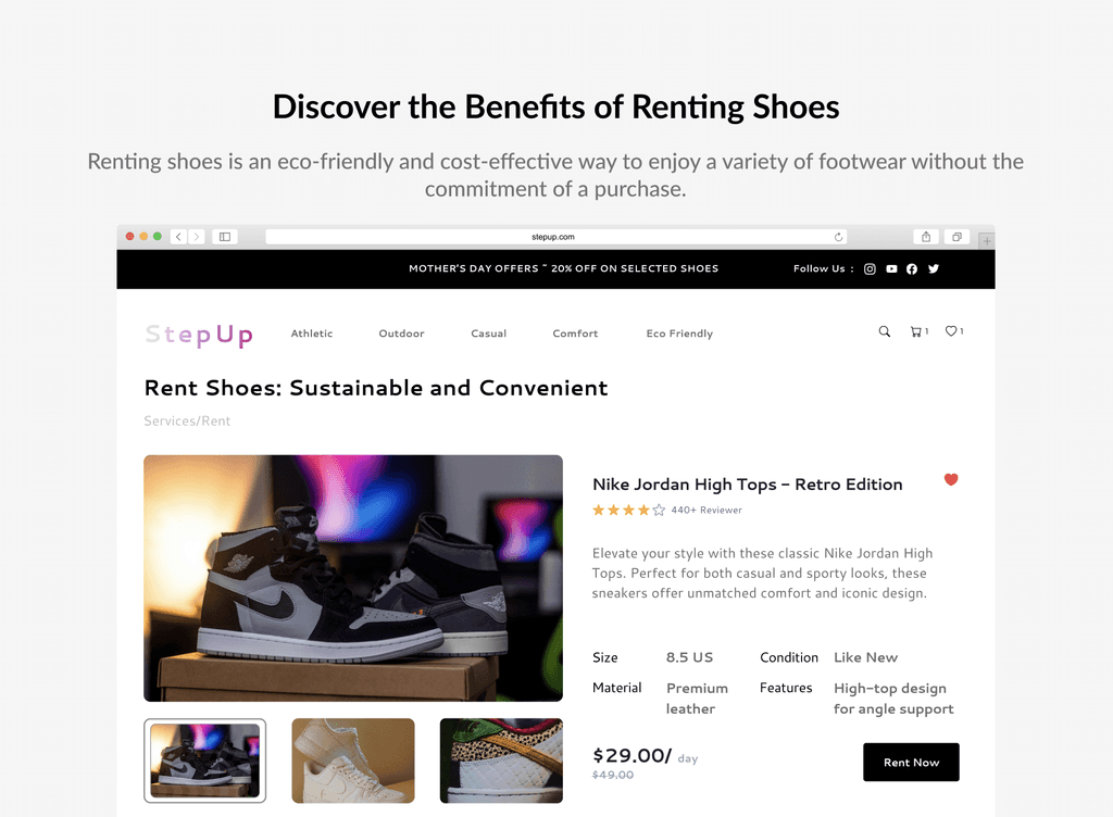
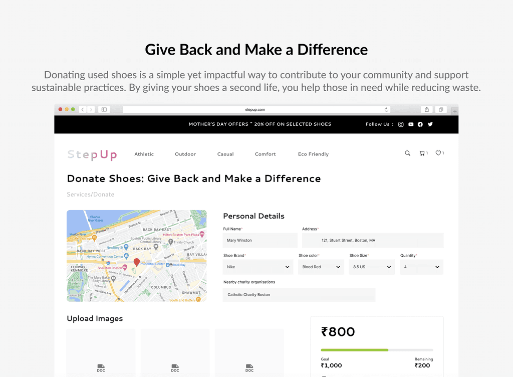
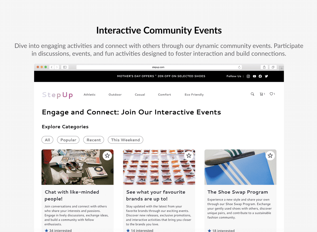
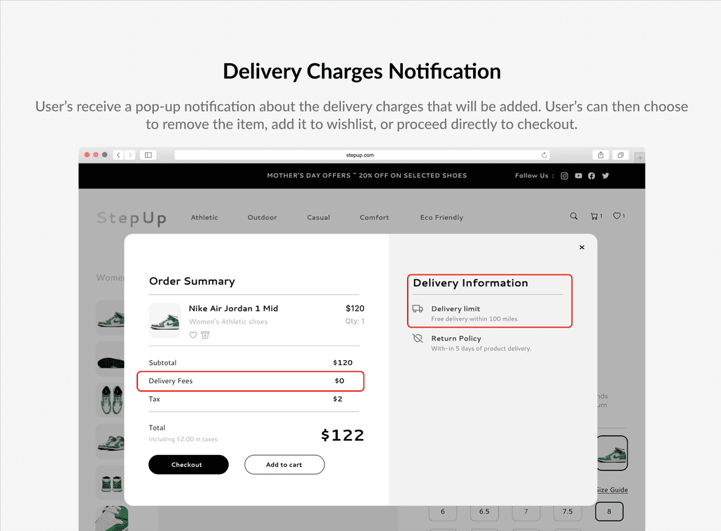
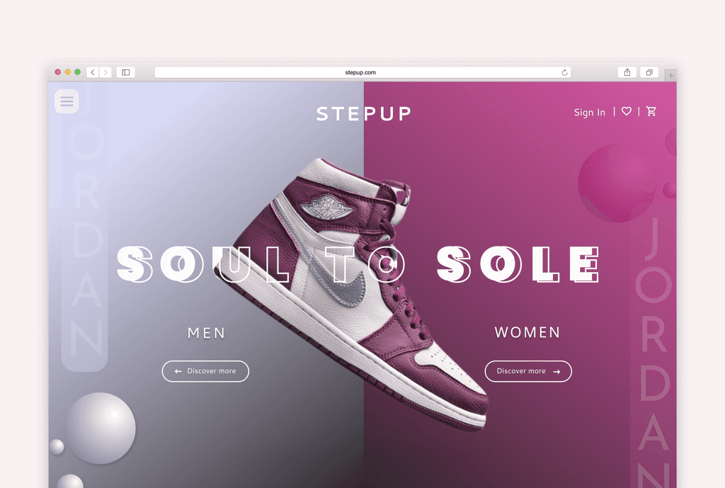
Aimed to revolutionize online shopping with a community-centric experience, achieving a 30% increase in user engagement and a 25% reduction in cart abandonment through intuitive navigation and personalized features, fostering customer satisfaction and loyalty.

Techniques

Visual Design • UX/UI Design • UX Research • Information Architecture • Wireframing • Prototyping

Team

UX Designer • Frontend Developer

Role

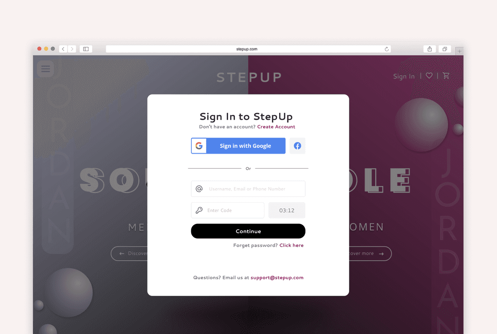
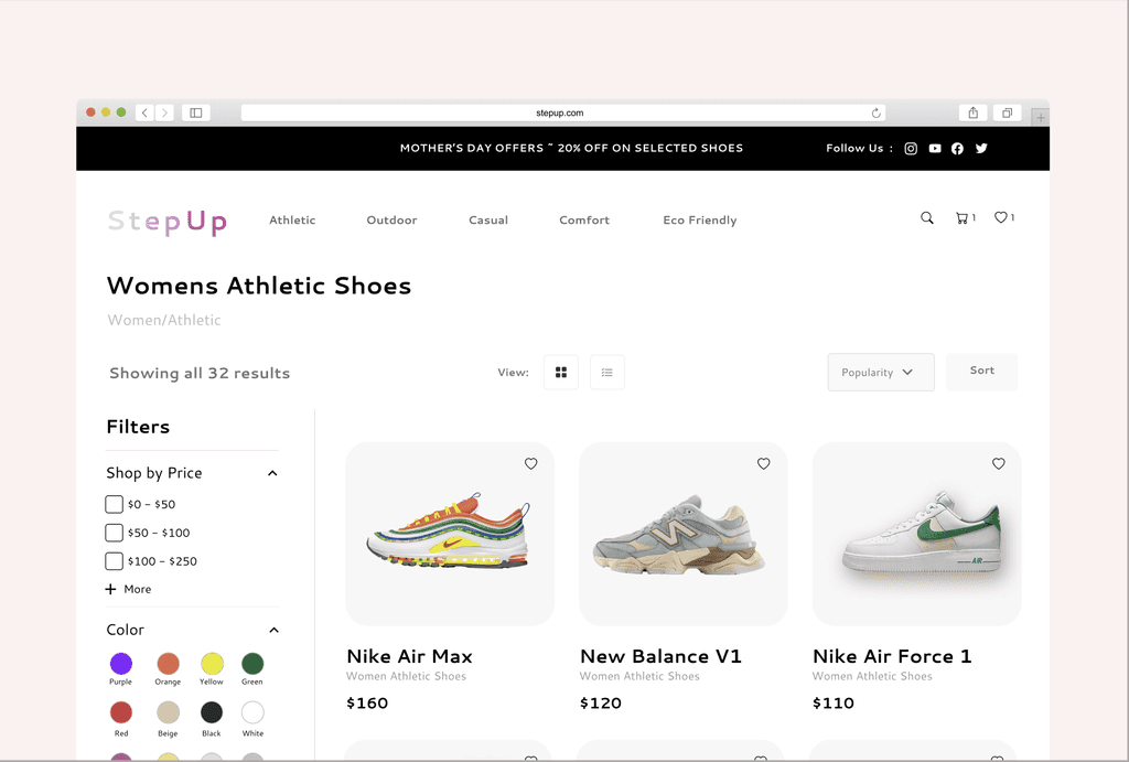
As a UX Designer, I conducted user research and defined pain points. Engaged in ideation to conceptualise solutions for card abandonment and user engagement issues and was a responsible for developing visual screens ensuring a seamless user experience.

Design Gallery

Problem Statement

Low user engagement and high cart abandonment rates are significant challenges faced by many online shoe retailers.


StepUp aims to address these issues by enhancing user engagement and satisfaction while fostering a sense of community through innovative features.

How did I get this idea?

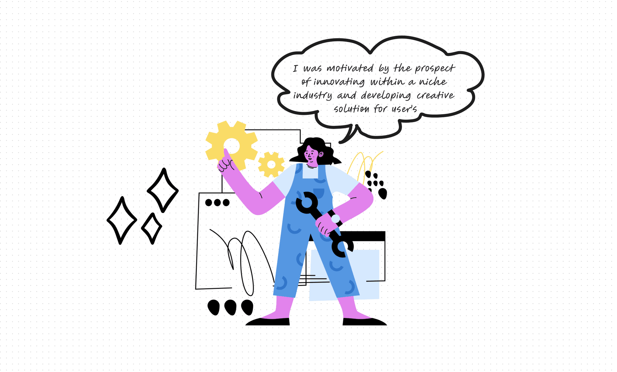
It all began with my experience with online shoe stores, where I encountered significant challenges in user engagement and satisfaction.


I decided to take on this project because I saw an opportunity to leverage my skills as a UX designer to address these challenges and make a meaningful impact.

Objectives

How might we focus on these areas to create a seamless and engaging user experience, thereby contributing to the success of the StepUp platform?

  • User-friendly Navigation

  • Smooth UI

  • Increase Conversion Rate

  • Enhanced User Engagement

Research

Conducted in-depth interviews to gain empathy and understand their needs, behaviors, and pain points to ensure alignment with user expectations and minimum friction points.

Empathy Mapping

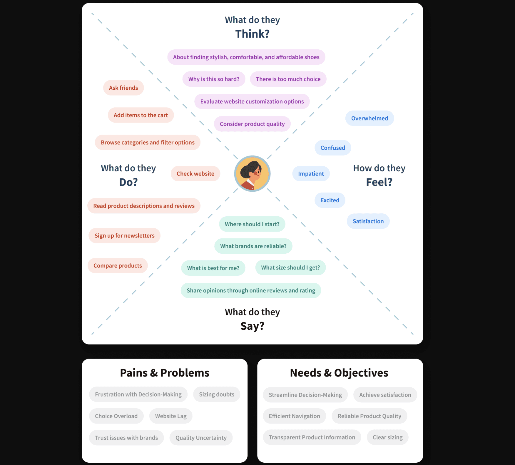
After the user interviews, I used empathy mapping to get a clearer picture of what users were feeling, thinking, and motivated by.
Card Sorting

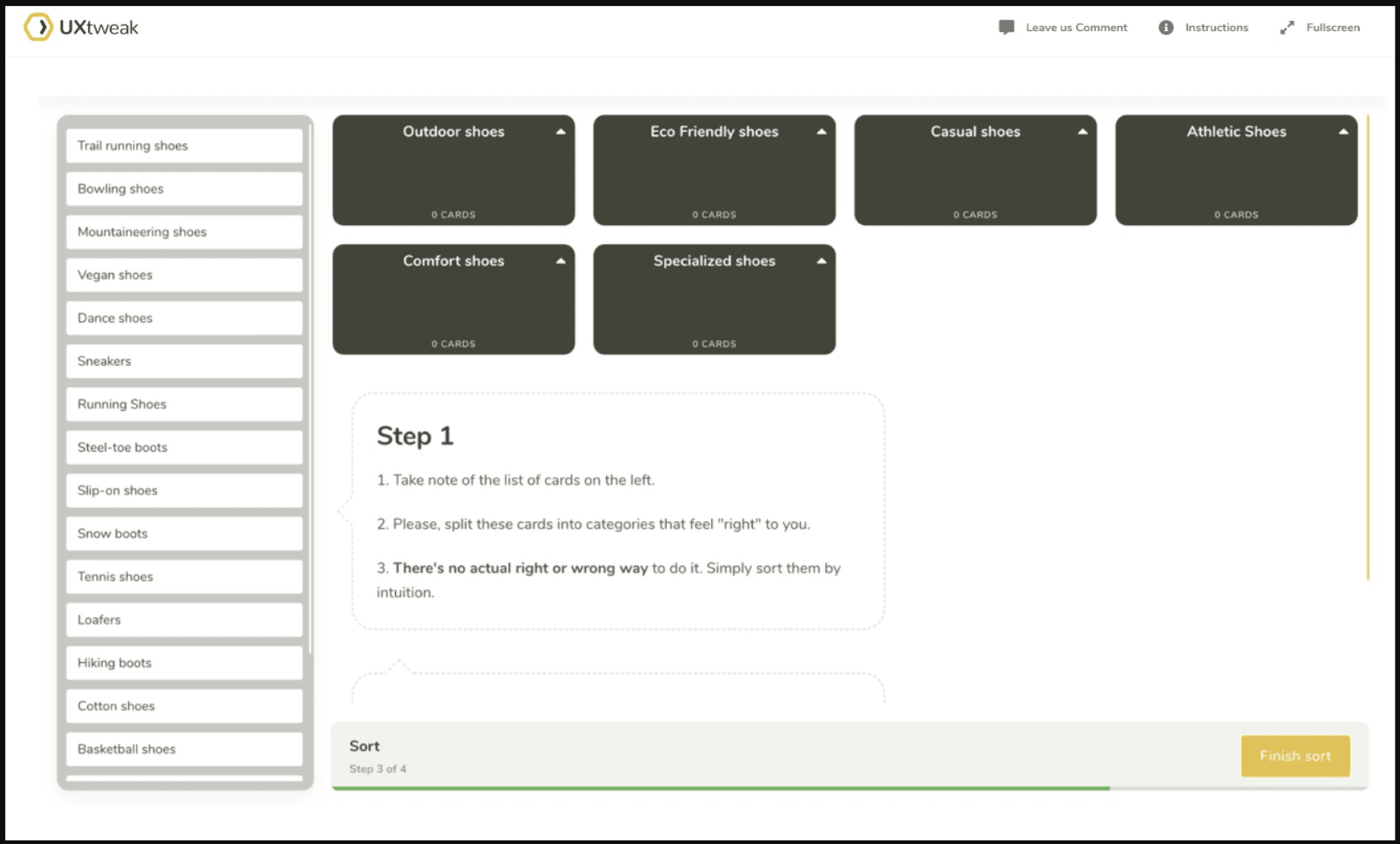
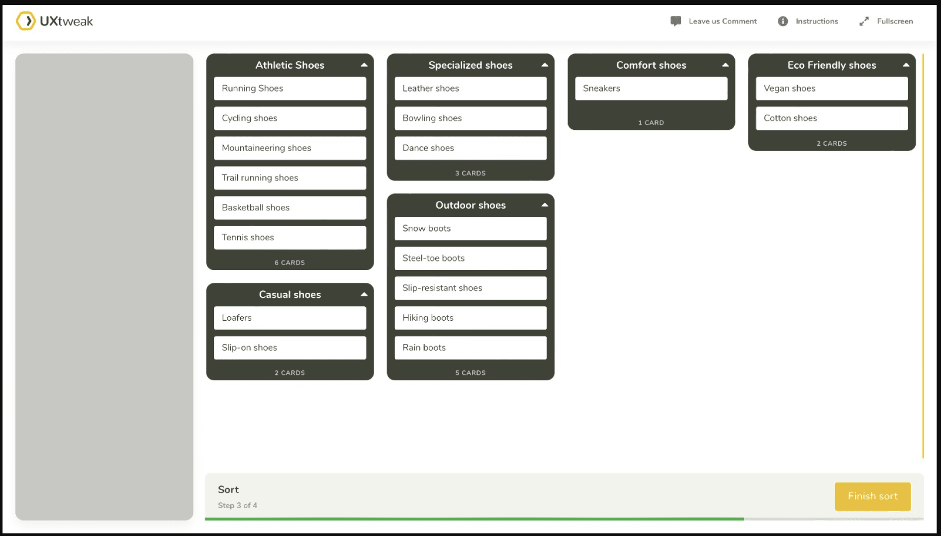
To optimize website navigation, I conducted card sorting exercises with users.


This activity provided insights into how users categorize and organize information, which informed the design of an intuitive and efficient navigation structure.


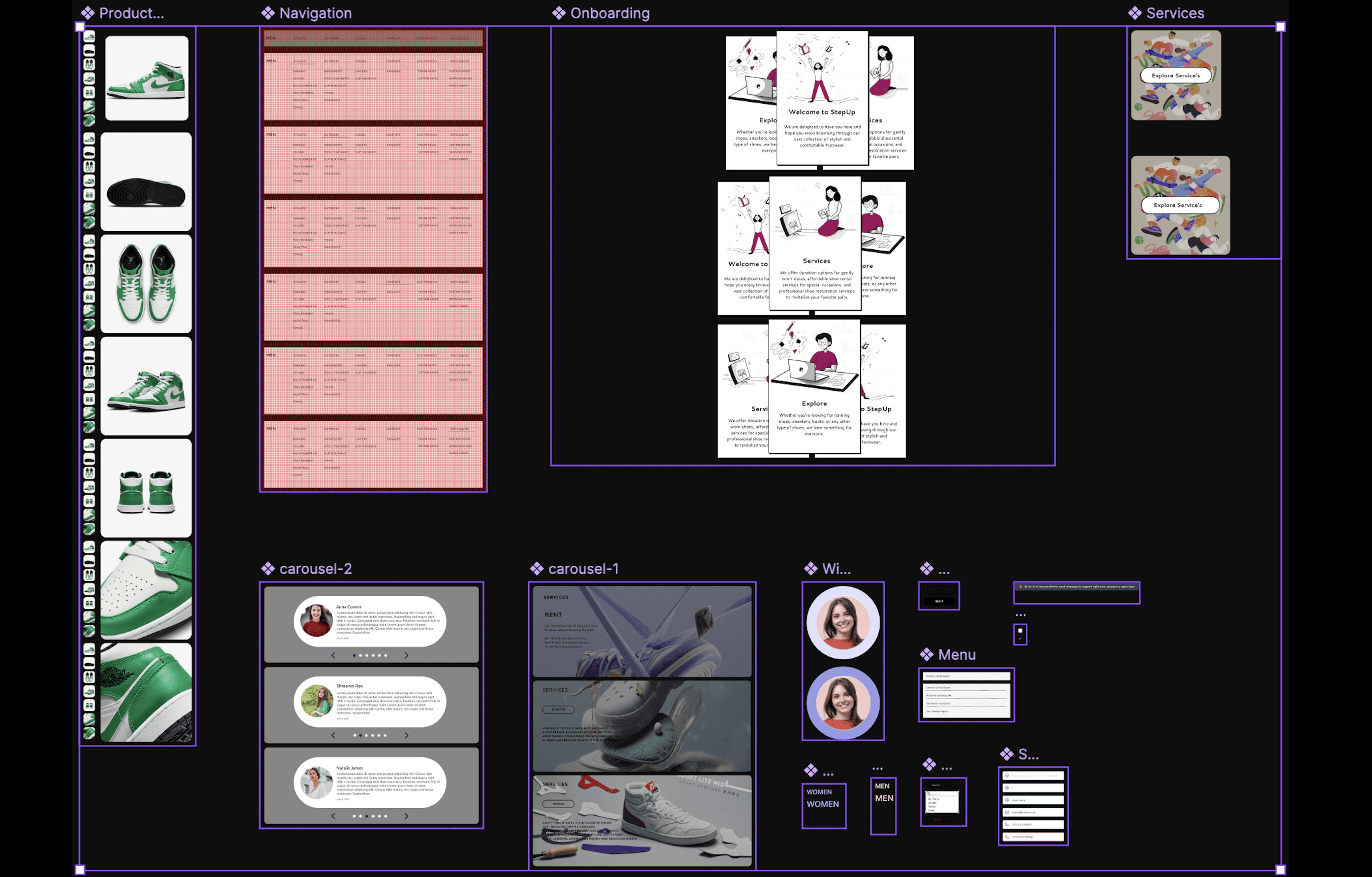
Components & Use of Variants

I utilized components and variants in my projects to ensure consistency and efficiency, allowing me to focus on creating seamless, user-centered experiences.


This approach streamlined collaboration with development teams and facilitated quick iterations, enhancing overall project quality.


Design Solutions

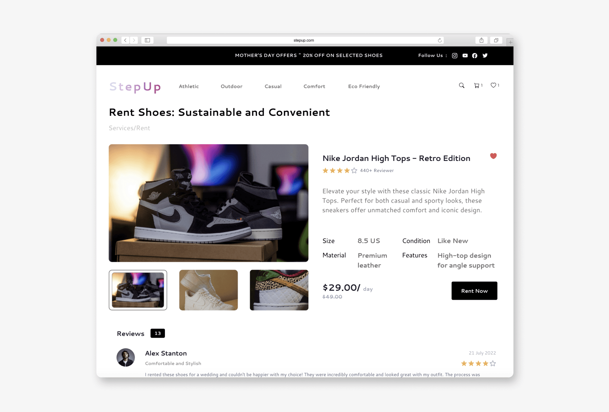
Design Solutions

Learnings & Impact

It taught me the importance of understanding user needs and emotions, making me a better problem solver and more creative in addressing challenges.


This experience also strengthened my empathy and user-centered design skills, helping me create solutions that truly connect with users.
Design A

Design A

Design A

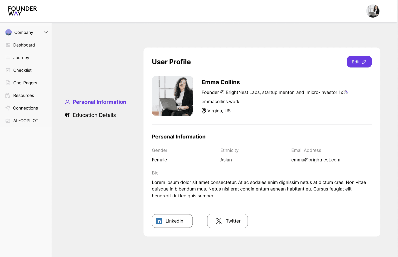
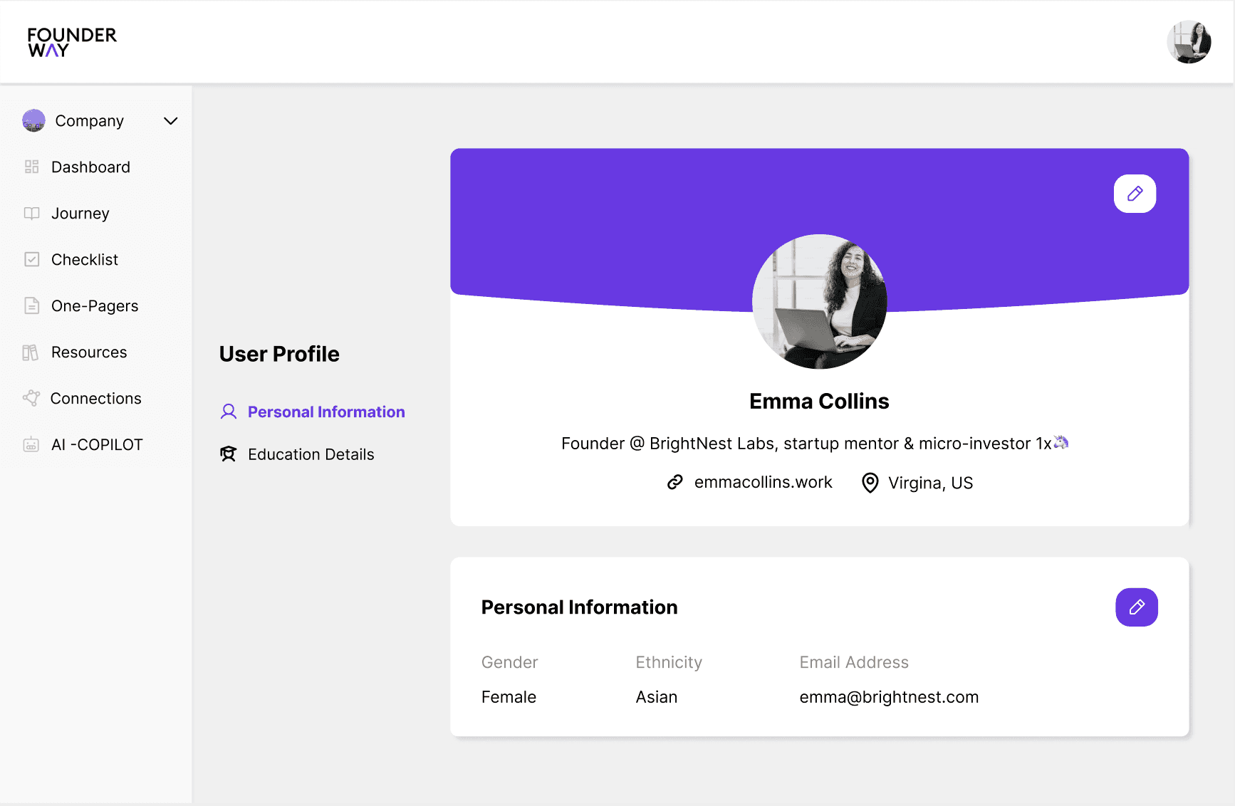
This version focused on a clean, minimal essential navigation elements like "Personal Information," and "Education" easily accessible on the left. The goal was to keep the user interface (UI) highly streamlined, focusing on the key actions a user would take.

This version focused on a clean, minimal essential navigation elements like "Personal Information," and "Education" easily accessible on the left. The goal was to keep the user interface (UI) highly streamlined, focusing on the key actions a user would take.

This version focused on a clean, minimal essential navigation elements like "Personal Information," and "Education" easily accessible on the left. The goal was to keep the user interface (UI) highly streamlined, focusing on the key actions a user would take.

Design B

Design B

Design B

User-centric, with a big emphasis on personalization (profile bio, education details). Enhanced hierarchy with profile details front and center. More space for key actions like "Profile Basics" and "Personal Information."

User-centric, with a big emphasis on personalization (profile bio, education details). Enhanced hierarchy with profile details front and center. More space for key actions like "Profile Basics" and "Personal Information."

User-centric, with a big emphasis on personalization (profile bio, education details). Enhanced hierarchy with profile details front and center. More space for key actions like "Profile Basics" and "Personal Information."

Design C

Design C

Design C

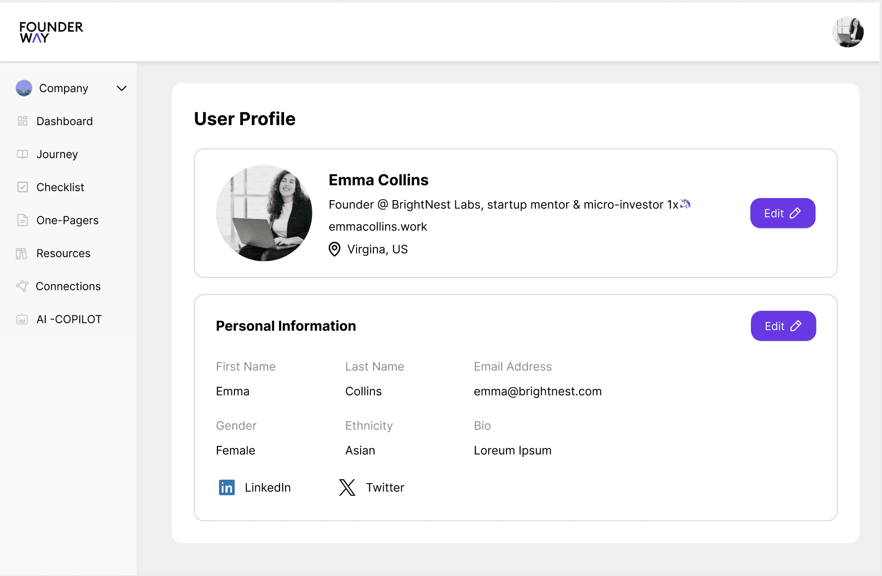
This option incorporates a balance between the first two. The information is integrated in a clean, accessible layout, while the sidebar remains functional and compact. Additionally, this version has easy scroll and edit options reducing the time spent.

This option incorporates a balance between the first two. The information is integrated in a clean, accessible layout, while the sidebar remains functional and compact. Additionally, this version has easy scroll and edit options reducing the time spent.

This option incorporates a balance between the first two. The information is integrated in a clean, accessible layout, while the sidebar remains functional and compact. Additionally, this version has easy scroll and edit options reducing the time spent.

Design A

This version focused on a clean, minimal essential navigation elements like "Personal Information," and "Education" easily accessible on the left. The goal was to keep the user interface (UI) highly streamlined, focusing on the key actions a user would take.

Design B

User-centric, with a big emphasis on personalization (profile bio, education details). Enhanced hierarchy with profile details front and center. More space for key actions like "Profile Basics" and "Personal Information."

Design C

This option incorporates a balance between the first two. The information is integrated in a clean, accessible layout, while the sidebar remains functional and compact. Additionally, this version has easy scroll and edit options reducing the time spent.

Let's Work Together?

Now that you've come this far, let's work together on your next product?

Let's Work Together?

Now that you've come this far, let's work together on your next product?

Let's Work Together?

Now that you've come this far, let's work together on your next product?

Let's Work Together?

Now that you've come this far, let's work together on your next product?

Let's Work Together?

Now that you've come this far, let's work together on your next product?